critique, if you please?
- Started
- Last post
- 20 Responses
- evanburke0
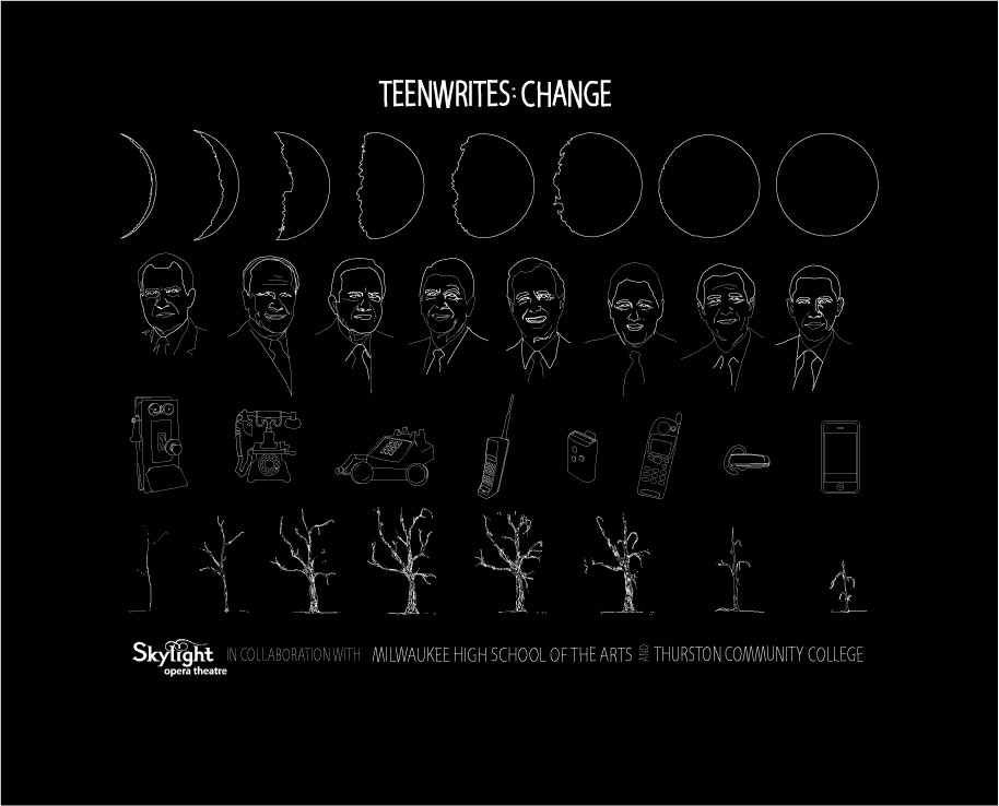
I think you should stick with one theme. Instead of nature (moon phases) + presidents + technology + nature, go with one theme.
I think nature would be best to stick with. Use your moon phases, use the tree, and then do something else...maybe the growth of a leaf from a tiny bud in spring, to a full grown leaf in summer, until it shrivels and dries up in Fall.
And stick with 3 rows. 4 is a bit much.
- katekelly0
haha!
- benfal990
i dont get the dying trees
- Progression of time.duckofrubber
- = changes things go through...represents life, growth, death, etckatekelly
- yes, duck.katekelly
- vitamins0
For some reason i'm drawn to the iphone illustration. Probably because I been looking at the itouch lately.
- katekelly0
d: i'd LOVE to do a series of shirts. and yes, my plan was to have each line (or even just a few of the illustrations) be seperate shirts...but sadly, this is for a public school...and I'm not even getting paid for any of this...which means theres pretty much no budget. which blows.
- d_rek0
I think the illustrations are very nice and thematically like the waxing / waning moon and tree. I agree with most of the comments above about line-weight and readability when printing onto fabric.
A couple thoughts which may be out of the question due to budget / production constraints - But have you thought about producing the shirt in series? With each set of illustrations and the type treatments? That may give you a little more flexibility in terms of scale and lineweight.
Anyway - nice work!
- katekelly0
thanks fellas. you've all been terribly helpful--'preciate it!
- katekelly0
yes, i feel you on the poster thing. i'm thinking i'm going to use most of this design for that-- and simplify the shirt.
- ok_not_ok0
hey, i saw your pic cute smile ;)
- mikotondria30
Did phones look like that when Ford was president ? lol
I like it, but agree with the tech. aspect of getting it printed onto a shirt.
Would be a good poster.
- rkrd0
maybe try to use solid shapes instead of thin lines, printing these hairlines is tricky
- katekelly0
Yes, thanks Jordy-- in the final version I'm bumping up the weight
as far as the illys go:
the play is performed by very socially conscious students, and topics vary with each group of kids so any performance could deal with changes regarding politics, age, technology, moods, love, etc.
- Projectile0
that won't print onto fabric the way it is. You definitely need to thicken up the white.
- vitamins0
Maybe make it 6 columns and scale up the images along with thickening the stroke.
- Orbit0
Nice illustrations, but I wonder if you're trying to get too much of the story into the print. It wont work like this, as others have said, but rather than thickening the lines... which in my humble opinion wont actually help the legibility at teeshirt viewing distance anyway... have you considered just taking one moon, one head, one device, and one tree, and making a bigger, abstract sort of totem pole out of them?
- katekelly0
i hear you on that one...theres so much freaking text.
- Jordy0
It's nice but I strongly advise to make the lineweight heavier, because this is not gonna work on a tshirt.
care to explain a little more about the illustrations?
- vitamins0
I really like it, but i'm wondering how it would look when printed on a shirt as far as readability. The illustrations are well done.
- katekelly
I'm working on a shirt for a friend-- shes directing this play put on by high school students...
been wrestling with this for a while...