Logo Crit Please
- Started
- Last post
- 14 Responses
- Sustenance
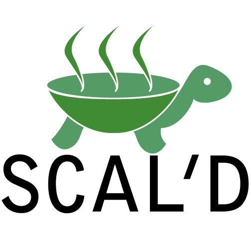
I'm taking my first graphic design class and I need a bit of help on a logo I'm designing.
[IMG]http://i30.photobucket.com...
[IMG]http://i30.photobucket.com...
- Sustenance0
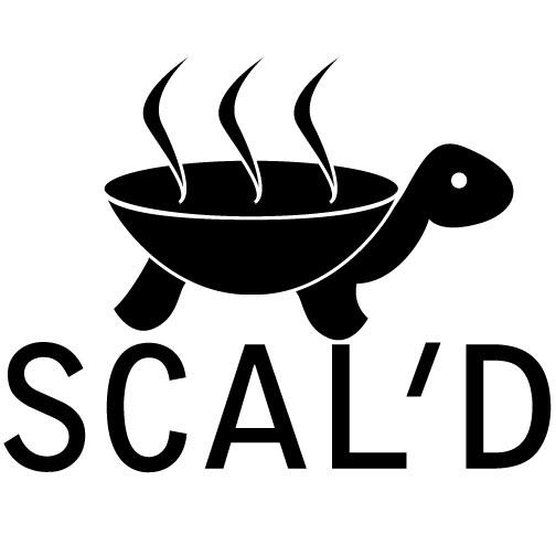
My Mistake
- Mistake? You mean that font?mg33
- I forgot that to post an image you don't use [img] tags in BBCodeSustenance
- version30
um...
well...
er...
if you "scal'd" it down, i think the gaps would bleed into one another- I was trying to perform "clever word play" by replacing the 'e' with an apostropheSustenance
- you're missing the pointversion3
- Sustenance0
The logo is for a fictional catering company based around reptile food
- the F associated with it will be very real.version3
- umm, okay. now it makes even less sense to me??lvl_13
- ha ha very funnySustenance
- do you see me laughing?version3
- I don't see you at allSustenance
- baseline_shift0
try some new typefaces. this one doesnt say reptile or food.
your mark and type are too close to each other.
see if you can simplify your mark to work withouth those white strokes.
- version30
btw...
scald
1 /skɔld/ Show Spelled Pronunciation [skawld] Show IPA
–verb (used with object)
1. to burn or affect painfully with or as if with hot liquid or steam.
2. to subject to the action of boiling or hot liquid.
3. to heat to a temperature just short of the boiling point: to scald milk.
4. to parboil or blanch (fruit, vegetables, etc.).
–verb (used without object)
5. to be or become scalded.
–noun
6. a burn caused by the action of hot liquid or steam.
7. any similar condition, esp. as the result of too much heat or sunlight.
8. Plant Pathology.
a. a blanching of the epidermis and adjacent tissues, which turn pale or dark brown, caused by extreme heat or sun exposure.
b. a condition resembling scald caused by improper conditions of growth or storage, as in apples, or by fungi, as in cranberries.
- Bam0
It seems a bit too forced to me, a tad too "packed".Give the whole thing a little air, add some more white. I would put the text lower and smaller. You also might wanna reconsider the font you used. Take something unique, then kern it better. Also, the turtle is off balance, his front leg is too low in comparison to the rear leg.
Another thing, i get the irony of the word "scal'd", but the logo isn't good enough to make it funny.
Don't want to be an asshole, but in this stage, the logo needs work.
- if he makes the eye into an X I can see the humour going somewhererzrffglyr
- CGN0
Play with the fonts for sure
- jimzyk0
it's great - all those guys are just crazy.
they know not what they speak of.just make it red, and bigger. done. print.
- harlequino0
Overall the concept itself is rather confusing. My word association was:
dinosaur
turtle
soup bowl
grill
scalding hot
burnReally, some weird and potentially negative imagery in there.
- kld0
his front foot is closer to the letters than the teh back foot otherwise... fail.
;) jk keep on, keepin on. It only gets easier and harder
- Nairn0
In zoom mode, in whatever software you're using, zoom out so this is at like 10% Note which details are missing and think about what you need to do to keep it distinct. Version3 meant up there that you should increase the thickness of your white strokes - look at the width of the eye - that'd probably be a good place to start.
The licks are a little flat and a bit too homogenous - get some life and variety in there. Also, your turtle needs a tail, no? :)
I'd consider trying a none-white-stroked turtle shell pattern, just made up of the two shades you've got (which I'd try and contrast a bit more too, incidentally).
Whilst you're playing with this - take out the text. It's probably distracting you from the components of the logo. Always have an idea of the types of text you want to use - but try and make it so both aspects are strong in and of themselves.
I think you're on to a good idea, if you play with it a little more.
Good luck!
- Also - why is your shell/pan in 3d and the turtle in 2d?Nairn