Logo Crit Please
- Started
- Last post
- 52 Responses
- JourNYC0
Scotch_Roman
True, a good crit does help from time to time. But would you want to crit every single time only to see the person who is unable to develop for themselves?
This idea of opening design for the masses has created an army of talentless people who think they can design (to my amazement even have an BFA / MFA).
Asking for crit on open forum is rather selective. You get crit from a kid fresh from BFA to someone old like my self. While, I refuse to give detailed deconstruction of the work, when I first see, I just have no comment. Why bother when the work is clearly bad and there is no real room to change. Editing bad work results is less bad work but still a bad work.
If someone tells you that just doesnt work, go back to the drawing board. That always helps.
- JourNYC0
I am sorry, I didnt ask for my work to be judged on public forum.
Thanks for the fuckhead comment, I bet you are a great designer who has a great future. Thanks Derek Kapa. Will put you in to never hire this kid pile. Come back and crit when you have some experience. Not just fresh out of school. Good luck!
- hahaha! Am i in the 'probably hire that kid' pile? Where do you work?baseline_shift
- Meh, hide behind anonymity then. It's where people like you belong.d_rek
- he's not that anonymous. *waves at dinky.skt
- Sorry skt, this was discussed already.JourNYC
- ah well. he might be reading this anyway. i wonder how he's getting on. good i hope.skt
- HHAHAHAHAHAHAHAnoRGB
- d_rek0

- Sorry Mondo, your thread got hijacked by JourNYC / Uber / Rob Benjamind_rek
- It's cool. This is fun. :)MondoMorphic
- Dancer0
Hold the fucking press the "Mac Daddy of design" has just entered the room.
- Scotch_Roman0
Now you're just picking apart my words. Of course talent is the necessary ingredient from the start, and talent can't be taught. Granted. All I was saying is that designers with at least the germ of talent can be greatly improved by sharp yet constructive critique. The better a designer can be at accepting critique, the more they'll be able to judge their own work with a critical eye, and thus grow in their abilities.
I was agreeing with you.
- d_rek0
JourNYC
Quit being a fuckhead and at least shoot us a link to your portfolio where you exercise the massive well of talent you so apparently are vested with.
- JourNYC0
< Sharp critique makes sharp designers.
– Scotch_RomanI disagree. If that was the case, everyone would be a great designer. There is a difference between being design aware versus being able to design something new.
- First of all, being able to critique and accept critique professionally is paramount. Second of all, show us your work.baseline_shift
- Yeah, I have to say, your lack of understanding in terms of the base nature of critique, it's quite telling.NONEIS
- A good designer knows how to ACT on good critique!NONEIS
- JourNYC0
Can you expand on that? Specific crits are usually preferred. Simply slamming something doesn't really help the designer.
– luckyorphanIts not slamming. If someone cant design, how can you teach them? Designing is not about just teaching, its about talent. Regardless of what you tell them, if they dont have the eye, its just not going to work. If you try to teach someone who has not talent, he/she only becomes a mimic.
- < Sharp critique makes sharp designers.Scotch_Roman
- uber?d_rek
- talent is a mythjaylarson
- MondoMorphic0
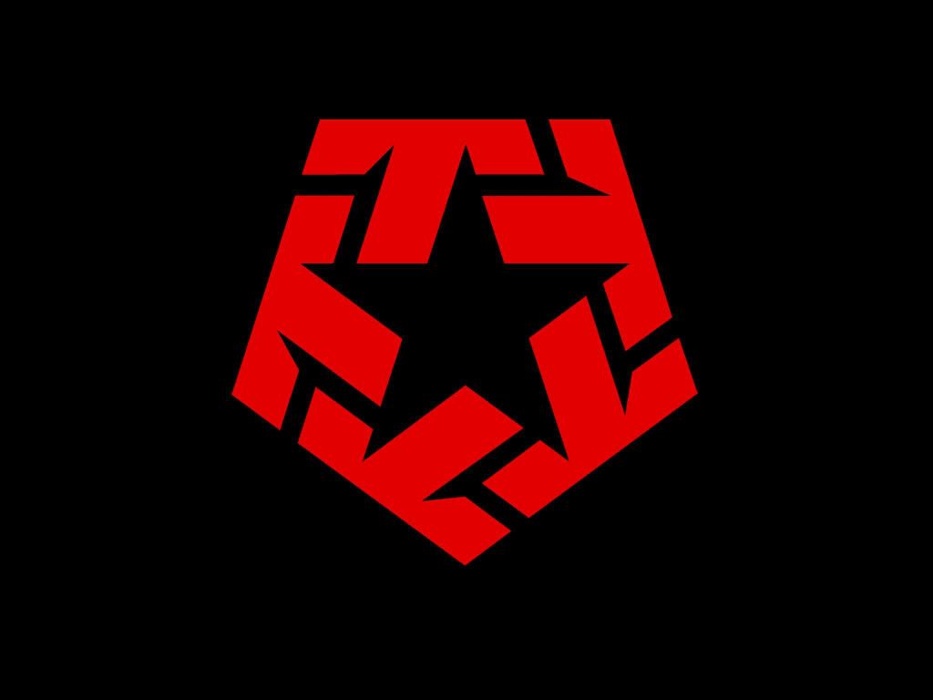
It is pretty!
- jimzyk0
i like
but the type is way too small in relation to the mark.
look at twitter down there. ----->
over there ----|\\\> that way kind of..now theres a logo
- Scotch_Roman0
I'd play up the arrows and play down the stroke. Agree with Mau that right now it looks more like a Sheriff's badge than anything else. I'd also rethink your gradient. Rather than top to bottom, could it be inside out?
Agree with Dancer's thought about the type. Also, the kerning is horrendous.
- MondoMorphic0
^^ Unfortunately, making the arrows more pronounced weakens the star. Plus, I like to do things...dangerously. :)

- baseline_shift0
i think you are in danger of the points looking phallic.
- < that too.Scotch_Roman
- I was just going to say that. Take a few steps back from your monitor and you really notice it.rosem
- JourNYC0
I think it doesnt look good. Very poor execution of an idea that lacks originality.
- Can you expand on that? Specific crits are usually preferred. Simply slamming something doesn't really help the designer.luckyorphan
- MondoMorphic0
The mark holds up pretty well when scaled down (which is great for a favicon), but the type is TINY.
- I have a logo, my full contact details and a picture of myself in my favicon.Nairn
- luckyorphan0
How does it look when reduced? I wonder if you'd lose the arrows when it's 16x16.
- d_rek0
I approve.
(but being critical)
I think the arrows are a little heavy handed. The type doesnt' feel wholly integrated into the mark yet. It feels frail in comparison to the weight of the mark. It's a great start - after some refinement i'm sure it'll be great!
- MondoMorphic0
Thanks for all the great feedback, folks.
What I didn't like about what the mark with the arrows pointing out actually was what it was communicating, but that's probably a problem with its execution.
- skt0
aggregation: arrows in.
propagation: arrows out.with a bit of refinement it would be a nice shape, but like dancer says, what it communicates is king, not what it looks like.
- dyspl0
speaking of stars logo,
my favorite one :