Fist in your face, LTD.
- Started
- Last post
- 16 Responses
- doctor
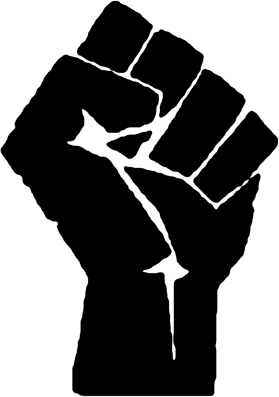
Check out this description of a logo design process: http://dryicons.com/blog/2009/02…
To me the logo just says "Fist in your face"... Nice.

- doctor0
*Punch!
Ouch... :(
- ********0
brilliant
- d_rek0
This logo is more like a bitchslap than it is a punch. Fail on all fronts.
- ********0
haha love these stupid fucking tutorials, pretending they actually had to sketch out that piece of shit.
I mean who needs a fucking tutorial telling you how to design a logo?

AND WHAT THE FUCK IS THIS SHIT?
Reminds me of this
- bulletfactory0
- - everytime i see this style I think of the old wb logo

- kult0
Those sketches are hilarious.
- ********0

- ********0
^ what does that logo actually mean symbolically?? That the more-able naturally gifted members of Manpower will leverage the less able (cheaper) staff to over-reach?
- the icon itself says MP********
- A sidearm pointing up.kgvs72
- the icon itself says MP
- ********0
it's an interim office
- nicole_marie0
i automatically saw some type of hand salute, hail ltd.
- monospaced0
"After the break, we have chosen one idea that will be our main concept upon which we're going to develop the logo. We are going to use a stylized fist, a powerful symbol which will unite all aspects of this logo design project."
HAHAHAHAHA
- ********0
The maximum a person can gain from this is how to use the rectangle + pathfinder tools in Illustrator. The comments are almost universally void of any substance - other than a sycophantic 'high-five' and a link back to the authors blog / $5-a-shot-logo-shop. This type of tutorial really is bullshit imo; nothing but fodder for a higher google page-rank.
- ********0
"Good tutorials are hard to come by, but great ones like this are nearly impossible to find. I like the sketch a lot, very cool"
FUCKING LOL
- doctor0
Those are the authentic sketches! ...Right. :)