Slab serifs
- Started
- Last post
- 25 Responses
- raf
I am strangely clueless in this area somehow, even about the basics. Looking for strong, simple, round ones. Any ideas?
- ********0
like archer?
- unlike archer, to be preciseraf
- Sorry.. Archer is perfect, apparently there is another font by the same name and it looks like http://i42.tinypic.c…raf
- TheBlueOne0
Memphis and Rockwell are your basics.
- Ahhh... faithful Rockwell.Andrew_D
- Rockwell MafiaAmbushstudio
- ********0
I'd choose Lubalin over rockwell, basically the same but Rockwell has some ugly characters.
not sure what you mean by 'round ones'
- TheBlueOne0
more contemporary, try vllg.com - apex serif or stag
- Apex Serif - looks like that's the one Threadless useraf
- ********0
you could be trendy and use black sabbath, well I guess thats actually played out already.
- NotByHand0
Strong, simple and round... sounds like 'Lubalin Graph' should be right up your alley.
–

- Whoa, didn't know this font had the alternatesletterhead
- Not digitalized : (CphGD
- raf0
Lubalin Graph! What a haze was I under.. Thanks.
Any info on which version contains alternates?

- kev_charlton0
Glypha is nice:
http://new.myfonts.com/fonts/lin…
- doesnotexist0
Serifa
- CphGD0
Egyptienne
Aachen
- Scotch_Roman0
Serifa beats the pants off of any geometric- or grotesque-based slab. It's much more elegant, and less slavishly geometric than Lubalin Graph or Rockwell. Better range of weights, too. I used it in the Herbie's restaurant ID in my folio. The built-in kerning is pretty good too, which I find rare among slab serifs.
- szymon_k0
I like memphis right after lubalin.

- ********0
I also prefer serifa
- raf0
What's that baby? whatthefont.com doesn't detect it and I keep seeing these dot-serifed S recently:

- isn't that archer?********
- It is.. I'm going back up to the first comment and apologize, because the archer I found was some para-medieval crapraf
- The old archer looks like this I shit you not: http://i42.tinypic.c…raf
- isn't that archer?
- monNom0
courier (old)
you'll have to kern it. can look nice
- Kiggen0
slab(ish):
Clarendon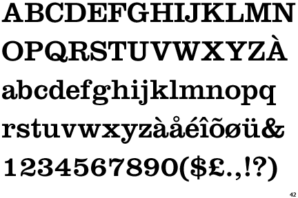
- keithrondinelli0
House Industries' "United" is a nice one. "Dispatch" I like a lot.
