logo critique, yo!
- Started
- Last post
- 32 Responses
- coco_ono
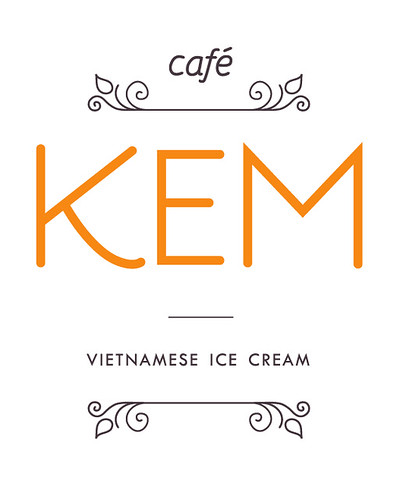
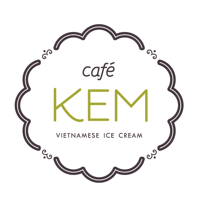
Kem (pronounced like "jam" but with a "g") is opening up in minneapolis come may...
watcha thinketh?
- VectorMasked0
huh.... nice. You def have something there.
Kinda prefer the 3rd option. Either one of those two is fine. Good stuff. Try fooling around more with the smaller type. how about increasing the size and tracking slightly in "Vietnamese..."
Needs a little polishing but you seem to be headed for something good.
- VectorMasked0
oh yeah.... the charp corners in the "M" don't work too well when large.
I'd round the the three sharp corners.
- and yes, the M is a bit sharp...That's because i traced it myself...i'll fix that.coco_ono
- 7point340
i like one and 3 have you tried combining them?
- yeah, it looks a bit over kill...i've tried many options of these...didn't know whether to post them or not.coco_ono
- post them! I also thought of suggesting a mix between 1 and 3.
VectorMasked
- johndiggity0
i'd round the top most joins on the m. the overshoot is really throwing the whole word off. the e should be wider as well. open up the letter spacing a little also. feels very closed and tight. i like where the bottom version is headed.
- MrOneHundred0
I like them a lot. I think the middle one hits the mark, but it’s a pretty close race. I would have gone with a slightly heavier type for the main word, but that’s just me.
- Ambushstudio0
Sweet logo, all 3 could be really cool apps if you think about future marketing. Totally agree on the sahro corners on the M. If I had to choose #1 is my fav.
good luck.And agree with 7point... you should try to combine 1 and 3 , would make a sweet label
- akrokdesign0
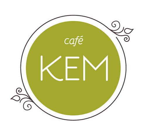
the 3rd version is the strongest.
- coco_ono0
Changes:
- coco_ono0
i brought the K in a bit more and made it smaller...
- waterhouse0
Lovely!
- ********0
2 and 3 are very nice.
- VectorMasked0
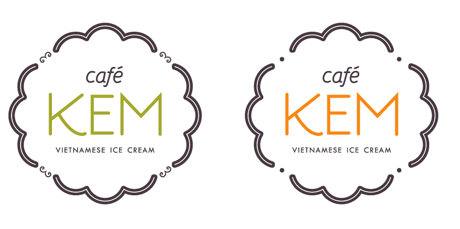
Better. The wider "E" works better with the K and M.
"Vietnamese..." doesn't not look quite right. It isn't totally centered.
I don't quite like the 4 small details and the circles to be facing outwards like that... It feel too repetitve since the 4 larger shape follow the same direction. They might work better if they were flipped so the circles ar on the inside.
KEM and the rest of the text could pssibly be increased a little. like by 103-105% or something. Worth exploring.
Now... it bugs me that the k is aligned with the top shape but the edge of the M is not aligned with the right side of the top shape. Makes sense?
- VectorMasked0
and please... If you do end up doing some packaging for them... post it here. It will be "hawt"! :o)
- i will do packaging for them as well as the interior store.coco_ono
- Good luck with all that. Fun job.VectorMasked
- coco_ono0
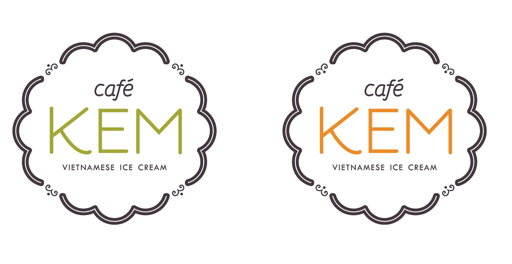
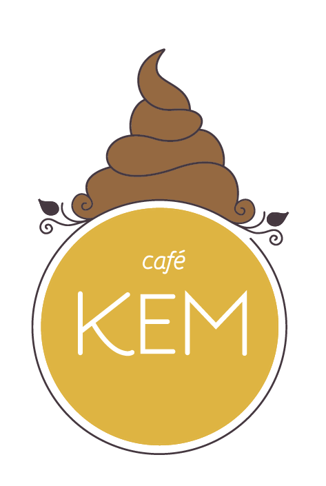
better?

- VectorMasked0
YEAH!! *fap fap fap*
finger lickin' good!
Now... the "f" annoys me ;o) a little that angle gets too much attention imo. easy to fix if you think it needs to be dealt with.
Could be worth also rounding the middle part of the M so it's also rounded (might suck though... but consider it) and the M could also be moved like a milimetre closer to the E.
- coco_ono0
Vector, I should be paying you for being such a good art director...
But it's okay, because I'm a student still...suckaaa! ;)
- VectorMasked0
hahaha

+1 for not going with this
- haha - yes...i know, i know.coco_ono
- awesome! hahaha
Ambushstudio
- coco_ono0
chocolate, anyone?
- instrmntl0
3rd seems ice creamy. others are more zen spa ish. naw mean?