Is branding for an electrician folly?
- Started
- Last post
- 66 Responses
- Meeklo0
I have to say, the current design is stronger and more suitable for an electrician. Just clean the type a bit, use one typeface, something nicer, but I think the current colors are a good choice, the new one looks more elegant, but also a bit generic.
I don't know if elegant is something that comes to mind when I think "electrician" though.

- kushman0
Thanks for the feedback. It's Monday morning and I think it's about time for another crack at it.
The idea behind using for NEUTRA the type was to emphasise the age old skill the company has (in the family since '42).
But the overriding feeling is NEUTRA is inappropriate for the task.
Elegance is not something Im trying to bring into this. I kind of want it classic and retro looking without being grungy at at all.
And then there's that yellow...
- typist0
classic and retro , but not boring
http://www.movingbrands.com/?p=6…
- kushman0
Like that a lot but it's far too high brow for what I need.
- kushman0
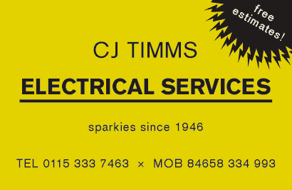
Ok I've done another one. This time it's in yellow and doesn't look like it's a taxi firm or dangerous.
Also the NEUTRA type has been replaced with Akzidenz Grotesk, which is more historically accurate to the style period than Helvetica.

- Hmm, looks like 'free estimates' needs kerning!kushman
- i like this one. it's strong and looks reliable.stewart
- I'm personally not liking the yellow and blackTheBIueOne
- agentfour0
i really like the original blue and yellow diagonal. Don't like the rest of it but that would be nice on the back of the card.

- typist0
looks like their secretary do it in ms word in 2 mins.....
- kushman0
You're right. I'm trying too hard to make it look old fashioned!
How about this one/

- uncle_helv0
I don't know why people think this is a good way of working??!
You seem to have gone from your original idea, which, personally I thought was nice, to a bit of a jumbled mess by listening to lots of sound bytes and conflicting advice.
- kelpie0
strong, reliable, simple, clear.
anything else is pointless graphic masturbation.
- stewart0
stick to this one. with dots between the C & J.
- scribbler0
I remember seeing a great electricians card a while back, it was printed with glow in the dark ink. Brilliant.
- kushman0
Ok, I'm breathing the last breath of life into this thread before i put it to bed!
After reflecting on some of the wisdom of helv, nain and others I've decided to stick to my guns and go back to the first idea but with some modifications.

Not sure which is the most effective. yellow and green are the colours of the Earthing cable flex in UK.
The red obviously stands out more though and has more impact.
One of these designs I will present to my client this afternoon (with some modifications)
- TheBIueOne0
Also,not sure what the laws are in the UK, but I've done a few sites for trades here in the US, well specifically NY, and by law you have to have the tradesman's license number included on all advertising - including websites. (e.g. Fully Licensed and Insured, License # 1111111). Websites are included in that. One of the guys I worked for got fined for not having that information up. I didn't know about it, nor did the client...but it was a good bit of knowledge to learn.
- kushman0
Hmm, I'll ask the question but it's not something I've come across before. Thanks.
- kalkal0
That's probably just for gas and corgi registered people here
- 23kon0
i actually prefer the twotone blue n yellow one to the white one youve designed, sorry.
with the first one i know what im getting - it LOOKS like an electricians card.
the white one with logo in the middle DOESNT LOOK like an electricians card.keep the red logo youve created maybe, but the rest of your typography needs major work done. honestly, that second designs typography looks untidier than the first!
- stem0
Having done a quick google around... it's pretty much as I thought. Sparkies are "One-Man-Bands" who don't know the first thing about marketing or branding and there are some truly terrible examples out there.
This is by no means great, but it stands out from the examples I have seen so far...

