Fonts You Want 2009
- Started 16 years ago
- Last post a month ago
- 132 Responses
- 5timuli0
Catacumba
http://www.fountaintype.com/type…
- bastid, ya beat me. love it. 60's sexorcisto/satanicojaylarson
- shit that is fucking awesome!Ambushstudio
- I can't take all this beautybump79
- Iggyboo0
Something I am working to create a new font you can see here http://www.advertisingbrandinget…

- too many ideas in one font... calm it down a little.Amicus
- also reconsider the numbers, they are a whole different story nowjimbojones
- Scotch_Roman0
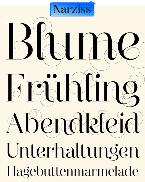
First font purchase 2009:

Using it for an ID project right now. Love it. OSF, small caps, alternate figures... only trouble is, I have no idea which serif faces I would pair this with if I had to.
- I think it would look good with a fairly wide-stanced contempo serif... no ideas.Scotch_Roman
- Mercury's on the wide side, but too sharp to go with such a round sans.Scotch_Roman
- take a look at ff tisajimbojones
- new a bunch of people that lived on that street in minneapolis: bryant.jaylarson
- 5timuli0
- Tadam!!!!non
- Once again, H&FJ come back with an instant classic.non
- Clarendon Killer5timuli
- I think I could just use H&FJ types for the rest of my professional career.non
- < This.Scotch_Roman
- Man, that is beautiful. Clarendon killer for SURE. WANTnoRBG
- Sentinel makes me drop human seed in my undergarments, sir.janne76
- their colour palettes are also great! Def could just use their type library from now on.mirrorball
- sweeeeeeeeeeeeet!akrokdesign
- Bloody marvellous. I have it : )MrT
- Scotch_Roman0
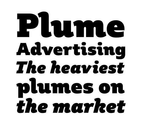
Whoa! Love the short-ranging figures feature. Kinda reminds me of a slab version of Miller. Goodbye Serifa, hello Sentinel!
- ukit0

- skwiotsmith0
There's something I really like about this...

- But I don't know when/where/if I'd ever use it.skwiotsmith
- Eesh, r and n are particularly nasty.Scotch_Roman
- Yeah. It's far from perfect, but I think that's kind of why I like it. But I'm not totally sure.skwiotsmith
- horton0
Neutraface Slab finally landed, and of course, I want:
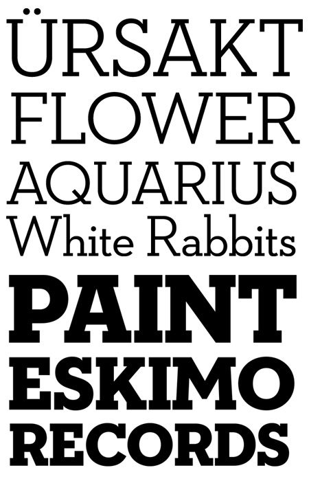
- not the most exciting specimen... damn house images ain't easy to link to http://www.houseind.…horton
- ... will admit though that any excitement about the release kinda fades in comparison to H&FJ Sentinelhorton
- 5timuli0
Azbuka – a decent looking alternative to DIN et al.


- looks like the "z" wants to get out of this font. its height looks weird next to the "a" for some reason.VectorMasked
- the S is ugly********
- 5timuli0
Azbuka (above) along side FF Enzo (below) are the final nails in the coffin of Magnitude (bottom). RIP 2001–2009.


- 5timuli0
Oh yeah, don't forget Process Type Foundry's custom, 'Sunday'. That killed Magnitude too. MURDERERERS!!! Maybe I should've got my finger out my arse earlier on and more often.

- 5timuli0
On a brighter note, we finally got round to buying Proxima Nova at work today. Tomorrow I'll begin the arduous task of removing Gotham from a completed book (72 pages) of text and illustrations, and replacing with our new baby. At first I thought it was a disaster but comparing the two faces, I'm really happy with the change.

- 5timuli0
A couple of nice serif faces in progress over at Typophile:
Ernestine
http://www.typophile.com/node/53…

[Untitled]
http://www.typophile.com/node/53…

- ukit0
- ukit0

- jaylarson0
Gravur Condensed.