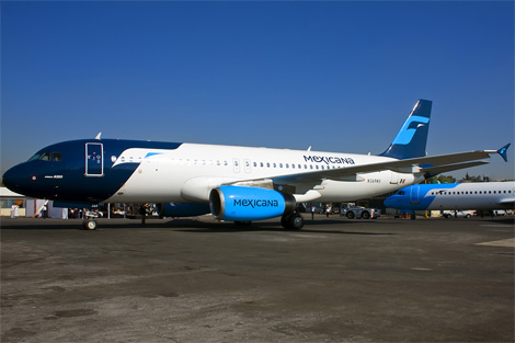
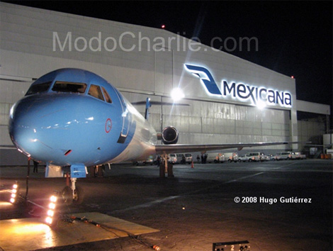
New Mexicana Airlines Logo
- Started
- Last post
- 24 Responses
- bananaman0
Not loving the livery and it looks like a derivative of Finnair:

- Meeklo0
the new logo looks actually nice.
great job
- sea_sea0
i love méxico. can't wait to go back in january, btw. lols.
- version30
i likes it, i hate italicized logos
- mistermik0
nowt wrong with it
- Gifto0
Why mixed case in word mark? Eesh.
- Buy_Antiviral_Drugs0
:->
- sofakingbanned0
I think it looks awesome, the plane graphics too.
The only thing that stands out is the uppercase "N"who designed it?
- sofakingbanned0
to Lloyd.
wtf are you rambling on about?
Clearly you have something against latins.
On behalf of my people...Go fuck yourself. :)
- don't mind him...hahaha!OSFA
- +1akrokdesign
- hie fie!sea_sea
- HAYZ1LLLA0
I do their UK advertising so am keeping my mouth shut.
- BonSeff0
i dig the 'm' and the bird head in the 1st mark- looks aztec'y
has more character
- OhYeah0
To be honest I like both logos, the new one is really nice IMO nice typeface. But I would get rid of that "eye".
- i_monk0
If that's how you want to play it, Hellrod.
- ninjasavant0
I like the new one.
- Point50
that bird head only works well when butted up to a boundary or edge like on the tail. Otherwise, it's way too open and unrecognizable.
- Crouwl8cY0
Decadent work
- akrokdesign0
wtf. i guess aeromexico was taking over. :-)