New Montreal Logo
- Started
- Last post
- 47 Responses
- taps0
Melbourne:


- http://www.landor.co…taps
- Melbourne's identity
is very nice, I like.utopian - I love modular logo designswinnie_the_shit
- taps0
Manchester:


- DoktorDavid0
Ack... beautiful Montréal has been living 1967 (see: http://en.wikipedia.org/wiki/Exp… ) over and over and over again... it is like the wet dream that never stops... hence the totally 40 year old feel for this branding... move along; nothing to see here...
- Centigrade0
But in fairness not as bad as this:
http://www.torontounlimited.ca/
- Centigrade0
Nein nein nein nein!
- Centigrade0
A really sub standard attempt to do what Melbourne did. Can't believe they'd ditch the floral one.
- svenreed0
it just feels way way to heavy on the right. like the type can't even hold it up. not a fan of the colors either, that's what makes it feel aged to me.
- miesvan0
M. The Citty of clowns. The room to try again.

- Nessikha0
Haven’t we learned a lesson from the “stolen” kiss logo for Montreal in the early 90s?
You can read about it in The Gazette from February 13, 1993. The Montrealers paid the
artist $ 30.000.00 for the outstanding copied idea which belonged to the former capital of Bonn/Germany. We repeated the same in the West of Canada in 2009 – to be precise in Kelowna, B.C. – Are we really that naive to make the same mistake in Montreal and now for
over $ 400.000.00 ? The logo is extremely ugly.
I wonder if I can apply to design the next logo for Montreal?! I could do it for a more reasonable price.
- pantonik0
this logo is by Gilles Robert (1981)
- pantonik0
What we've lost?
The exisiting City of Montreal logo by Georges Huel (1983)
an elegant geometric abstraction of the Montreal Flag
/Users/pk1/Desktop/132190561_98f...
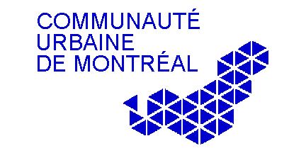
and the "Communaute Urbaine de Montreal" logo (reminiscent
of Wim Crouwel's old Rotterdam logo)
/Users/pk1/Desktop/alban.jpg
- section_0140
This thread just reminded me of the Canadian Grand Prix getting the axe. Mother F*!$%
- Douglas0
I really like the mark and the Greater Montreal type. Not so sure about the subtext. Love it or hate it though, I really like seeing that the public is starting to notice graphic design and it's ability to work. That's one of my favorite things about the Olympic 2012 logo, was just that it is generating all sorts of emotion. $487k sounds about right for rebranding a big city. Was it WO who did it? I didn't read that in the article. It would've been nice to keep it local imo.
- doesnotexist0
maybe it took 100 rounds to get there though?
- It's a government sponsored job with what is likely a minimum 10 person committee involved. 100 rounds sounds right.Groks
- LOKi0
as a montrealer, I'm kinda dissapointed...
- non0
+
Icon is ok-
Type is bad
Proportions are off
General spacing is inadequate*goes back to making shit design*
- canuck0
Looks ok to me.
- CuriousGeorge0
look better than most crap posted on here looking for crit.
- + controversialmistermik
- but correct...neue75_bold
- also not saying much really...neue75_bold
- yes.pylon
