NEW Pepsi Logo
- Started
- Last post
- 76 Responses
- ********0
it's just a marketing flip? ah hell, I thought this was fo realz
- Complexfruit0
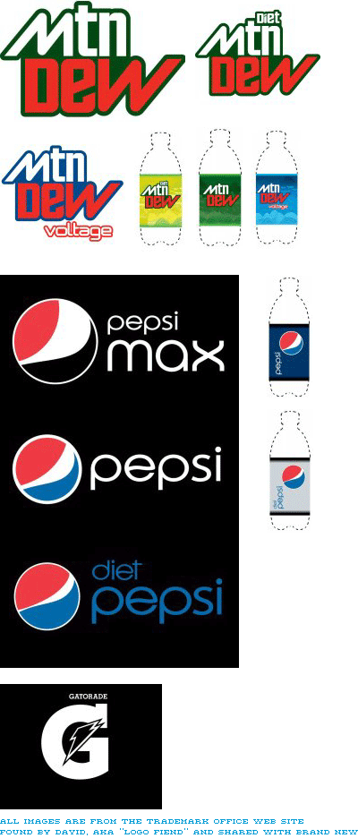
Taken from http://www.underconsideration.co… on Pepsi's new redesign. "Now, this doesn't mean it will all be used or that this will be its ultimate form, but if it's been registered or trademarked it sure won't be too different."
- yup i like it, nice touch on the "e"horton
- dear god. whos is doing their design? the CEOs kid whos in design college?sofakingbanned
- I think the Mtn Dew logo works, since they gear it towards the extreme sports demographic. I'm not sure about the other though.Complexfruit
- ...logos though.Complexfruit
- horrible font on the pepsi one, I do not like that bauhaus stylee 'p'.ian
- uan0
i like it...specially for the reason that in 5-10 years they will redo the whole thing and can go 'classic' again, rebooting the original logo :)
- Leigh0
If it aint broke...
- mistermik0
haha looks alike anti-freeze bottles.
- Ampersanderson0
Totally hate it.
- ********0
i don't get the point of abbreviating Mountain. were people having trouble with it?
i really hate when cell phone or IM typing shortcuts find their way into the real world. it's fucking ghey.
- voiceof0
The new bottles look a little phallic
http://img162.imageshack.us/my.p…
- marchelo0
The blue bottle logo works the best, maybe switch out the blue to represent the flavors. Blue, silver, black.(Since you've come this far.) Lose the big ugly "O carb" type. And work on the top red portion of the logo to make it look more balanced. Has Potential, but needs work.
- marchelo0
The blue bottle logo works the best, maybe switch out the blue to represent the flavors. Blue, silver, black.(Since you've come this far.) Lose the big ugly "O carb" type. And work on the top red portion of the logo to make it look more balanced. Has Potential, but needs work.
- doesnotexist0
looks like a store brand


