Quick logo crit
- Started
- Last post
- 37 Responses
- dbloc0
I would try different fonts.
- dbloc0
what is the track used on the Go Skateboarding Day video?
- http://www.youtube.c… ?neverblink
- that wasn't it. Did you just update your site?dbloc
- No, havn't updated in years. Which vid' are you referring to? this: http://www.youtube.c… ?neverblink
- neverblink0
thnx for the feedback everybody
I'm off to bed. Maybe I'll dream up a solution for this.. or maybe not
- neverblink0
a combination of the previous.. made an alternate ('one story') g.
- i like itSpanna
- I shortened the tail of the 'g' a bit more after this. gives the 'j' some more breathing room.neverblink
- need to soften the corners of the box if you are going to use that typeface.skt
- thnx.. that does look more cohesiveneverblink
- Vicentvangogh0
Please no more 1990 swooshs, please for the love of god
- JasonPenopolis0
LAME
- Kiko0
just noticed this yesterday

perhaps you could so something similar with the G and J as they go into each other
- thnx, that is nice, but a bit too decorative for what I'm after with this wordmarkneverblink
- akoni0
find a good typeface, and you won't need any swoosh or gradients mang... good start though
- ian000
makes me think of feminine products
- moamoa0
Yes, that's a swoosh! Yes, that's a gradient! Logo is for a site by an uncle of mine.
thats not an excuse for gradients & a swash
- hahaOSFA
- I agree, that's why I need your help ;)neverblink
- tasty0
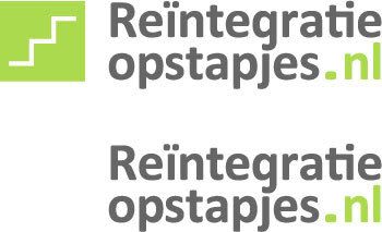
.NL gets lost
if we hear the code words throughout the day do we scream bloody mary?
- Amicus0
sorry. this looks like it needs more thought.
If it's for a family member you should use it as a portfolio opportunity. shouldn't your family have enough trust in you to give you a little free reign?
- boobs0
Would being re-integrated into the mainstream of Dutch society mean I could smoke a lot of weed? Because I would sign up for that, no matter what the logo.
Anyway, I'm liking the new direction. I like the steps and the colors, and you're now 80% of the way there.
- neverblink0
I have free reign, but also little time to spend on this (as I have multiple projects at the moment which require my attention)..
Thnx for all the feedback thusfar.
I think the colour might give it the 'female' feel.
I actually like the typeface (Calibri), I know it's the new 'Times New Roman' as it's used as the default typeface in Office 2007, but with it's subtle rounded corners I think it gives it a softer feeling.
That swoosh was just a way to portray the upward motion of people being helped out of a job-less situation and getting back into 'normal' life.
- maybe the font will look not so softie with a stronger colourmoamoa
- last loine: might be a bit too literalneverblink
- horton0
wow i feel for, visually challenging name to work with
- tenpointtwo0
Looks like an ED medication logo
I like the font choice a lot though.
- neverblink0
@ horton; yes, and splitting it up in three parts (.nl as thrid part) doesn't really help, and in one line it's just too long..
I might add the literal translation of the name is something like 'reintegration steps' (steps as in a staircase).
- try Infotext, it works much better then Calibri
http://www.fontshop.…
moamoa - low cost project; don't think they will cover the cost of the font. Thnx for the suggestion tho'neverblink
- try Infotext, it works much better then Calibri
- shinpo0
sorry, but it kind of looks like a viagra logo. I agree that if you find a better typeface it will be your strong point and a better place to start.
- moamoa0
you should work with a pure type solution, like the bottom left one...
maybe not in upper case? that makes it very unreadable, but you definitly need a stronger font & a better colour... & as mentiones before, there is no need to set the .NL smaller then the rest- if upper case = a condensed weight... if lower case = a "normal" weightmoamoa