Quick logo crit
- Started
- Last post
- 37 Responses
- neverblink
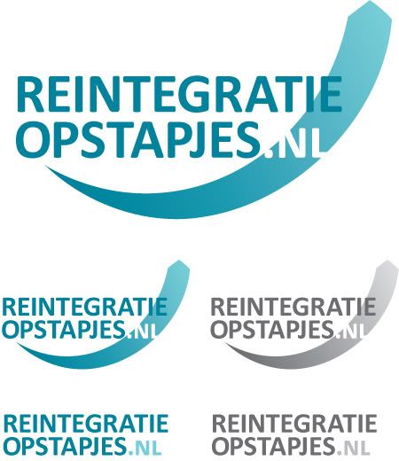
Yes, that's a swoosh! Yes, that's a gradient! Logo is for a site by an uncle of mine.. you know the deal - low cost project, so nothing too fancy.. I'm sure there's room for improvement here, so help me out..
Site will help people who are currently without a job to come in contact with organizations which provide short educations to help people get a job.
Codewords: Positive, Professional but easily Approachable.
- akoni0
find a good typeface, and you won't need any swoosh or gradients mang... good start though
- ian000
makes me think of feminine products
- moamoa0
Yes, that's a swoosh! Yes, that's a gradient! Logo is for a site by an uncle of mine.
thats not an excuse for gradients & a swash
- hahaOSFA
- I agree, that's why I need your help ;)neverblink
- tasty0
.NL gets lost
if we hear the code words throughout the day do we scream bloody mary?
- Amicus0
sorry. this looks like it needs more thought.
If it's for a family member you should use it as a portfolio opportunity. shouldn't your family have enough trust in you to give you a little free reign?
- neverblink0
I have free reign, but also little time to spend on this (as I have multiple projects at the moment which require my attention)..
Thnx for all the feedback thusfar.
I think the colour might give it the 'female' feel.
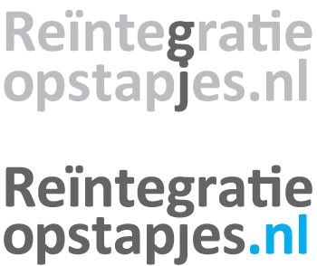
I actually like the typeface (Calibri), I know it's the new 'Times New Roman' as it's used as the default typeface in Office 2007, but with it's subtle rounded corners I think it gives it a softer feeling.
That swoosh was just a way to portray the upward motion of people being helped out of a job-less situation and getting back into 'normal' life.
- maybe the font will look not so softie with a stronger colourmoamoa
- last loine: might be a bit too literalneverblink
- horton0
wow i feel for, visually challenging name to work with
- tenpointtwo0
Looks like an ED medication logo
I like the font choice a lot though.
- neverblink0
@ horton; yes, and splitting it up in three parts (.nl as thrid part) doesn't really help, and in one line it's just too long..
I might add the literal translation of the name is something like 'reintegration steps' (steps as in a staircase).
- try Infotext, it works much better then Calibri
http://www.fontshop.…
moamoa - low cost project; don't think they will cover the cost of the font. Thnx for the suggestion tho'neverblink
- try Infotext, it works much better then Calibri
- shinpo0
sorry, but it kind of looks like a viagra logo. I agree that if you find a better typeface it will be your strong point and a better place to start.
- moamoa0
you should work with a pure type solution, like the bottom left one...
maybe not in upper case? that makes it very unreadable, but you definitly need a stronger font & a better colour... & as mentiones before, there is no need to set the .NL smaller then the rest- if upper case = a condensed weight... if lower case = a "normal" weightmoamoa
- MISTERKIJI0
i dont see a clear relationship between the wordmark and the swoosh. the "I and E" in "intergratie get lost in the swoosh as well as my eye keeps going back to the .NL since is swapped out. It's definitely hard to interpret how the word "feels" since the language is so foreign to me. I think im in agreement with some of the other people that the typeface and the color you chosen speak a very medical language.
- ********0
I think you're going to be very sorry about that typeface in a few years.
- dbloc0
is the swoosh supposed to look like a tie?
- Nairn0
The P and the J feel a little tight and the .nl suffix is hard to discern.
- neverblink0
thnx Nairn, they do.
I agree with most of the comments made.
The swoosh was a way to get the upward motion into the logo, but it clashes with the wordmark.
The .NL are currently in small-caps to give them less presence (name should also work without the .nl), but by being different from the other text it just draws extra attention.. I'm not too worried about it not being readable. (99.9% of the users of the site will know it stands for Netherlands and recognize it without too much difficulty).
The reason I had for chosing all caps was that I could get away with not correctly puntuating the i in 'reïntegratie' (double dots look messy).
The colours give it a medical/female feeling - I can see it being something by Always or Viagra (esp. with the upward motion).
In spite of what most have you have said about the font, I still like it. Moamoa suggested FF Infotext, but I think that's a bit too rigid for this, it needs to be a bit more 'humanist'.
- naaa I suggested Infotext as a better choice then colibri.moamoa
- it's all good.. thanks for the suggestion either way :)neverblink
- I see your budget is low, otherwise I would suggest you a Lucas de groot font
http://www.lucasfont…
moamoa - haha.. Calibri is by Lucas! ;)neverblink
- jaaa he sold his ass for MS :)moamoa
- neverblink0
just messing around; deleting all that was too much..

- I like the ti-ligatureneverblink
- ...bettermoamoa
- maybe left sided would work better?moamoa
- ********0
that looks like a tampon but those are two of my favorite color combos
- neverblink0
the 'g' & 'j' clashed so had to remove the dot and shorten the 'l' a bit to get the lines closer together.
- I see hmmm, the second line should look a bit shorter, then it would look much better..moamoa
- but how? not its like almost like a bloc.. doesn´t workmoamoa
- that's why I had them right-alined above.. becomes really static like thisneverblink