Quick logo crit
- Started
- Last post
- 37 Responses
- MISTERKIJI0
i dont see a clear relationship between the wordmark and the swoosh. the "I and E" in "intergratie get lost in the swoosh as well as my eye keeps going back to the .NL since is swapped out. It's definitely hard to interpret how the word "feels" since the language is so foreign to me. I think im in agreement with some of the other people that the typeface and the color you chosen speak a very medical language.
- pylon0
I think you're going to be very sorry about that typeface in a few years.
- dbloc0
is the swoosh supposed to look like a tie?
- neverblink0
thank you for bumping a 7 month old thread :)
(btw. JasonPenpolis is now on my ignore list)
- I think he's on everyone's list, actual or habitual.Nairn
- typist0
jason is terminated by qbn
- Nairn0
The P and the J feel a little tight and the .nl suffix is hard to discern.
- neverblink0
thnx Nairn, they do.
I agree with most of the comments made.
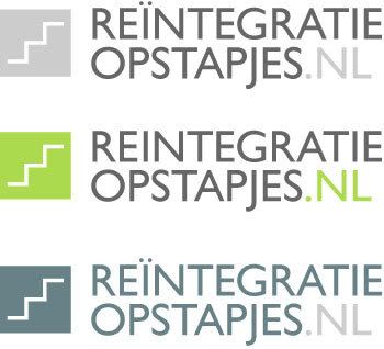
The swoosh was a way to get the upward motion into the logo, but it clashes with the wordmark.
The .NL are currently in small-caps to give them less presence (name should also work without the .nl), but by being different from the other text it just draws extra attention.. I'm not too worried about it not being readable. (99.9% of the users of the site will know it stands for Netherlands and recognize it without too much difficulty).
The reason I had for chosing all caps was that I could get away with not correctly puntuating the i in 'reïntegratie' (double dots look messy).
The colours give it a medical/female feeling - I can see it being something by Always or Viagra (esp. with the upward motion).
In spite of what most have you have said about the font, I still like it. Moamoa suggested FF Infotext, but I think that's a bit too rigid for this, it needs to be a bit more 'humanist'.
- naaa I suggested Infotext as a better choice then colibri.moamoa
- it's all good.. thanks for the suggestion either way :)neverblink
- I see your budget is low, otherwise I would suggest you a Lucas de groot font
http://www.lucasfont…
moamoa - haha.. Calibri is by Lucas! ;)neverblink
- jaaa he sold his ass for MS :)moamoa
- neverblink0
// We just went through an eighties revival, the nineties are the next big thing!
- Spanna0
I like the type route you were following, but the steps block is also nice. I do prefer the lower case solution as opposed to having it all in uppercase - too harsh and shouty.
- skt0
I like the one at the top of this page, there might be something you can do with the . n l to further emphasise stepping up as it is almost there anyway.
- neverblink0
just messing around; deleting all that was too much..

- I like the ti-ligatureneverblink
- ...bettermoamoa
- maybe left sided would work better?moamoa
- epete220
that looks like a tampon but those are two of my favorite color combos
- neverblink0
the 'g' & 'j' clashed so had to remove the dot and shorten the 'l' a bit to get the lines closer together.
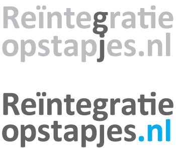
- I see hmmm, the second line should look a bit shorter, then it would look much better..moamoa
- but how? not its like almost like a bloc.. doesn´t workmoamoa
- that's why I had them right-alined above.. becomes really static like thisneverblink
- neverblink0
just messing around:

- dbloc0
what does this mean?
- neverblink0
it's on the first page, but loosely translates to "reintegration steps" (site for helping people get back to work)
- if you mean the letterform-play.. it's "integrating" the words..
*insert comic drumroll followed by hi-hat crash*neverblink - by hi-hat crash*neverblink
- if you mean the letterform-play.. it's "integrating" the words..
