Logo Crit
- Started
- Last post
- 36 Responses
- sublocked
Yo qbn.
I don't get to practice logotype and design as much as I'd like.
I'd love to get honest crit from some people more talented than I. It's a logo I'm working on for my online invoicing, estimating, time tracking service - http://www.getcashboard.com
Below are 3 looks at the logo. The first is the current, which I'm really not happy with.
The bottom I'm liking a lot more, but wondering about the kerning and legibility of it at small sizes.

I chose Trajan Pro Bold as the base type. Reasons being I wanted something that looked "bank-like". Something respectable, solid, and conveyed a sense of strength.
Another reason for going with the choice - I'm sick to death of all these Web 2.0 sans-serif logos. They all look the fucking same to me.
Crit away.
PS: Fuck you, candy.
- graham0
a bit too harry potter
- harry potter has that lightning font thing going on. i don't see how they're similar?sublocked
- not literally man, just looks nothing like a software logo more like a fantasy movie titlegraham
- gotcha. the stereotype of software logos at the moment seems to be some generic sans though. bleh.sublocked
- totally agree. but perhaps thats what the market expects, rather than noble stand against the trend - the product might do better from conformitygraham
- you might be right. instead of trying to buck the trend i might best be served by yielding to it.sublocked
- ********0
trajan pro = the movie font, not the bank font.
kerning it horrible on all of them, but it's not really something i'm good at. get moamoa or gramme in here.
- sublocked0
i'm totally open to listen to other font choices. hook a dude up.
not violently opposed to a sans choice as long as it meets my requirements.
- ian0
The third one is pretty ropey. Its looks like its kind of a small caps but the first 'C' looks too large and too heavy compared to the other letters. The whole thing just looks too squashed, look at the serif on the 'AS' the tip of the serif is appearing just above the leg of the a. The BOA looks tighter than the others too.
In my opinion it does not look respectable or honest, it looks more like a title of a videogame or band logo.
- ********0
Bad choice of font, especially when you begin to use this awful gimmicky tight kerning - what you are left with is something that has the look and feel of an online casino, not really desirable for an accounts app.
You need something that looks solid, professional and overall; reliable. Not gimmicks.
- chossy0
none of these are logos
1. too much space
2. too little space
3. too crunchy nut cornflakes.I don't like logos that are just a font to be honest.
- none of these are logos?Meeklo
- http://www.ci.savage…Meeklo
- Not savage atall concise would be a better word. Although he/she did say logotype designs :/chossy
- either either way I don't like just type logos.chossy
- WeLoveNoise0
would bother scaling the C up with there all gona be uppercase
- ********0
have you ever used a dictionary chossy?
- CBSTHLM0
"All typo logos" are fine by me. But you really need to do something to make text into a logo. A name is'nt a logo. If you dont want to have a mark then don't but make the text into a mark....
Guess that's the challenge everytime.
- ian0
sub, yeah I thought that was what happened. With Small Caps, the Uc's are designed to be visually the same weight as the lc's when you scale it up it looks heavier and out of place.
If you want ot use small caps, try to find a font with nice small caps, if you're making it yourself offsetting the path in illy will help but it'll take a fair bit of tweaking to get it to look right.
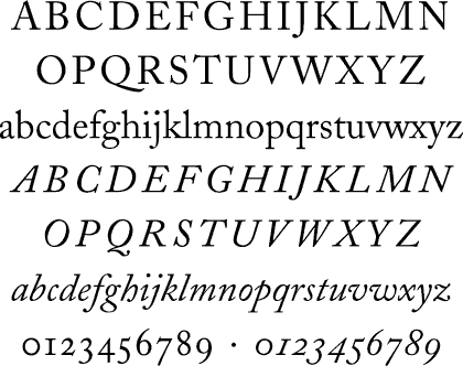
Caecilia is quite nice,

as is archer:

Traditional font like Caslon?
But perhaps just play withe the fonts more. Im kinda in agreement with chossy on this, I think if its just going to be a logotype then you need to do something with it to make in unique to your client.
Have a look here for some inspiration:
http://www.qbn.com/topics/566198…Also look at some other bank logos to see what they're doing, not all use serif:


- Mojo0
Hey Sub, nice to see you around here again.
I really think that Trajan needs good spacing, or can look horrible. I don't think it works too well when the characters are touching, kerning that tight looks a bit odd on Traj.
I think type-only logos are just fine. Not everything needs a glyph. If I were you, I'd have a look around and see what other typefaces would work for Cashboard. Keep at it.
- chossy0
why not introduce some folding money to make the C of cashboard? curl it up a bit, or are you wanting to completely avoid anything other than type?.... curled up money has been done before and it may look a bit cheesey but have a go?.... or not who cares eh? jam tart won't change the old bread knife will it?
thought I'd throw in some cockney ryming slang here to lighten things up a bit... how did it go did it come across ok or should I work on it a bit more?.
- ********0
Says Online Casino to me?
- skii0
I'd want to use a rigid/bold/simple typeface maybe inside a box to give a sense of stability. The current failing financial market will mean customers need to feel safe with who they invest their cash with?
- not an investment app...time tracking, project management, invoicing, estimates. but point taken.sublocked
- poolio0
agreed.. in the last one the C looks like it's eating the other letters.
- ********0
I'm not even sure careful kerning will help these.
- me either, probably gonna scrap em. playing with some sans choices now.sublocked
- jimzyk0
It's just the typeface at the moment, not a logotype.I think you at least need to give this some attention, try to make it unique, try to give it some originality.
go go tiger