Logo Crit
Out of context: Reply #11
- Started
- Last post
- 36 Responses
- ian0
sub, yeah I thought that was what happened. With Small Caps, the Uc's are designed to be visually the same weight as the lc's when you scale it up it looks heavier and out of place.
If you want ot use small caps, try to find a font with nice small caps, if you're making it yourself offsetting the path in illy will help but it'll take a fair bit of tweaking to get it to look right.
Caecilia is quite nice,

as is archer:

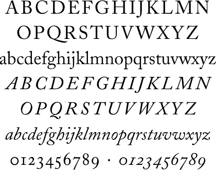
Traditional font like Caslon?
But perhaps just play withe the fonts more. Im kinda in agreement with chossy on this, I think if its just going to be a logotype then you need to do something with it to make in unique to your client.
Have a look here for some inspiration:
http://www.qbn.com/topics/566198…Also look at some other bank logos to see what they're doing, not all use serif:


