Logo Crit
- Started
- Last post
- 50 Responses
- WhiteFace
Hi QBNers, I'm creating a logo for a local choir, i've been looking at this idea for too long, can I get some feedback from you lovely people...


Thanks
- jandiroo0
1 is nice
=)
- menos0
i like your type but i dont understand the mark... but out of all 3 i'm leaning more towards the 1st one.
- WeLoveNoise0
so the yorkshire philharmonic are looking for some design work
.........Mmmmmmmmm jackpot
- tenpointtwo0
What's the mark supposed to represent?
- a Y a P and a C...Concrete
- YES8!!!! I was right! omg! i'm good! :D********
- Concrete0
I like the first one, but with the darker colour of the second.
- ********0
1st will look like 3 when printed very small
- ********0
1st one is the nicest, but what does it have to do with a choir?
- Moo0
i agree with menos dont really understand it but nice use of type and number 1 is my fav so far
- ********0
it represents Y P C
- WhiteFace0
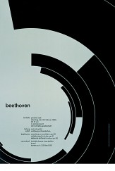
the mark is representing the stands the chior stands in from an areal view:

the curves spell out YPC, also slightly inspired by brockmans beethoven poster :)
- Jnr_Madison0
What does the mark represent?
- WeLoveNoise0
nice 1st one is best
- Alu0
1st one is good, but looks like the white space needs to be increased as it may fill in when printed
- tenpointtwo0
The type is ok, but I don't think the logo works.
- menos0
hmm regarding it representing a YPC... i think it's a bit far fetched. only trying hard to make it seem so can i see a possible y in there... the p also..
- fodcj0
1st
- menos0
and i agree w/ digdre, to avoid this, the white space should be bigger..
- Spanna0
I like the first one. I was trying to see a marque that was someone, open mouthed with hands outstretched, like they were singing in a choir, but it wasn't there...
I think you need to balance the marque and the words better.
- Jnr_Madison0
ya, I think it's a bit of a reach to say it represents YPC.
- I did have small decenders on the Y and P but then it no longer looked like the stands.WhiteFace