Logo Crit
- Started
- Last post
- 50 Responses
- Nairn0
I liked the vagueness of your original #1 & 3. The first thing I thought was "oh, look - it's the choir from above - nice".
I like logos that work as forms in their own right - if I can then realise there's a legitimate hidden meaning after initial exposure, then more's the better.
If you go down the route of making it obvious that it spells out YPC, you may as well just use the bloody letters.
So, for me, #1 or 3 - but work on making them look a little less techie - a little less contrived, a little less like a simply shaded 3d form.
But, wer, good work.
- roundabout0
Do you have any other design idea's for the logo. At the moment you only have one. I'm sure the client would like to see more?
- I have 3 all together, this and two (very different) ones. But this it the first one i've worked up.WhiteFace
- set0
Your direction has gone steadily downhill, number one is the best.
I quite like it, but I think it'd work better if the lines were all the same weight / bars were all the same thickness
- chossy0
The first one was ok, but I didn't like the type, I do also think it is a bit much to ask to read ypc out of it. Great start yo!.
- d_rek0
It's an interesting mark - I think it may be a little too abstract for a broad audience to be able to grasp. For something like this to work you would really have to give the logo some context. Also, the type does not feel terribly integrated with the logo at this point. I'd really be interested to see the other variations too.
- skt0
yeah, getting worse trying to force the ypc. 1 is still the nicest, but needs a bigger gap between segments.
- WhiteFace0
Thanks all for your constructive input. I'm taking it back to the drawing board. I'll re-post once i've made progress.
- vcr0
i hate it
- jandiroo0
1 is nice
=)
- menos0
i like your type but i dont understand the mark... but out of all 3 i'm leaning more towards the 1st one.
- WeLoveNoise0
so the yorkshire philharmonic are looking for some design work
.........Mmmmmmmmm jackpot
- tenpointtwo0
What's the mark supposed to represent?
- moamoa0
#1
I am not a big fan of the type, I think its lost against the strong symbol.
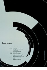
here a logofrom metadesign which I really like... for the berliner philharmonic

- Concrete0
I like the first one, but with the darker colour of the second.
- digdre0
1st will look like 3 when printed very small
- skt0
1st one is the nicest, but what does it have to do with a choir?
- Moo0
i agree with menos dont really understand it but nice use of type and number 1 is my fav so far
- digdre0
it represents Y P C
- WhiteFace0
the mark is representing the stands the chior stands in from an areal view:

the curves spell out YPC, also slightly inspired by brockmans beethoven poster :)