Looking for Nazi WWII Typefaces
- Started
- Last post
- 33 Responses
- 72-dpi
Hello!
I’m designing a book jacket on Nazi WWII propaganda and would like to use type that accurately represents the period. Does anyone have any suggestions?
I’m particularly confused about whether or not to use a blackletter typeface. I’ve found a lot of information explaining that Nazi’s rejected blackletter typefaces in the early 1940’s. However, most propaganda pieces I’ve found online use some variation of blackletter.
My other idea was to use Frutiger because that is the typeface of the current Bundeswehr (http://users.ncrvnet.nl/mstol/b...
Thanks in advance for your help!
- ********0
"My other idea was to use Frutiger because that is the typeface of the current Bundeswehr (users.ncrvne t.nl/mstol/bundesweh r.html).
Thanks in advance for your hel"
----------// yeah. you should really do that. i guess the current army will be glad to be identified with Nazi's again!
- r_mutt0
what crouwel said
- pascii0
whatever you do, don't use stereotype
- ********0
great article about this jazz in Eye magazine
http://www.eyemagazine.com/backi…
issue 62 (with the black monster on it)
- cacoe0
gotta agree there, this font totally doesn't fit
- ********0
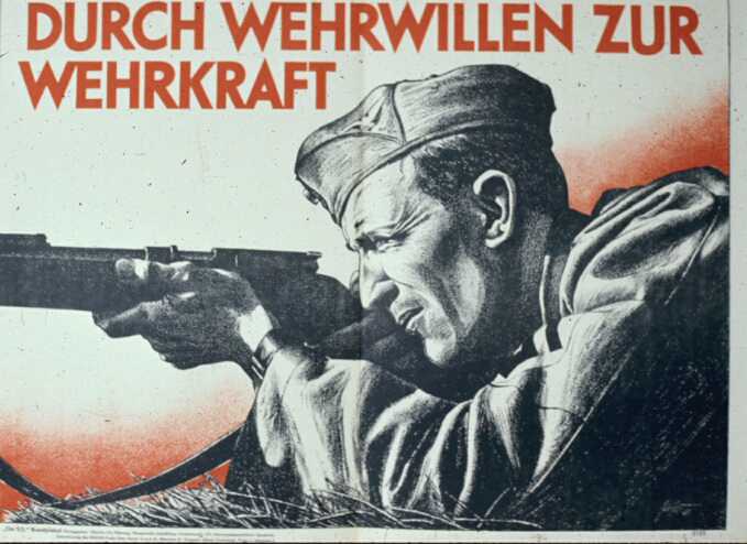
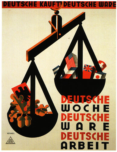
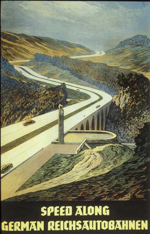
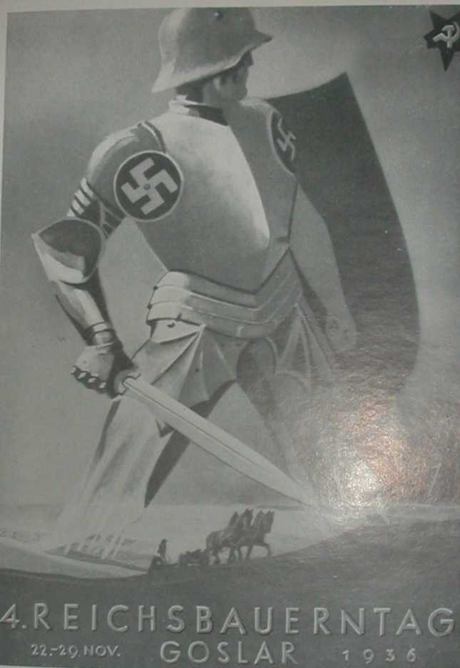
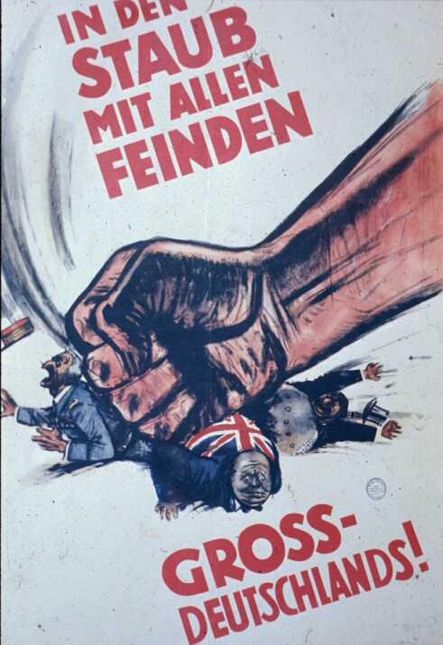
i don't think there's such a thing as a specific Nazi typeface. they used common block fonts of that period and of course blackletter for headings & titles.
- neverblink0
http://typophile.com/node/12177
check the links mentioned in that thread...
Even though 'Fraktur'-fonts give the feeling of Nazi-Germany, they wern't really used as far as I can tell. It was mostly Bauhaus-style letterforms.
Also I vaguely remember there being some review of the typography used for "Der Üntergang", anyone else remember that?
- ********0
proper read
- ********0
It is more likely that Adolf Hitler was the reason for the ban. He appeared to have a dislike for the Fraktur typeface, as demonstrated by a declaration made in the Reichstag in 1934:
“Your alleged gothic internalisation does not fit well in this age of steel and iron, glass and concrete, of womanly beauty and manly strength, of head raised high and intention defiant... In a hundred years, our language will be the European language. The nations of the east, the north and the west will, to communicate with us, learn our language. The prerequisite for this: The script called Gothic is replaced by the script we have called Latin so far...”
- ********0
from same article:
From the academic year 1941/42 onwards only the so-called Normalschrift (“normal script”) was allowed to be used and taught, which up to that point had been taught alongside the Sütterlin script under the name of “Latin script”.
- drgs0
Gotenburg, Ratdolt-Rotunda, Sütterlin, Berthold Lo-Type
- ********0
- ********0
bit futura like
- ********0
more examples
and (lol) a dutch pro-SS poster (basterds):

- ********0
- 72-dpi0
Thanks for all the help everyone! Crouwel, I wasn't able to access your last set of links. They were restricted.
- ********0
when you research enough in gestaltung you realise that, apart from rainbows and the possibility of having no content at all, nothing has changed.
- ********0
oh they were just samples from those lists, so use those links instead.
- ********0
haha witt. so it seems.
crests were all the shit back then as well..
;)
- neverblink0
Thanks for all the help everyone! Crouwel, I wasn't able to access your last set of links. They were restricted.
72-dpi
(Mar 31 07, 11:46)
---------------------
copy-paste the url's into the adress-bar of your browser (hotlinking is prohibited on that site).great examples crouwel!
