New UPS logo
- Started
- Last post
- 35 Responses
- DutchBoy
i actually like it. and i am not being sarcastic.
now flame me to death.
- lifeinsodium0
actually i liked it too. i think.
- clerk0
i actually like the new unilever logo.
- DutchBoy0
people only hate it because they stopped using Rand's design.
People need to realize Rand was a graphic designer, not an artist like Rembrandt or anything.
Graphic design is applied art, and inherent to contemporary influence.
it needs to be evolve with time, not being conserved.
simple as that.
logo's die and at least they end up in nice books like Logo RIP.
- lifeinsodium0
the new unilever logo leaves me quite speechless - everytime. i am trying to decide if that's a good thing or bad.
- DutchBoy0
it's a step in a different direction.
Unilever sells so many things you can't possibly list them here..
their motivation is quite logical..
- jox0
New logo? Surely you must mean the shield, released a little over a year ago?
Yea, 'snoyce.
- DutchBoy0
yes. ofcourse i mean that jox and i know it's there for at least a year now.. wisecrack! ;)
it's still quite new and fresh.
- clerk0
the unilevers logo is even better in a perspective of a competition like this:
- dave_bxcr0
i like the unilever logo
mad as a nail?!there are a lot of BIG companies restyling their logos. watch out for the new GE one.
- monkeyshine0
I don't like it. I can't help it. Don't know if it's Rand nostalgia or not but it seems like a step backward to me.
What about this logo...I'm still amazed. What were they thinking?!
- DutchBoy0
corporations are into 'humanizing' their logo's, either by adding a human shape/silhouette, organic shapes or a bevel..
there are so many recent examples i am not going to list them..
but this one failed (imho):
http://users.ncrvnet.nl/hstol/ra…
- spongebob0
the unilever logo is mofo ugly!!!
- dave_bxcr0
humanizing their logos...
probably.its also a bit of a chainreaction.
if one rebrands the other one follows.by the way the new UPS logo...
shite! ; )
its an ok logo but it doesnt grasp the simplicity and the bold power as the old one.
Lack of vision, hmn. A pity.
- elms0
its logo sunday
- monkeyshine0
exactly, Dave. Lack of vision. I can't think of any other major brand logo update that has been so lacking.
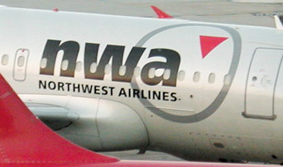
the "nwa" logo kills me. the circle with a triangle...looks like the arrow is pointing down. That's nice subliminal language for an airline. :)
- lifeinsodium0
whatever goes up, has to come down. they are merely emphasizing their love for the laws of physics ;)
- dave_bxcr0
: D
- lifeinsodium0
nah man, thats too christmasy, ribbony looking. i prefer the new shieldy-mililary-i-will-kick-you... look.
- DutchBoy0
nwa: to me the triangle points up right..
matter of psychology.. :)
- DutchBoy0
haha, word saf.