Logo of the Day
Logo of the Day
Out of context: Reply #543
- Started
- Last post
- 934 Responses
- ********0
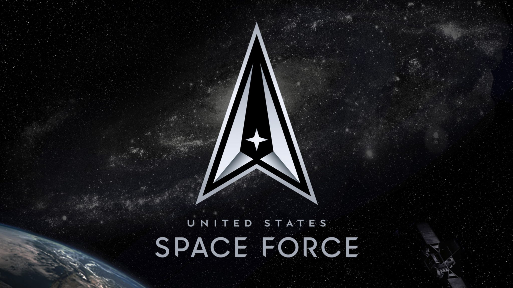
The United States Space Force has unveiled a black and silver logo, following an earlier design released by president Donald Trump that proved controversial.
Revealed 22 July, the logo comprises a delta symbol with a silver border intended to represent defence against "adversaries and threats emanating from the space domain". It encloses a black centre indicative of deep space.
- https://www.dezeen.c…********
- lol black centreMrT
- Space hoodsMelanie
- The explanation is quite over the top, but the logo is not bad I guess********
- It's days ahead of their previous logo.utopian
- I still see the Federation logo in there, but that's just me, designer with trained eye...********
- So they went from ripping off the NASA logo to ripping off the Star Trek logo...Live Long and Prosper !fooler
- I hope this was written by you and not the official statementdbloc
- actually it is the official..Centre is very unamerican of a spelling.dbloc
- unbalanced. black centre void of space is too big, imo.imbecile
- All I can see is the ship from Asteroidspolybius
- it's a cursor. coolDRIFTMONKEY
- pretty sure Jivanka made this happendasohr
- Black logo centers matter!evilpeacock
- fuck these hard corners...neverscared
- the two silvers arrows with the black middle make it appear the logo is pointing down. you don't see the top because it is too stretched.face_melter
- Pontiac derivative https://www.carlogos…********
- I mean it’s more modern, but still just as derivative as the first onescarabin
- Do other countries have a Space Force? And if not, who are we fighting exactly?yuekit
- ^ Aliens!Ianbolton
- Am I still one of the few people left in this star system that still sees this similarity? https://www.telegrap…CyBrainX
- Let's try that again.
https://www.telegrap…CyBrainX - Damn, you Qubes. Star Trek! I looks like the Federation.CyBrainX
- https://www.dezeen.c…