I'm not a designer, but ...
- Started
- Last post
- 77 Responses
- fresnobob0
Some of those made me think of this sort of thing...
- hans_glib0
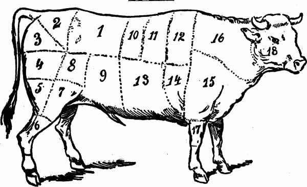
this is a visual of the concept i was trying to describe, not an attempt at a finished item.
The idea being that the peas have made the cut and the pods haven't. A variety of images could be a range of fruit, some ropey, some pristine, or prepared veg with the peelings. but always with a defined line - it'd be interesting to do to with the objects themselves rather than cropping as my visual here.

- I getcha, and thank you so much for putting in the effort, it's much appreciated.********
- I getcha, and thank you so much for putting in the effort, it's much appreciated.
- ********0

- MrNibs0

- what about full circle back to the knife thing?
MrNibs - apologies for assy executionMrNibs
- << yup.mikotondria3
- Nice, Let me have a go at developing this. A huge thank you to everyone who has helped me on this.********
- this is really radsublocked
- what about full circle back to the knife thing?
- ********0

- I think there has been progress.
Still some tweaking to do. But you might want to try a totally different concept.hektor911 - Something less literal. Maybe.hektor911
- Thanks dude, but I don't know if I have any more time to devote to it, tweaks for sure but a complete re-imagining, not so much. It's holding up everything else! maybe I can revisit it when I have more time.********
- ... holding up everything else! maybe I can revisit it when I have more time.********
- I think there has been progress.
- i_monk0
"it's holding up everything else"
That's ok, it's only the logo that will appear on everything ever associated with the thing, not important. Just type it out in Times New Roman, it'll be fine.
- I completely get what you are saying, but seriously, I'm not a designer and there is only so far I can take this. Sad but true : (********
- It sounds like you are the one losing out from this ... I'm the one losing here!********
- I completely get what you are saying, but seriously, I'm not a designer and there is only so far I can take this. Sad but true : (
- ********0

- If I had the dollar to hire a designer I would, but I don't. I can give it one more day of tweaking/re-imaginin... and then I have to move on.********
- have to move on.********
- You get what you pay for. A cheap poorly executed design.qTime
- You think I don't know that ... you roboplegic wrongcock?********
- @qTime jokes********
- If I had the dollar to hire a designer I would, but I don't. I can give it one more day of tweaking/re-imaginin... and then I have to move on.
- BaskerviIle0
Something typographic?
Simplify. Stop chopping up type and maybe try something angular and sharp with the type itself.
Some thing bold and pointy:
- You've kinda got a butcher's knife shape in the negative space there. Not sure that was intentional but could work with a little tweaking!yerolda
- You forgot the 'n' before the 't'qTime
- @qTime are you having a bad day!?********
- @Baskerville, that's very nice, what's the typeface if you don't mind me asking?********
- shapeaspect0
I thought this was quite a nice solution to a similar concept.
- ********0

- cannonball19780
These logos where the "cut off part" is removed just makes the logo look like it is folded over or obscured. To tell the story about the cut, you need the parts on both sides of the cut.
- monospaced0
The neverending critique
- SteveJobs0
My personal feelings are that a knife, particularly the one you're using, and treatment would be better suited for a butcher shop/meat market than a restaraunt
and ps. i don't think your color choice of red on the blade with a black or white handle would sit to well with potential customers either.
- Well it's just as well it's not for a restaurant then isn't it?********
- Go home Jobs, you're dead.********
- burn!monospaced
- Well it's just as well it's not for a restaurant then isn't it?
- ********0
Right, you can all tell me to take a run and jump at this stage, and that's fine. Either way, here's the latest round of rubbish. Think guillotines.

- zaq0
- detritus0
have you had a ‘sit down and sketch concepts on paper stage with these, eion?
Strikes me that these feel like they've been entirely thought about in-computer, which I've always found limits scope and makes one revolve around peripheral concepts without much thought to 'why'.
Regardless - you need to consider display sizes when rendering words like'the' so small - also, I'm not sure why you've gone the guillotine route. Seems a little macabre for a fooderie.
- restaurant reviews can destroy restaurantsmonospaced
- No, I haven't. Yes, they have. The reason it's a guillotine is it's about making the cut, if you don't make the cut your head gets chopped off ...********
- chopped off ... But really, I suppose it allows the site to eventually be opened up to other things. Not just restaurants.********
- Thanks for the pointers, much appreciated.********
- @mono that's true, it can also get people fired etc. With great power comes great responsibility ...********
- albums0
The type you're choosing lacks personality.
The name is too open to interpretation.
Not one of these logo concepts seems timeless.
Concentrate on a type only treatment in B&W.- I'm ugly.
My mother dresses me funny ... No really, I appreciate your comments. My issue with type-only treatments is where do I get nice typefaces that I can try out?******** - doing type-only treatments is where do I get nice typefaces that I can try out?********
- And thanks for your input, much appreciated.********
- Take screen caps from font retailers for mock upsalbums
- Okay, thanks.********
- I'm ugly.
- monospaced0
For not being a designer, you have put more thought effort and time into your task and revisions than most of the clowns out there. Good show, keep it up.
- Ever read the definition of insanity?albums
- yes... I'm just impressed with the willingness to keep tryingmonospaced
- Thanks mono, that's very kind of you. And encouraging.********
