I'm not a designer, but ...
- Started
- Last post
- 77 Responses
- ********
I'm trying to come up with a logo for a website and restaurant guide I'm developing. It will be called "the cut", do any of these work, in terms of concept ... ?

- ********0
And yes, I know my illustrations are shite.
- robthelad0
3rd one along is a good start. Go from there. Remove the, napkin? leaving the knives. Maybe just use one knife and make the other a fork.
- Yeah, I don't know about knife and fork though, seems a bit cliched? Was hoping to avoid using a fork.********
- But thanks!********
- Delighted you recognised it as a napkin!********
- I didn't recognise it as a napkin - how about, instead of a fork, a knife sharpener/ steel?detritus
- Excellent point, had thought about using a steel, might work well. Thanks.********
- Yeah, I don't know about knife and fork though, seems a bit cliched? Was hoping to avoid using a fork.
- mattwrightgd0
Defiantly a start lose the Clip art style knive make it a more simple style. And like robthelad said Remove the napkin and add a fork?
Just my opinion. There are some great examples online of restaurant/food branding jobs out there worth looking at for reference.- Yup, don't like the 1st year Illustrator style either, would love to have a nice crosshatch styled illustration ... don't have the skills though so I may commission someone, essentially I'm just looking at concept at the moment.********
- ... though so I may commission someone, essentially I'm just looking at concept at the moment.********
- Yup, don't like the 1st year Illustrator style either, would love to have a nice crosshatch styled illustration ... don't have the skills though so I may commission someone, essentially I'm just looking at concept at the moment.
- MrAbominable0
no napkin. i'd like the first one if the knife were intersecting, cutting the banner in a minor way. would probably require changing perspective on it but same orientation. kerning on 2013 is screaming at me.
- Like the minor cut in the banner idea, had thought about this too. Thanks.********
- Like the minor cut in the banner idea, had thought about this too. Thanks.
- monospaced0
Where's your other idea? Hard to critique just seeing one concept.
- The rest, if you can believe it, are way worse than these. I haven't done anything like this for a bout ten years ...********
- I doubt they're as bad as you think.monospaced
- The rest, if you can believe it, are way worse than these. I haven't done anything like this for a bout ten years ...
- 23kon0
no napkin, it looks like someone concealing a knife.
- As a restaurant critic I kind of like that idea ...********
- Maybe that would work better as an ad, with a real knife and napkin, photographed.********
- As a restaurant critic I kind of like that idea ...
- monospaced0
Overall, conceptually, I don't think it works. Sorry. A knife is obvious both for 'cut' and restaurant, and the rest just seems thrown in. A star for no reason, a red ribbon, for no reason. Conceptually, you could really have fun. Cut the type, relate it to a restaurant guide, etc. What you're showing is really one concept with things pushed around. Try to come up with at least 20 completely separate concepts, some with illustration, some type only, some really out there, and then come back, perhaps. That's my advice.
- Ok, thanks, solid advice. The star and ribbon could be related to the grading system in the book, but you're right it's a bit too irrelevant at the moment.********
- irrelevant at the moment.********
- ...good adviceMiesfan
- Ok, thanks, solid advice. The star and ribbon could be related to the grading system in the book, but you're right it's a bit too irrelevant at the moment.
- detritus0
Needs to be rawer and more contemporary.
May i suggest soemthing along the lines of..

- conceptually you might be on to something actuallymonospaced
- Completely agree, would love it black and white, crosshatched illustration ... or some arm gouging.********
- John Barrowman???MrMackem
- feel0
can't recognize it as a napkin, i guess most people wont
try something different from a knife, that is a cliche for the cutdo a little research on what your client's competitors are doing, it gives you a good idea on what not to do or what you're competing with
- I am the client! Thanks for your input, all noted.********
- I am the client! Thanks for your input, all noted.
- i_monk0
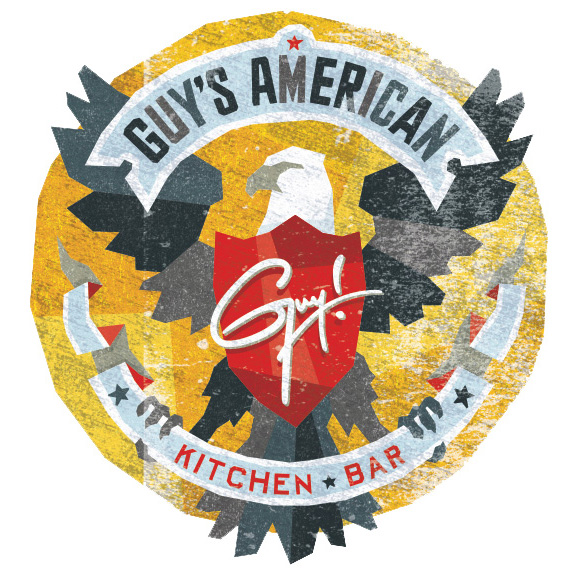
No no no, *this* is how to make a quality food industry logo:
- ughfadein11
- Did you read the New York Times review of this restaurant abomination? It's great.********
- Yep. Check the Guy Fieri thread - http://www.qbn.com/t…i_monk
- Just checked it, the dude is a walking brisket.********
- Walking brisket? That's a real offense to brisket.mg33
- True enough, bad analogy.********
- ********0
"The Cut" refers to making the cut, as well as tying into a chef's cut, or a cut of meat. It also corresponds to a critic's cutting remarks ... perhaps. The book will be the top 100 restaurants in the city, i.e. The Cut presents Dublin's 100 Best Restaurants. Half will be voted on by diners, the rest by me and a panel of judges. One voting diner will win dinner for two in the Top 100 restaurants, to be used over a year.
The website will be daily food/restaurant reviews, news, events that I'm hosting, and so on, with room for commenting etc. I'm doing everything myself so it's a hard slog! But hopefully I can get a sponsor onboard and get the book moving at least.
- bumdrizzle0
i would keep the mark really simple. maybe just 'the cut' in a nice face with a dotted underline (it made the cut, below the line didn't). you could then take that dotted line device and use it on collateral in other ways. this being the obvious choice: http://www.list.co.uk/article/17… although personally I would keep it more abstract.
- < cool conceptsmonospaced
- Fantastic, intelligent advice, thank you ... er ... bumdrizzle ...********
- good advice!utopian
- qTime0
I would start by designing the logo in black and white, then when you have nailed the composition then think about rendering it in a particular style.
- i_monk0
I was about to say pretty much what bumdrizzle did – use the "cuts of meat" diagram as a starting point, setting the word mark in a shape suggestive of one of those cuts.
- I agree, it's a great idea. Not sure what you mean by "setting the word mark in a shape suggestive of one of those cuts", can you explain?********
- explain?********
- I agree, it's a great idea. Not sure what you mean by "setting the word mark in a shape suggestive of one of those cuts", can you explain?
- Kiko0
how about an Xbox type cut in the paper?
- I hear what you are saying bit I think it moves away from the types of cut I'm referencing. Thanks though, appreciate the input.********
- input.********
- I hear what you are saying bit I think it moves away from the types of cut I'm referencing. Thanks though, appreciate the input.
- CALLES0
good name for a circumcision clinic
just saying
- doesnotexist0
just use the ribbon
kill the knives
done
- maybe the star too, that's neat.doesnotexist
- Cheers.********

