Crit My Lunch
- Started
- Last post
- 28 Responses
- Fax_Benson0
You're the client and the designer, and it's STILL gone wrong. Take another look at the brief.
- see_thru0
Will be taking my daily walk to see the sandwich store hotty in t-minus 55 minutes...
- Fax_Benson0
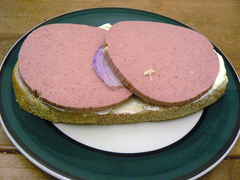
I'd say 1950s - cartoon lunch.
That meat looks grim.
- qoob0
It is very 90's.
- moniker0
You must smell like heaven.
- dbloc0
There's something odd and fishy about all of this. The outdated sandwich design, the lack of garnish sense (regarding the separation of work between the two pieces of meat), coupled with the big-name chip brand... and the really out-out-place onion section.
Are you really eating this?? Is this all self-initiated work? Everything seems inconsistent, even the quality of work from one sandwich to the next (the sandwich I'm mainly looking at).
How are you so out of touch that you don't know what a top piece of bread is, yet you are eating a sandwich and chips. If you're sandwiches like this, you should be on top of what is going on culture-wise. You don't have to make sandwiches all the time, or even like it. But to not even KNOW how to do it is just odd.
I just can't imagine these big clients asking you to design for them based on what I'm seeing from how you present yourself, your company, and your work.
Something just isn't connecting here.
- d_rek0
Living the high life, I see.
- stoplying
Liverwurst with Muenster, mayo and red onions.
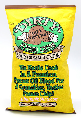
DIRTY Sour Cream and Onion Chips
and Water.
