The new Aol logo
- Started
- Last post
- 54 Responses
- Projectile0
well at least it's better than the 2012 olympics logo. And these bit ^^ aren't all that bad I reckon. But yeah.. all in all, a bit too try-hard and, as often seems the case with WO, aiming for award-winning design as opposed to effective design.
- ukit0
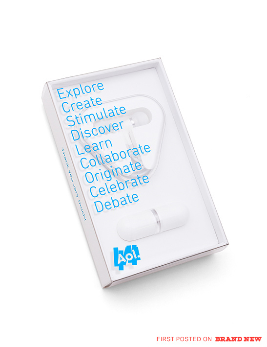
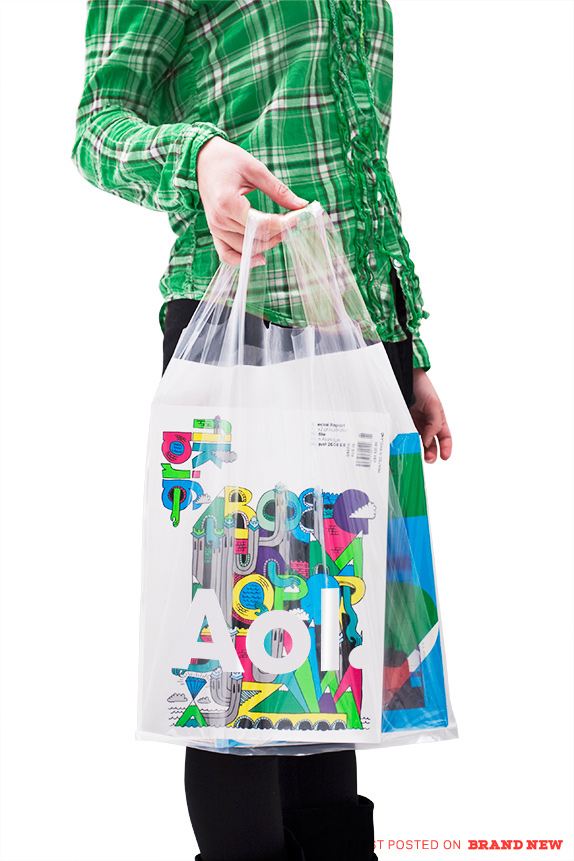
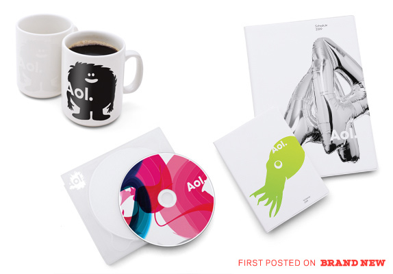
A few more pics from Brand New
I kind of wonder what the site will look like though. Bing is already doing the image under the logo approach. Get a couple more brands to adopt this and it's going to lose its novelty pretty fast.
- utopian0
Same designer as the "ADC" logo?
- FredMcWoozy0
whats with the satan sign?
- eieio0
el Diablo Aol
- scarabin0
it just looks like boring shit stock images to me, not edgy
- dbloc0
I considered taking those first images and making them all say Lol. instead of Aol. But didn't feel like wasting my time.
- jteore0
Bye Bye AOL. Less than 3 years before someone buys them out. This is NOT an identity. Seems as if someone just said "Everyone is doing lowercase letters with periods now. Let's go with that look."
- eating_tv0
Azerbaidjan On Line
- dbloc0
Afghanistan On Line?
- fooler20
Lol.
- _salisae_0
anyone read their book? it's rather ironic that the cover is so nicely designed. why didn't they apply the ugly branding style to their product? didn't want to take the risk? i suppose, in this case, they're speaking to the designer audience and know what language they hear best–while anyone who is an AOL customer could only hear the language of pure repugnance.
- _salisae_0
as much as this makes me quiver – when i look across design fields (fashion, product design, architecture, interior design) i'd say that architecture and branding are two fields that can expand in ways that are outside of a socially unacceptable realm and still survive quite healthfully. for that I am happy to see something like this occur.
i guess someone has to push the old 'envelope'. i just wish they didn't get paid so much to do it – the underdog is supposed to struggle!
- jfletcher0
I'm with _salisae_ on this... interesting/cool concept, but the execution looks like a joke... I'm still not sure it isn't. Although so did the "bing" logo...so...
- _salisae_0
the concept is great. the execution is infantile. is wolff olins' studio outfitted with corel draw?
- comicsans0
@visual_infection Sensible viewpoint, trouble is that anyone can do this, and many people will. Just stick your logo or name in front of an arbitrary graphic and away you go. Google's 'special' logos are recognised as variants on a well known identity. This is quite different, an absence of identity which merely consists of a text logo with a random background. Or maybe I'm just a boring old fart.
- doesnotexist0
g'dm you wolff olins
- visual_infection0
I think at first reaction, I wasn't too big of a fan, but it made me think of something. We are all ok, with Google changing their logo to celebrate diffrent events and holidays throughout the year.
Doesn't it feel like this ID system is setting itself up for something like that? Election day, columbus day, a celebrity dies, just slap the new AOL logo typeface on an image representing that and now your brand is associated with it forever or associated with celebrating it. If they would have done this one year ago, AOL would have been there when MJ died, when the nation elected it's first black President.. etc.
Would that not lead to us seeing AOL as being more cultured, more up to date and with it versus the perception we have of it now?
Of course.. the above could just be the ramblings of an insane man.
- pillhead0
In video format the idea work quit well, and I can see the think behind the idea. I am amazed there are no fucking wank CD in the video .
