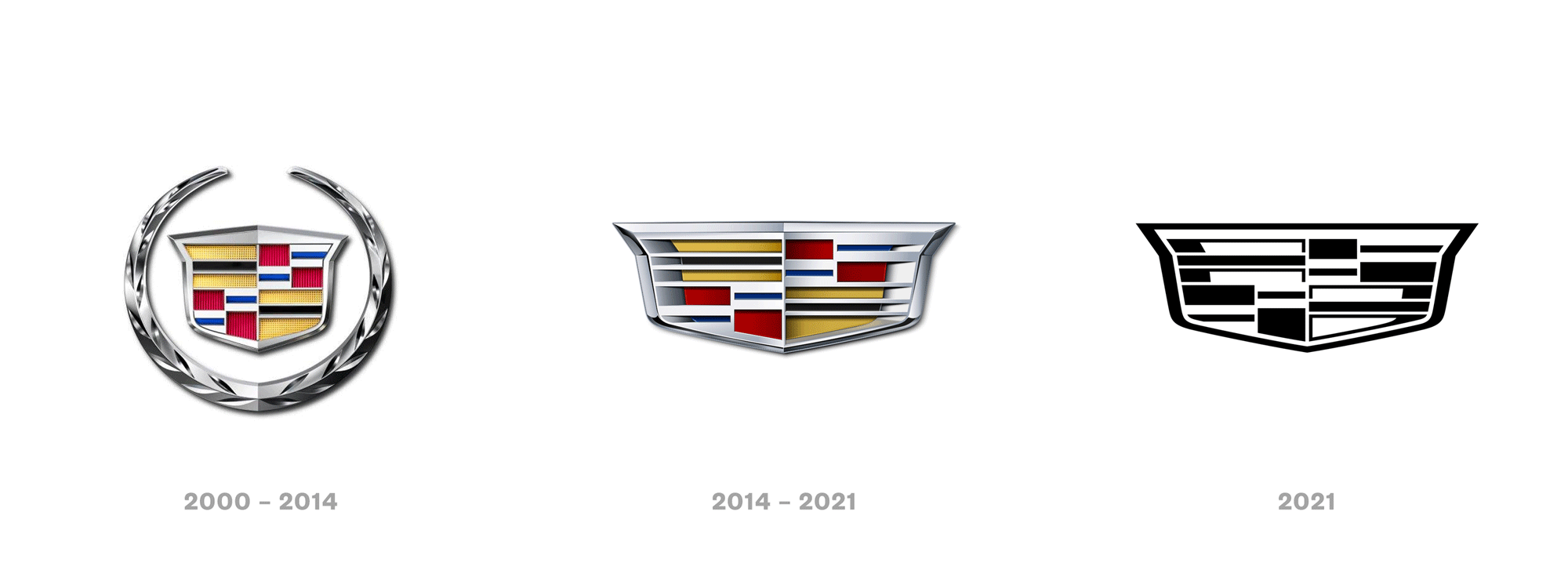
Logo of the Day
- Started
- Last post
- 820 Responses
- utopian-2

- I like the new oneMondoMorphic
- reminds me of couche-tard
https://c8.alamy.com…_niko - very angrybirds thosarahfailin
- obeseKrassy
- so it went from normal, to burnt, to high?shapesalad
- utopian-3

- grafician-3
- Yeah, that's pretty boring. Guessing they all fell for the "well, it has to be legible on a small cell phone" and just followed the herd.formed
- The "architecture" is far worse, tho.formed
- The sans logo actually needed to be used on jewelry, so think extra smallgrafician
- whats the font tho?sarahfailin
- Probably custom ofc
But could be dafont.com too
You never know with Demna...grafician - beautifulHayoth
- grafician-3
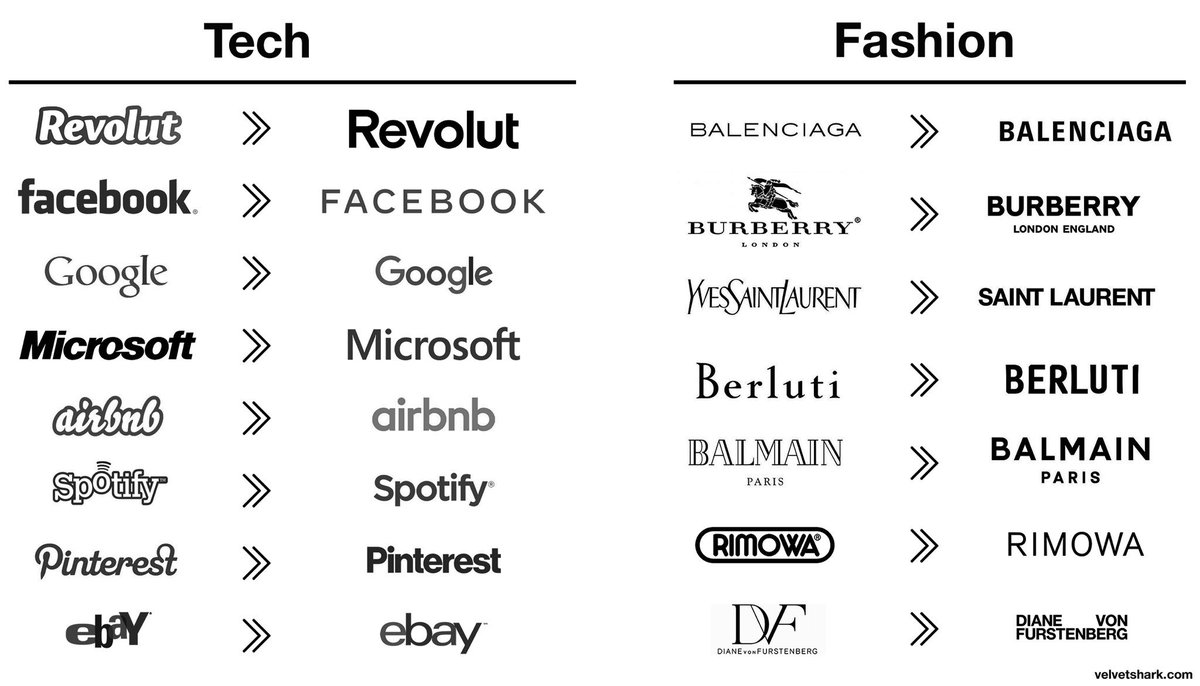
This ridiculous discussions about these fucking logos...a meme really
but...reasons:
- Revolut going from a startup to a EU wide bank
- Facebook going from Zuck to Zuck under Sandberg
- Google going under Alphabet (and material fucking design)
- Microsoft going under Satya
- airbnb going worldwide
- spotify going global adding podcasts and shit
- pinterest rulling google images
- ebay dropping paypal and trying to still be relevantsame with all the fashion logos, almost all changes driven by changes of the owners, CDs, etc.
I might be mistaken, but all these were strategic, business decisions, then design decisions followed...
But then some idiots copy pasted these logos all together and called it a "trend" or something.
Oh well...
- Graphic design is nothing new for almost a decade and we still discussing this shit...grafician
- But yes...discuss™grafician
- The "Diane Von Furstenberg" logo is not bad at all.utopian
- You cannot scale without a sans serif logo
Discuss™grafician - https://cdn.neow.in/…Salarrue
- cleansing your logo of any character is the best illustration of how devoid of inspiration corporate life ishans_glib
- Legibility would be the trend, no? Some of these were just atrocious logos before (ebay??) Some did lose character, though, like Burberry.formed
- @formed yes, scale to other markets and the logo needs to adapt easily
And in the case of Burberry, the branding switched to their famous patterngrafician - When adobe makes font management so shitty in Illy, you just go with the same font for every client request...shapesalad
- "Yeah you need your logo updated? Remove anything that might trigger, sure, let me type that one out for you..., and ok, we're done, so that'll be $100k..."shapesalad
- wordmark ≠ logo
Most/all of the techs have an actual non-generic logo.i_monk - People like boring stuff. The cleaner the betterPhanLo
- The fact that so many companies made this move over the given time period is the definition of a trend.monospaced
- @shape, lol wut!? no.monospaced
- _niko-5
new Logo for burger chain replacing McDonalds in Russia
as depressing as the country
- If Marriott hotels bought out McDonald's.i_monk
- If Adidas Footwear bought out McDonald's.utopian
- "is this what food looks like?" - hungry russians, prollysarahfailin
- a burger and two large fries, pleasescarabin
- a mini burger and two large fries, no coke thanks!oey_oey
- Do they even play cricket in Russia?Nairn
- d'oh at me, cricket has three stumps.Nairn
- two buns and one meatball pleasesandpipe
- Former McDonalds in Russia renamed "Vkusno i tochka" (Delicious Full Stop): AFPgrafician
- Delicious. Period.jagara
- Or Tasty, Period.jagara
- lnu1


- Looks like toothpasteHench
- https://www.thedrive…wckd
- For a second I thought it was a Pentagram rebrandNBQ00
- I imagine they would have lost a lot of brand equity if they went for this. And started a cycle of updating the logo every few years.Chimp
- This is just about the only time for me that he misfired, but it's still pretty cool.MrT
- There's a weird human centipede/Mr Garrison's invention going on in the middle of that logo. Kinky.Wolfboy
- Foidsrhadden
- Durexmilfhunter
- Why the ball? Chip that off and squeeze it together.garbage
- Honestly he came to a one-line link collision from R to D, but he was committed and said "fuck it, I'll put a bump".garbage
- Wheelchair dude sucking the dbabydick_
- Please tell me this is a jokesection_014
- grafician-5
New Logo and Identity for
@Minecraft
by
@boldscandinavia
- You’ve done something with your hair, haven’t you? No? New shoes? Come on, what’s changed?mort_
- ^^^^^^^^grafician
- I just vomitted on my screen.utopian
- Thouoght the same at first, but dug into the case study, and actually they've tiightened up a HUGE design system - which is quite impressive.bulletfactory
- whole brand identity based on the grid/block mechanics of the game itself... actually quite humbling in it's elegance... fuck the naysayers.jonny_quest_lives
- grafician-5

- https://about.instag… - "squircle" to land this in the "Punches For:" thread.bulletfactory
- Squirrellyutopian
- mort_5
Andertons UK music instrument shop. Not a new identity (2017) but I love the variants of the A for the different departments.
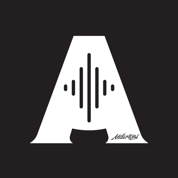
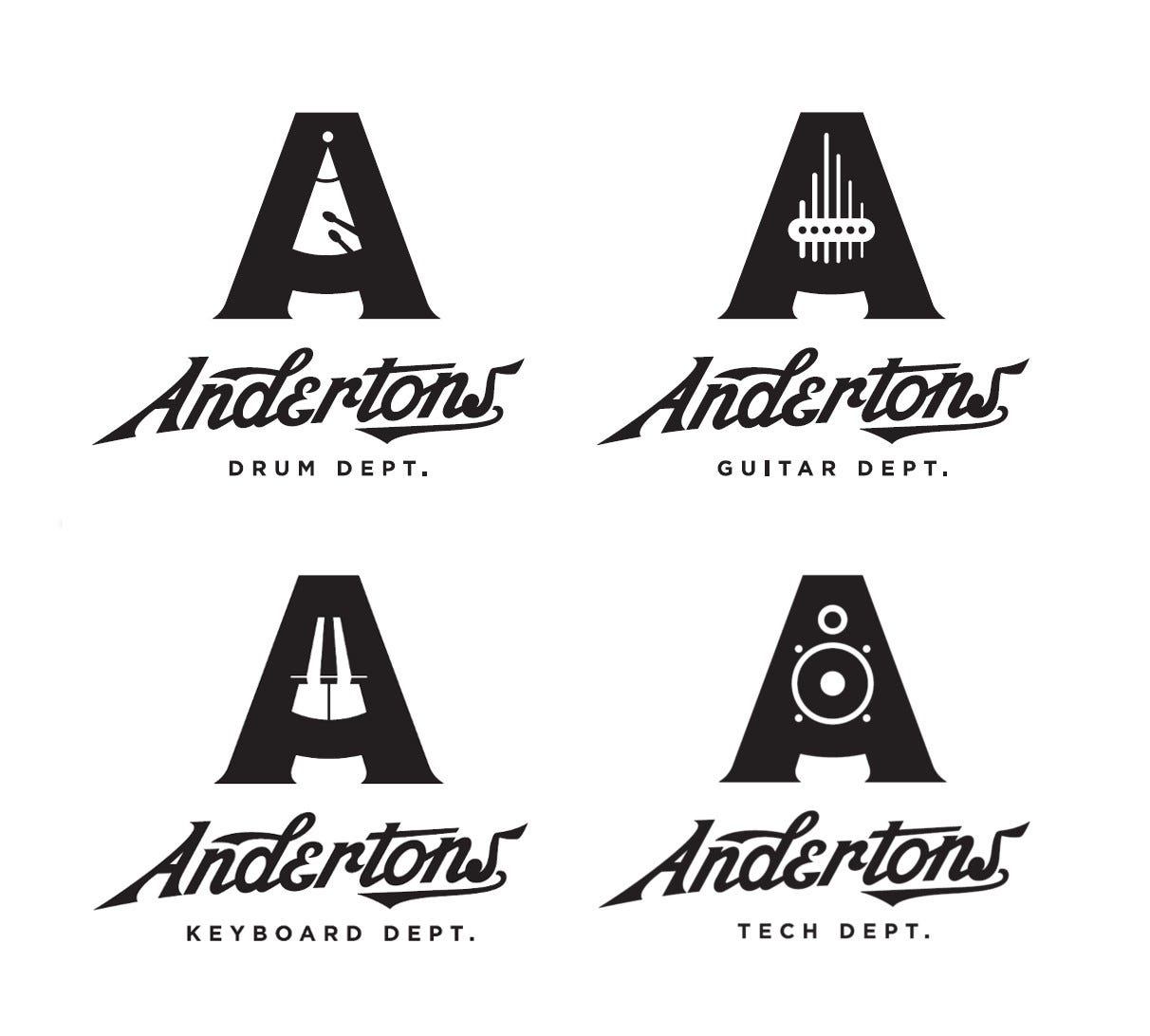
- by The Pull Agency
https://www.thepulla…mort_ - Love this, although it feel slightly stiff in some way. Like it's trying hard to be retro. Maybe it's that E. Still, loving the brand.Ianbolton
- Is it better than this though? https://pullwebsitep…Ianbolton
- The type has always felt a bit dated for me, but the A work is real nice.robthelad
- It’s visually complicated but I like the concept!Chimp
- i like the concept, i don't like the executionmilfhunter
- I love the A marks but don't love the Andertons type.CyBrainX
- What Milfhunter said!utopian
- logotype screams BaseballKrassy
- That icon is great, I feel like the wordmark needs a little tightening up.dbloc
- The A could have been a metronomeYakuZoku
- Still niceYakuZoku
- Goodshapesalad
- @yaku, Nothing worse than replacing a letter with a small logo or item. Amateur AF.monospaced
- I like their youtube content...that type is atrocious thoughBaskerviIle
- by The Pull Agency
- sarahfailin-1

- Do you really need the uitarnb
- Oh I think I got old and new wrong. Guitar shape is a big improvement if a bit boring. This could literally be 90s clip art and done in MS Office 98nb
- A lower case "c" for "center" would've looked so much more sophisticated.utopian
- the old e's look like bleating sheep- the Ce together look like another body of a guitar in the old logo, which is just not adding anything.sarahfailin
- drgs2
Microsoft's 1980 Metal logo


- 1987 is my fav. A few tweaks but have stuck with it.Hayzilla
- 1980 is a straight up heavy metal band \m/Krassy
- 87 was the best.utopian
- '82 version had the fucking Death Star in it!grafician
- 1980 should be Microsofticadbloc
- That's not a Death Star....that a TIE fighter!utopian
- It's funny that they only went 2 years with the "metal" 1980 logo.NBQ00
- 2012 is fucking awfulinteliboy
- so they've never had a good logomonospaced
- 1987. Serviceable but with something missing. Perfect.MrT
- '87 FTWrobthelad
- when you have no vision or values, but still succeedaliastime
- fisheye0
Pentagram’s new identity for the Mellon Foundation
- _niko-3
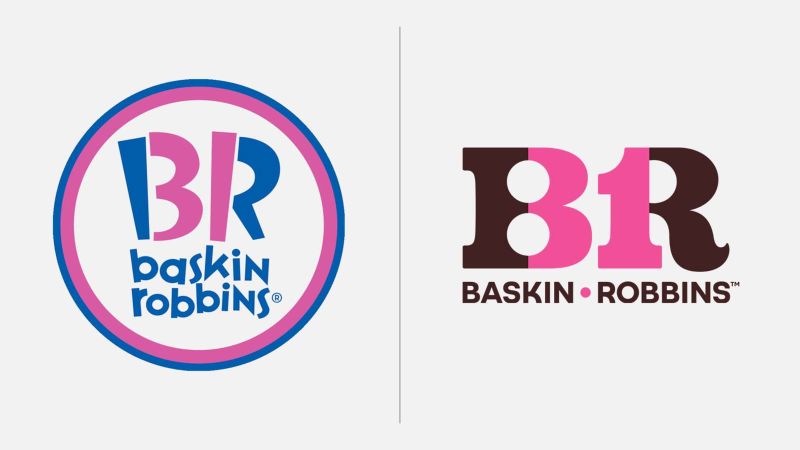
- Funny, I remember posting the new one on the left a few years agofooler
- new one's not an improvement but I do prefer the chocolate to the blue_niko
- Not a fan. It's lost personality and isn't very well resolved. Always wished it was Robbin Baskins.MrT
- The old one did a better job of disguising the 31 also felt more appropriate. New one feels 70s and the 3 & 1 are too conspicuous and also nasty letter formsBaskerviIle
- Looks too forced and not as fun as the old one.dbloc
- The 3 bugs me but i like the color schemescarabin
- 8RKrassy
- 8KKrassy
- I don't like the circle but the type is fun. New one is too corporate.doggydoggdog
- old one was OK and appealed to the right (kids) demographic just fineKrassy
- the old one was all right! Why does company changes their logo all the timeBennn
- I like the new one over the old one.MondoMorphic
- The new one feels more like their old brand and less like shit which is what the last logo embodied.monospaced
- I feel late to the game here, but I only just now noticed the 31 in the first logo..autoflavour
- utopian0
- On a budgetnb
- C&D from Togethxr: https://www.undercon…i_monk
- milfhunter-4
flat