Logo of the Day
- Started
- Last post
- 820 Responses
- Gnash-2
- grafician1

Great British Chefs by Hat-trick
- grafician1
- Gen Z unreadable garbage.utopian
- chobani inspiredgrafician
- a logo's design should give you a hint at what the company does. none of these communicate tech companies. They all say spaghetti western or 70's softcore xxx_niko
- like mode: https://www.undercon…_niko
- the design doesn't fit the company. based on the overall look and feel I don't know what they do or what they're trying to be._niko
- Under Consideration loves anything in this style.Chimp
- I don’t think a logo has to be anything like that a company does. It just has to be recognizable and aesthetic.doublespaced
- Generally yes. Logos are not brands.grafician
- "Logos should identify, not to inform" Chris Do. (the quote is something like that anyway)Frosty_spl
- It doesn't have to mimic what a company does, but it should at least be relevant. All this retro-futurism crap is just horrible and already looks so dated.formed
- grafician8

Logo: D’Angelo Coffee by Studio Band
BP&O Gallery → http://bpando.org/logos- spells "יס" in Hebrew wich is a transliteration of "yes" in Englishsofas
- and is used in the same way...sofas
- I don't hate this at all.Continuity
- SlashPeckham0
- https://64.media.tum…Nairn
- like shitutopian
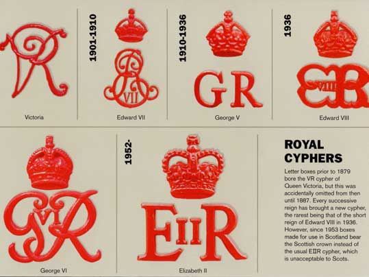
- Liz was never II in Scotlandzardoz
- (Liz I of England predates the Union of the Crowns)zardoz
- https://www.logolynx…Palindrome
- i_monk2

- Did you post this same thing like 10 years ago? I feel like I’ve seen it on here before_niko
- hahaha I was right, got the year right too lol
https://www.qbn.com/…_niko - omg stalkeri_monk
- Haha amazing that I can’t remember what I ate yesterday or my anniversary but I remember posts from a decade ago!_niko
- Psychoooooooonb
- sted0
ORF1 (former FS1) has been Austria´s number one TV channel since 1961. The mission of ORF 1 is simple: Broadcasting quality TV content for everyone. It was time for a new and confident take on a television identity based on new values and a clear vision. The main design principles are courage, clarity, versatility and zeitgeist.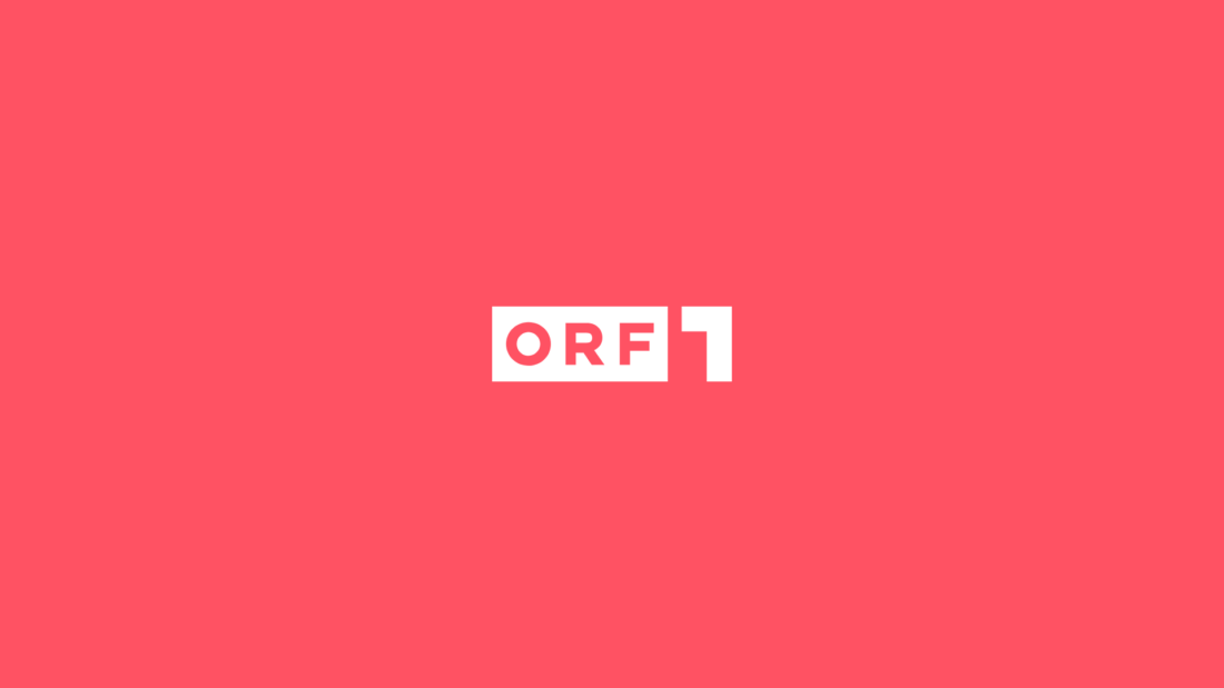
- I'm curious why they went with O and not Ö (Österreich), though. That's weird.Continuity
- Aaaah yeees, one of the low quality Bleed projectsgrafician
- What?sted
- grafician-1
- 1974 ahahhaahha AHAHAHAHHAHAsted
- Yes, still a good example (of timeless design).grafician
- Yes, still just bullshit and nothing to add.sted
- You're not a designer sted, this is not for you so move on.grafician
- Love this logo and identity.Chimp
- Yep a classic. When they were nationalised too before the free market sorted them out/fucked it all up.MrT
- fooler0
Kanye West has filed for the rights to another new trademark under his Mascotte Holdings company.- what. a. knob.scruffics
- A bottle cap?i_monk
- probably something GAP relatedgrafician
- Clip Art...LOLutopian
- Maybe he's developing a new logo for Sealdbloc
- rimshot.wavpalimpsest
- Blue Reeses?stoplying
- It's a circular saw to cut off his own head.Nairn
- You know. For kids!monospaced
- lol monoMrT
- It is super similar no?nb
- lol @ monoYakuZoku
- bloke's a fuck knucklesab
- Diplomas are a growth business. The third world is coming into the middle classes.slappy
- Mattel?letterhead
- @mono great movieArchitectofFate
- grafician-3

- No. Also its like 5% chocolate 95% sugary trash.shapesalad
- no.oey_oey
- Sad is the fact that they changed the mountain symbol and now the bear inside is not visible anymore...grafician
- You can still see the bear, but the new Matterhorn is not as nicely resolved https://imgur.com/a/…MrT
- @MrT Oh just barelygrafician
- yeah it's a shame, but I do like the new packs and reintroduction of the old logo.MrT
- They're dropping "of switzerland" from the logo because it may be made elsewhere. I have only ever seen it in a triangular box, square box looks wrong.comicsans
- grafician4

- Always loved the logo and packaging/brandinggrafician
- This is a really good book: https://page-spread.…zardoz
- @zardoz Tnx, indeed!grafician
- i_monk-2

by Interbrand
- I always struggle with left-aligning certain letters togetherGnash
- yuck. and conflating 'piece' and 'peace' is annoying. what's up with that a?sarahfailin
- Peace is here, If you wantrobthelad
- Pizza one dayChimp
- utopian1
Cobb county school district halts distribution of new logo for East Side elementary school after condemnation on social media.

- jagara1
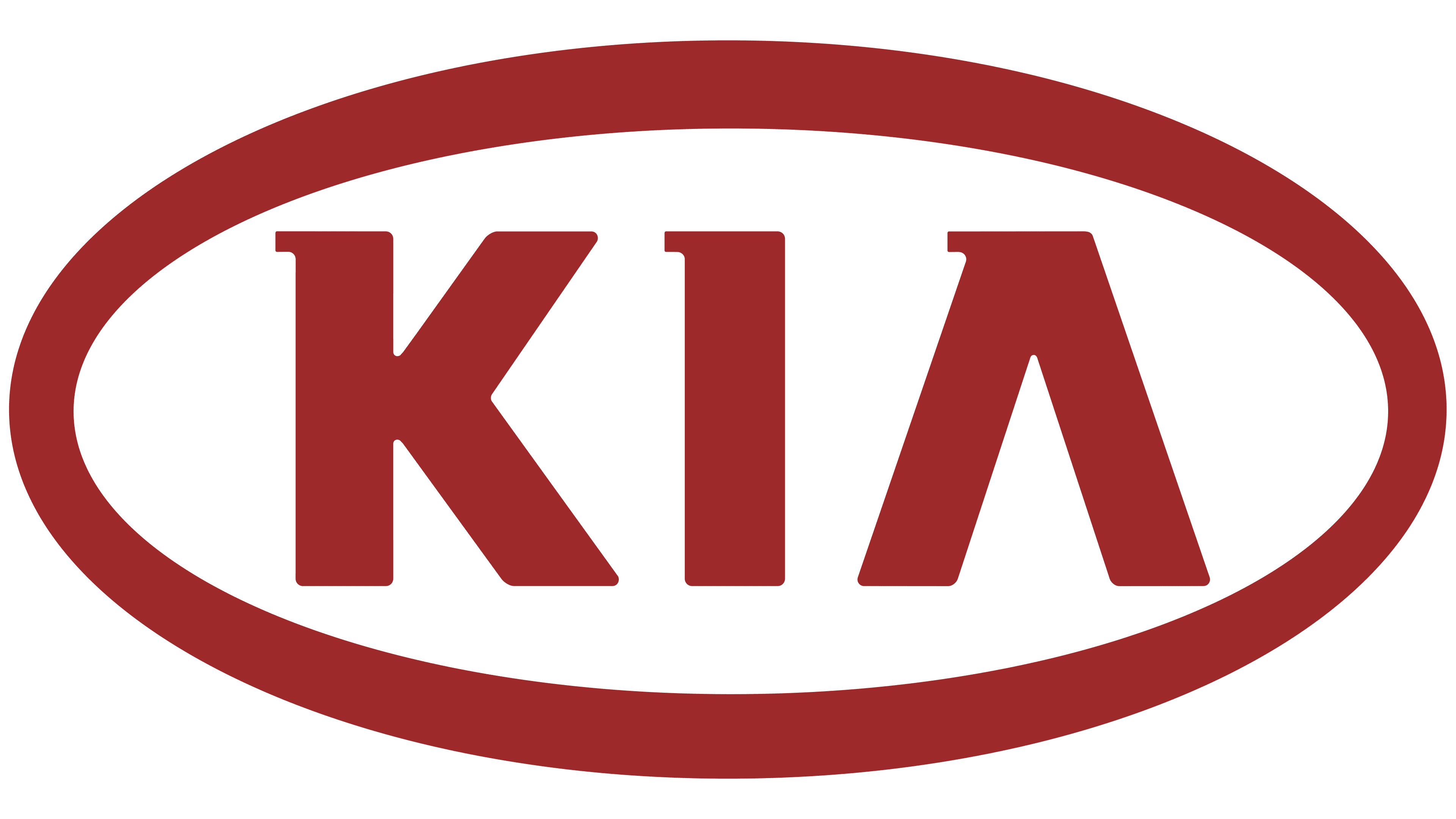
Not great, but so much better than the old one:

- KNKrassy
- it looks great on their vehicles_niko
- it's way too big on the vehicles.
"make the logo bigger" was at play . LOLKrassy - It's been quite a big rise for Kia over the years. Some of their latest models are tidy as hell. Vast improvement on brandingIanbolton
- KИwhatthefunk
- I like it. Certainly one of the better auto logos out there. Look at GM for fcks sake!formed
- KoreaИdbloc
- killed in actionzardoz
- worst logo on a cardoesnotexist
- ^ second worst behind CadillacKrassy
- https://cdn.motor1.c…
vs_niko - this https://www.autotrad…_niko
- grafician0

- Niiice, took me a second, haharobthelad
- Nice, well donejagara
- ahh no way_niko
- I don’t get itnb
- It looks like a tire. if you change the color of the t...sarahfailin
- i don't get otkingsteven
- Oh a tirenb
- Well I never. Nice.
They could have probably done similar with the ee too.Hayzilla
- grafician-4

"Peter Saville has redrawn the Aston Martin wings
The car manufacturer has updated its branding, adapting the 95-year-old wing logo with what Saville describes as “subtle but necessary enhancements”"
- More: https://www.creative…grafician
- iStockutopian
- they should have stopped at the 1920 one_niko
- besides the A+M monogram, it looks like a falcon in flight. just brilliant. the rest are all dog shit._niko
- woo Peter's learned to use illustrator and not just other people's images.MrT
- I'd still buy a One-77 if I was a bigger twat.MrT