Logo of the Day
Logo of the Day
Out of context: Reply #712
- Started
- Last post
- 822 Responses
- mort_5
Andertons UK music instrument shop. Not a new identity (2017) but I love the variants of the A for the different departments.
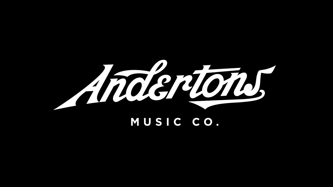
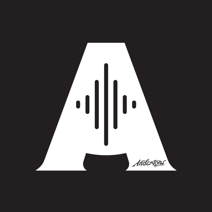
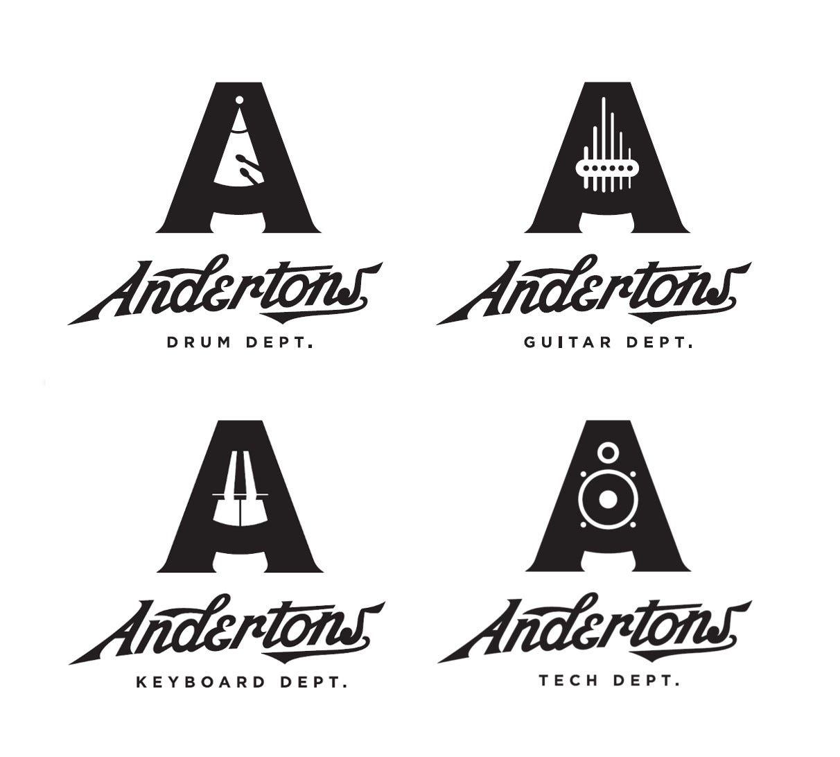
- by The Pull Agency
https://www.thepulla…mort_ - Love this, although it feel slightly stiff in some way. Like it's trying hard to be retro. Maybe it's that E. Still, loving the brand.Ianbolton
- Is it better than this though? https://pullwebsitep…Ianbolton
- The type has always felt a bit dated for me, but the A work is real nice.robthelad
- It’s visually complicated but I like the concept!Chimp
- i like the concept, i don't like the executionmilfhunter
- I love the A marks but don't love the Andertons type.CyBrainX
- What Milfhunter said!utopian
- logotype screams BaseballKrassy
- That icon is great, I feel like the wordmark needs a little tightening up.dbloc
- The A could have been a metronomeYakuZoku
- Still niceYakuZoku
- Goodshapesalad
- @yaku, Nothing worse than replacing a letter with a small logo or item. Amateur AF.monospaced
- I like their youtube content...that type is atrocious thoughBaskerviIle
- by The Pull Agency