Logo of the Day
Logo of the Day
- Started
- Last post
- 820 Responses
- milfhunter0

- *palimpsest busts a nutNairn
- I really don't get that random symbol. Also it gives me Asics vibes.milfhunter
- quoi!omer
- what is the icon supposed to be?dbloc
- cool clipart symbolutopian
- https://wolffolins.c…dmay
- I'd love to know how much Wolff Olins charged for this.Continuity
- Also, that they managed to make that CA ... err ... ligature(?) look even worse than it did on the old logo is astonishing. That's talent I really don't have.Continuity
- the lettering is much better, the icon... well, it's usable and distinct enough to use across all the products they havedmay
- Logo of the Day shows it without context; meh.
Wolff Olins over contextualizes it, BUT man it looks good!ideaist - that will be 895,734.76$
Our team worked very hard in the last 6 months to bring your logo to the next level.HAL9001 - I think it's smart to have a "mark" that you can use without the type. Clip art or not, it works well on their clothing and on tiny applications.monospaced
- It evokes movement, it's like a D, it locks up nice. Don't need to read too much into it beyond that.monospaced
- Pecathalon.Nairn
- Weird forced ligature that looks like C4bulletfactory
- ^ For whatever reason, that CA ligature thingy reminds me of a dog lifting its leg up to piss on something.Continuity
- The icon is the P for decathlonimbecile
- The selected blue color is not working, previous was way more "positive" than the new. The new logo looks like the LADA of clothing...OBBTKN
- Taking into account the price increase that their products have experienced lately... This is not going to help them to sale moreOBBTKN
- The icon makes sense in that it is reminiscent of the CA ligature, although that could be pushed harder. Very useful to have something small for buttons and >>skinny_puppy
- >> other small touches. I liked the old font though has character, the new one is ... dull. They could just have tweaked the original lettering.skinny_puppy
- @cont Like a lone elephant washing itself with the self-knowledge that it is a dying species, because it fits in with nothing that surrounds it.garbage
- The new font is boring, generic. The icon looks like a random korean or chinese car company. The old color is also way better. Don't get it.sandpipe
- I do not approve.
I agree with sandpipe, the old color is the best thing they had.palimpsest - The tension between the top right of the C and the A makes me very uncomfortable.maquito
- We want it to have movement, so italicise the ligature.
More.
No like they did in the 90s.
PerfectionProjectile
- grafician-2

- lol I was just reading about this.
more *clap* female *clap* deathsquads *clap*face_melter - they using all the Grilli typefaces lol
GT America Extended, wow so trendygrafician - wondering who did this rebrandgrafician
- Same team that created the Space Force logo?utopian
- ^nah, this one actually looks "designed"grafician
- why only 3 times?Krassy
- also, unknown pleasures woulda been a better backgroundKrassy
- lolKrassy
- haha krassy was thinking the same thing_niko
- ppl on twitter thinking this looks like a techno festgrafician
- https://adage.com/ar…grafician
- How did an entire room full of people not laugh this off the table?scarabin
- https://control.fand…thumb_screws
- Jesus, Mary and Joseph, I didn't realize that was for real. FLOL.helloeatbreathedrive
- Should have gone with something like this
https://www.atlasobs…yuekit - i like the idea, but cia... not working.renderedred
- trashmilfhunter
- @krassy
https://twitter.com/…milfhunter - wow that is truly abominablehans_glib
- Are they planning to rebrand in 18 months when this style has gone out of fashion?Chimp
- not unintelligent to use scripting.. should be used much more in any mainstream design operations.neverscared
- This really is fucking dire.Continuity
- They gotta lure all those MIT nerds away from google. very hip CIA, very hip.ben_
- I don't understand the panic. I think it is completely ok redesign. They don't probably need website at all and as it is now it serves the purpose. Careers + PRdpi
- ryder ripps did itnico412
- This is gonna look awesome on all the cia merch people love.monospaced
- this must work really well, reduce in size.utopian
- Student project surely?calculator
- https://deadline.com…Nairn
- the designer responsible for this (who's a Kanye , Pusha T, Grimes collaborator) calls himself "conceptual artist" http://ryder-ripps.c…Krassy
- i like it... has early tdr/ ian Anderson vibes... pretty bold actually especially considering who it's for. not as good as the NASA worm logojonny_quest_lives
- but people now sell visual identity ecosystems now versus a solid stand alone iconic logo so it fails as instantly recognizable wordmarkjonny_quest_lives
- nah it wasn't that guy Ripps
https://exclaim.ca/f…grafician - he took credit, but now he deactivated his instagram and twitter on private :))grafician
- lolKrassy
- lol I was just reading about this.
- whatthefunk7
- No one asked for this and everyone hates it.CyBrainX
- it was made on windows just look at the anti-aliasingsted
- David Carson should also work on getting his website secure. It's more broken than this new logo.dbloc
- #wetoodbloc
- you're right, holy shit, what a nightmare w/ the horizontal doom scroll
http://www.davidcars…whatthefunk - Not just nightmarish horizontal doom-scrool, but reams and reams and reams of tiny copy with leading tighter than a nun's cunt on Ash Wednesday.Continuity
- Also, I hate that We heart NYC logo. Fucking hell.Continuity
- Apparently not meant to replace OG logo, meant to be separate campaign post Covid... https://www.nytimes.…whatthefunk
- what the fuckcrazyprick
- Shit logo and David Carson was just a fad.MrT
- WE ❤️ QBN®utopian
- kill it with fireoey_oey
- Can't be any worse?
https://imgur.com/Za…theonlyengineerhere - agreed with him but hate every bit of his work as well.milfhunter
- Flipping through Transworld, David Carson made my day as a young skateboarder.canoe
- @MrT - at least he had fad, that's more than I can say for me. You?canoe
- I'm not famous but I don't see what that has to do with what I think of David Carson's work, which is not that much.MrT
- sted4
- sure, why not_niko
- I likeGnash
- Ew. I guess this is for the 'real' Nokia, not the phone brand, mind.Nairn
- iPhone Kiler 2.0utopian
- I like it.i_monk
- Smooth. I like it.CyBrainX
- missing bitssab
- Cutting edgemisterhow
- I'm nokeenMrT
- I wonder if the young kids who never heard of NOKIA would recognizeAQUTE
- Made with Flash™OBBTKN
- i dont hate it.milfhunter
- NO CIAgarbage
- KIAdbloc
- I can dig itscarabin
- mort_5
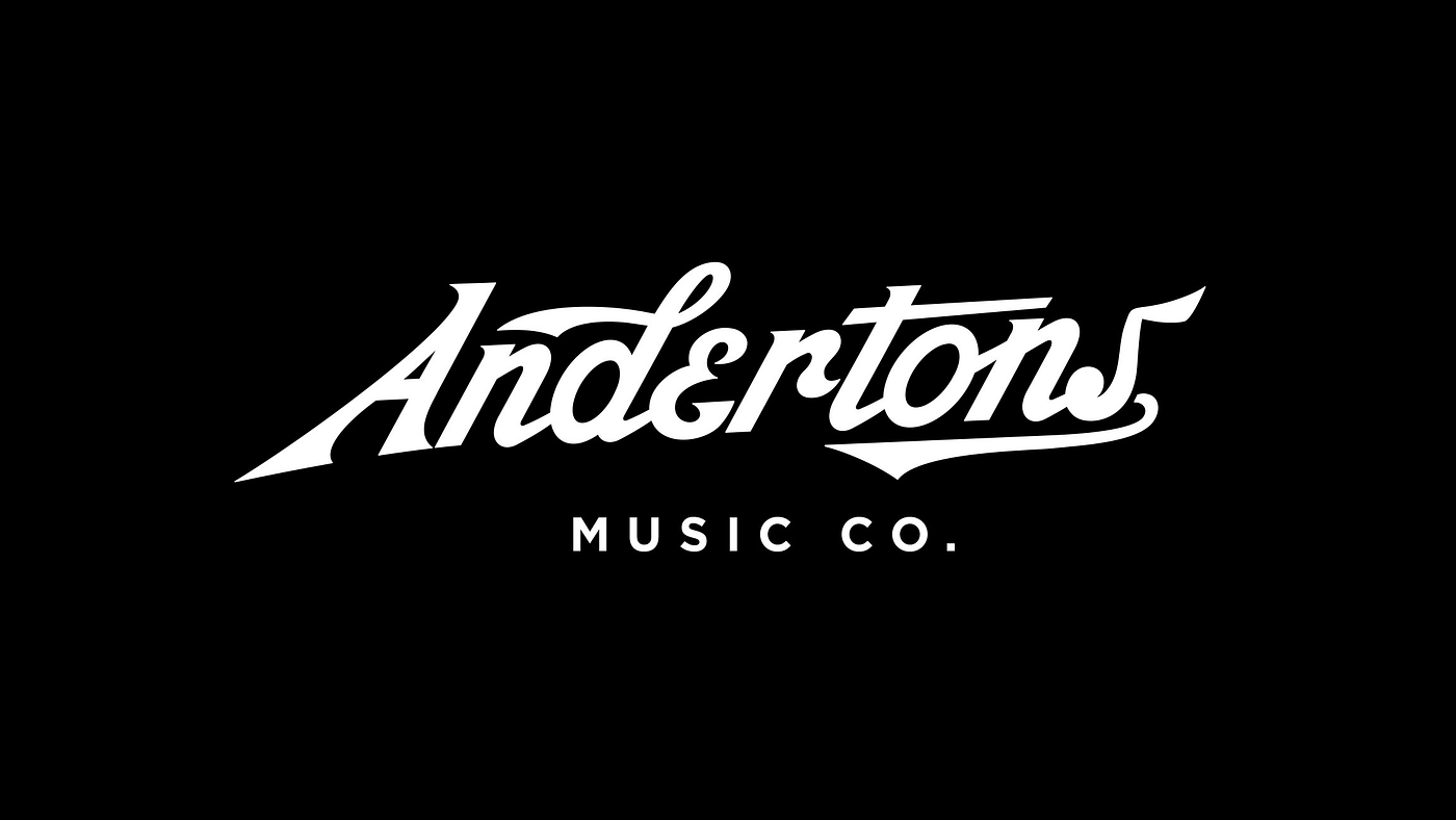
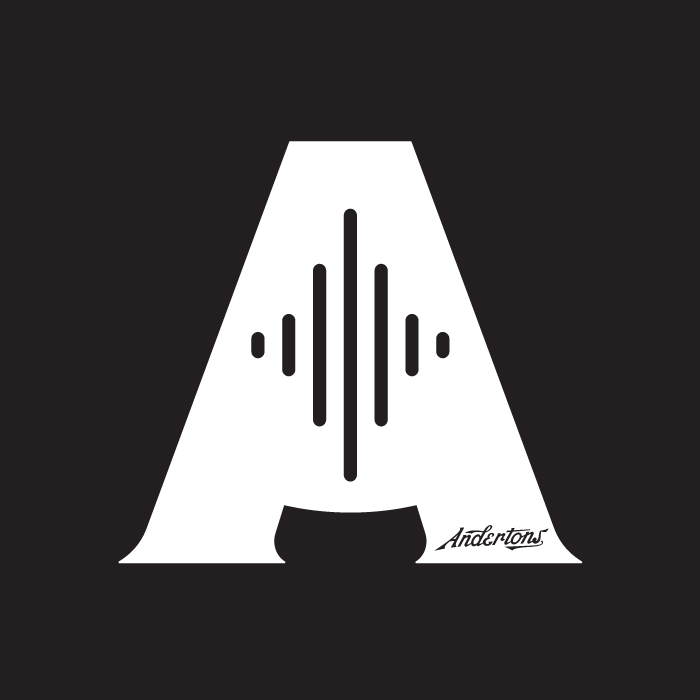
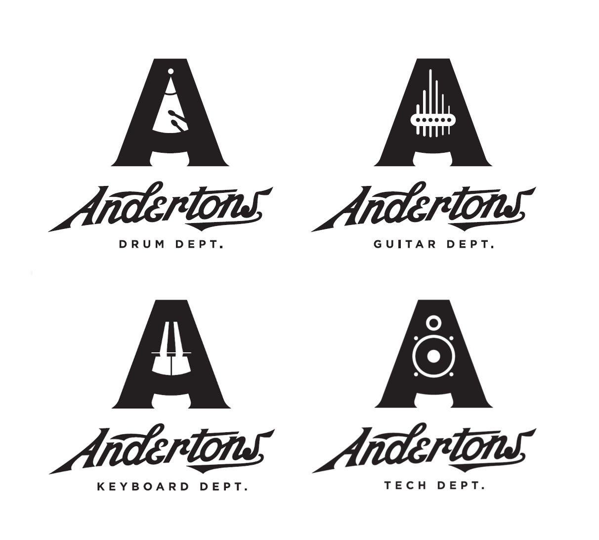
Andertons UK music instrument shop. Not a new identity (2017) but I love the variants of the A for the different departments.
- by The Pull Agency
https://www.thepulla…mort_ - Love this, although it feel slightly stiff in some way. Like it's trying hard to be retro. Maybe it's that E. Still, loving the brand.Ianbolton
- Is it better than this though? https://pullwebsitep…Ianbolton
- The type has always felt a bit dated for me, but the A work is real nice.robthelad
- It’s visually complicated but I like the concept!Chimp
- i like the concept, i don't like the executionmilfhunter
- I love the A marks but don't love the Andertons type.CyBrainX
- What Milfhunter said!utopian
- logotype screams BaseballKrassy
- That icon is great, I feel like the wordmark needs a little tightening up.dbloc
- The A could have been a metronomeYakuZoku
- Still niceYakuZoku
- Goodshapesalad
- @yaku, Nothing worse than replacing a letter with a small logo or item. Amateur AF.monospaced
- I like their youtube content...that type is atrocious thoughBaskerviIle
- by The Pull Agency
- scarabin10
- Dubai duty free zone?grafician
- Paris gay free zone?utopian
- Matt Damon joke zone?GuyFawkes
- Fart Gas Co zone?sted
- hahahaBPPYKM
- https://images.uncyc…i_was
- It’s like something out of GTAscarabin
- they did this on Team America World Policesarahfailin
- grafician0
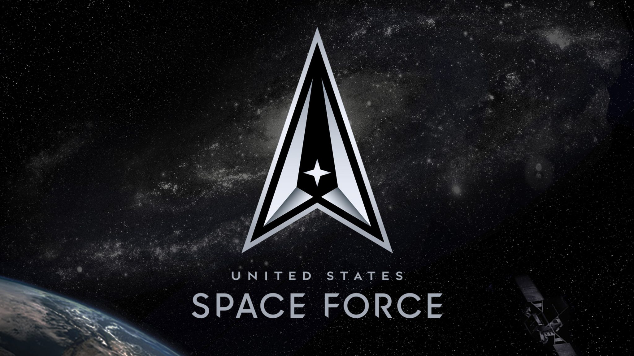
The United States Space Force has unveiled a black and silver logo, following an earlier design released by president Donald Trump that proved controversial.
Revealed 22 July, the logo comprises a delta symbol with a silver border intended to represent defence against "adversaries and threats emanating from the space domain". It encloses a black centre indicative of deep space.
- https://www.dezeen.c…grafician
- lol black centreMrT
- Space hoodsMelanie
- The explanation is quite over the top, but the logo is not bad I guessgrafician
- It's days ahead of their previous logo.utopian
- I still see the Federation logo in there, but that's just me, designer with trained eye...grafician
- So they went from ripping off the NASA logo to ripping off the Star Trek logo...Live Long and Prosper !fooler
- I hope this was written by you and not the official statementdbloc
- actually it is the official..Centre is very unamerican of a spelling.dbloc
- unbalanced. black centre void of space is too big, imo.imbecile
- All I can see is the ship from Asteroidspolybius
- it's a cursor. coolDRIFTMONKEY
- pretty sure Jivanka made this happendasohr
- Black logo centers matter!evilpeacock
- fuck these hard corners...neverscared
- the two silvers arrows with the black middle make it appear the logo is pointing down. you don't see the top because it is too stretched.face_melter
- Pontiac derivative https://www.carlogos…BustySaintClaire
- I mean it’s more modern, but still just as derivative as the first onescarabin
- Do other countries have a Space Force? And if not, who are we fighting exactly?yuekit
- ^ Aliens!Ianbolton
- Am I still one of the few people left in this star system that still sees this similarity? https://www.telegrap…CyBrainX
- Let's try that again.
https://www.telegrap…CyBrainX - Damn, you Qubes. Star Trek! I looks like the Federation.CyBrainX
- fooler0
Kanye West has filed for the rights to another new trademark under his Mascotte Holdings company.- what. a. knob.scruffics
- A bottle cap?i_monk
- probably something GAP relatedgrafician
- Clip Art...LOLutopian
- Maybe he's developing a new logo for Sealdbloc
- rimshot.wavpalimpsest
- Blue Reeses?stoplying
- It's a circular saw to cut off his own head.Nairn
- You know. For kids!monospaced
- lol monoMrT
- It is super similar no?nb
- lol @ monoYakuZoku
- bloke's a fuck knucklesab
- Diplomas are a growth business. The third world is coming into the middle classes.slappy
- Mattel?letterhead
- @mono great movieArchitectofFate
- BaskerviIle9
Nice

- Aye. But, needs more distance - that's WAAY too close! :)Nairn
- not if the circles are 1.5m in diameterhans_glib
- Really?utopian
- They can use this logo also for Tokio 2021grafician
- Oh waitgrafician
- ^ LOLoey_oey
- had to be doneESKEMA
- I always think the circle for Australia is missing.SimonFFM
- Isn't that the blue one, for Oceania? Asia the red one, Americas the black one, Africa the green one and Europe the yellow one?oey_oey
- You are probably right. It’s just not intuitive to me.SimonFFM
- Hey Simon, sorry but I totally invented it, I mean the colors corresponding to the continents. but there's 5 so I guess it would be correct?oey_oey
- HijoDMaite8
Sears Roebuck atom logo


- Not too shabby!MondoMorphic
- That's actually pretty cool.Continuity
- Awesome! Any idea when it was in use?nocomply
- looks like they began using it for their house branded electronics in 1970HijoDMaite
- Cool! I want that lens capfuturefood
- likenotype
- I see SR...see_thru
- well done logodbloc
- Looks better on the camera than on the guitar headstock, though.Continuity
- utopian-3

- not understanding the thinking behind the sport one - but i actually like them as a set._me_
- ^ yeah. Maybe it's a race or a league table. No doubt it'll all be slick in motion...MrT
- https://twitter.com/…_me_
- These are crap. I'm guessing the sport is suppose to depict motion.dbloc
- Sport logo is top view of the start of an oval track. Y’all were nerds or art kids in high school, weren’t you?? ;) ;)nb
- ^why not an 1-2-3 podium? just flip that lol
these are dumbgrafician - podiums are usually 2-1-3 silly billyMrT
- @_me_ it works from me when you see it in the video but the symbols as a stand-alone look horrible.milfhunter
- As dumb as Google apps logos.jagara
- I dunno pretty interesting to do each with only 3 rectangles no?inteliboy
- defund the bbc!Brabo_Brabo
- I like the consistency but I'm not sure if they work on an individual level. Time will tell.Chimp
- No one watches it. Even my mum doesn't watch it. 16 year old interns said they don't trust it or watch it. BBC is pure woke forced diversity left agenda.shapesalad
- ...but...but why is there one red square...ArchitectofFate
- A woke veneer on an institutional cesspit. Forget defund, needs to be forcibly disbanded with CBT therapy for all involved.kingsteven
- I left the UK 11 years ago. Every time I go back and watch TV I can only stand it for about 5 mins.Chimp
- what's the News one supposed to be?Krassy
- perfect for that shitty institution, something for all the genderless nonces to wank off tohans_glib
- Not feeling these at all. Seems like poor execution at following a trend.desmo
- the Sun is blue?Bennn
- Ok but compared to the old ones?!nb
- ^nothing beats a wordmark lol
it's literally telling you what it is
no guessing, just wordsgrafician - NOsandpipe
- dbloc6

- nice touchmilfhunter
- The British monarch is the head of state and the sovereign, but not the head of government. Weird Logo.robthelad
- https://insidegovuk.…Nairn
- It's kind of cute, but depressing that so much effort has to be deployed to feed some spoilt manchild's idle whim. Nice work by the gov.uk team thoughNairn
- Suitably opressive looking!mort_
- To steal a phrase from a better man, I will never understand why people tolerate these "six-toed, born to rule pony fuckers".garbage
- It was pathetic to watch American boomers weep when that old hag died last year. They do nothing but throw the UK's Disney Childrape Extravaganza.garbage
- I like the way they simplified the favicon.stewart
- Garbage coming in HOT! lolmort_
- is it 'cause monarch had boobs and now has a dick? why is the crown version different top to bottom?uan
- found the link ^ tnx@Nairnuan
- Disney what?monospaced
- The royal family and Disney have long ties, and they're both hollow entities that provide nothing of real value.garbage
- Also just last year Disney tried to fight DeSantis using the royal lives clause, specifically citing PC3 himself.garbage
- imbecile6

- clever & well executedhotroddy
- Clever, but the logo and type are hard to read at a distance. Could be bolder and simplified more.bainbridge
- what bainbridge saidutopian
- the swan and big white ampersand are pretty legible from a distance.hotroddy
- Niceterry_cloth
- Well executed, but there's a huge fatigue on X and X names for bars and restaurants.garbage
- Everything about it is great. Bravo to the designers.Krassy
- Does this exist or is it a logo pond mockup or something?_niko
- it took me a second look to actually see the word restaurant.utopian
- To clarify: the design is great, the idea is rotting in the back of the fridge.garbage
- It's just a pretend behance mockup. I love it though.HAYZ1LLLA
- Nice but it's another solution looking for a problem.MrT
- https://www.behance.…CygnusZero4
- I dont think this is an actual restaurant. Cant find anything at all for it. Probably made it up for his portfolio.CygnusZero4
- dead url from the business cards too http://theswanandmal…CygnusZero4
- You don't put tiny orange type on black and expect people to be able to read it. The details of the nostrils are lost among others. Poor execution.bainbridge
- ideaist5
^
- for pete's sake..._niko
- Texasdbloc
- nice!Krassy
- Looks like Old Navy.freedom
- this is greatmonospaced
- LOL @ Freedom
Old Navy!!!OSFA - Iowa is really nicedyspl
- What's high in the middle and round on both ends?elahon
- ohighoimbecile
- seems like they took a lot of inspiration from state universitiessarahfailin
- Salarrue2
from
- and finally to...
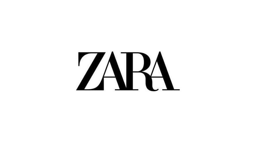
https://i.imgur.com/…Gnash - lolKrassy
- lolSalarrue
- ha_niko
- the logo equivalent of the new ugly sneaker trendsarahfailin
- I quite like it and was bemused by Spiekermann's outrage..
https://twitter.com/…Nairn - new's pretty bad, old one is decent (minus the R)Krassy
- no! argh!! paging miesfanmaquito
- lol @gnashmaquito
- Fashion brands got the ugliest logos...pango
- this one is not the final one. look here:
https://www.zara.com…
it's fashion. it fits. the old one was so last season.sandpipe - Here your new logo. 350,000$ pleaseBennn
- shitutopian
- Fashion is full of garbage like this.i_monk
- @sandpipe its actually less ugly than the one in the post. Also, looks good in orange.maquito
- ^ trueGnash
- Por los clavos de Cristo!!!
pobre Amancio Ortega, jajaja maquito!!!Miesfan
- and finally to...
- scarabin4
- 0.000% characterutopian
- taking the pets out of petco™futurefood
- whooosted
- lol. so much passion over the logodbloc
- the dog's ear is weird on the cat. start to look like fat horns.bezoar
- Imagine the blowback from being the designer who was responsible for that logo. You think you got problems?cherub
- Samson has a point.PhanLo
- https://www.youtube.…dbloc
- I think Samson is fucked up beyond repair.helloeatbreathedrive
- Always blue.jtb26
- Samson owns 57 catsKrassy