Logo of the Day
- Started
- Last post
- 820 Responses
- i_monk0

I like it. FastCo calls it "confusing".
- Approved.ideaist
- FastWho?moldero
- How can you approve it without knowing what the icon represents???iCanHazQBN
- Likeitset
- How can you not know what it represents?i_monk
- it says what it represents, in big ass all caps letters, lolmonospaced
- i love black flagApeRobot
- skulls are cool.Al_dizzle
- if you have to explain it, does it really work that well? plus there is a W hotel right there. kind of stupid, imo.doesnotexist
- That wouldn't ever be confused with the W logomonospaced
- well no shit, but it does look like a w. not everyone is a brand expert. i like landor but this is weak.doesnotexist
- it is a Wmonospaced
- Looks like it was inspired by the competition winning design, which politics axed, unfortunately, and left a banal design (at best)formed
- piece of architecture (at best)formed
- imbecile0

- tightrenderedred
- is the keming OK tho?Krassy
- That’ll be $10 million please_niko
- Moved the ®freedom
- Feels squashed on the right.i_monk
- @i_monk yup, also my thoughts on the poor kemingKrassy
- https://static.feber…lnu
- Looks like an improvement to me.robthelad
- looks awful still. needs a smooth modern look, Airbnb, monese style.shapesalad
- it's icon, in a Best Buy cheap ass way. says nothing about modern furnitureshapesalad
- Looks squashed to me. Amazing they'll spend money redesigning this, let alone the cost of printing, etc.formed
- dbloc0
This one was back in August, but the C21 one reminded me of it.
- haven't seen it in the field yetGnash
- that looks betterpinkfloyd
- i like the new one better in this instance.capn_ron
- looks better but still sux :Dsted
- There was a video of the making of the new logo which is pretty much 5 minutes of the creative agency blowing each other._niko
- slight improvement.utopian
- And that probably cost them 10s of thousands....Maaku
- The old one is a bit uneven but I think I prefer it. New one is boring.PhanLo
- I really hate this basic font as logo trend. There's no personality or individuality there.i_monk
- i_monk8
I'm going through old sketch books and boxes and came across a bootleg copy of a book of modernist logos I printed from blurry JPGs back in 2005 or so. This is the publisher logo I made for it:

- _niko2
just came across this today, it's been around since 2018 but I never noticed it before, quite like it.

- the tour could use some love maybe but I dig the atp_niko
- Looks like a 90's ISPfadein11
- You like the gradient and shape in the racket?bainbridge
- I've seen it solid somewhere but couldn't find it to post which for sure is better, but the shape in the racket is fine, lines up with the "p"_niko
- and a huge improvement of hat they had before https://www.atptour.…_niko
- 1990's version was dopescruffics
- I like this, there's enough energy it almost don't need no gradients.MrT
- I likeKrassy
- NBQ000
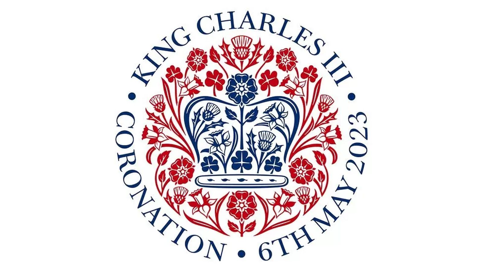
Apple's Former Design Chief Jony Ive Designs Emblem for Coronation of King Charles III (pretty sure not Ive himself but some designer in his new company LoveFrom.)
- its OKmilfhunter
- A distinct lack of heraldic animals.zardoz
- Clip Art Vibes.utopian
- Future commemorative plate.i_monk
- all the things Camilla chews onMrT
- Camilla's got the covid again. Imagine if she died.zardoz
- Low hanging fruit.
Is that a baguette in the middle?grafician - It's a tampon.i_monk
- Works well in single colour/black onlymonNom
- Like a royal Shepard Faireystoplying
- I hope none of you actually think that is a well designed logo.utopian
- I hope none of us think an emblem or coat of arms is a logo.i_monk
- sted-1


- not for me. too gamertechNairn
- Needs more FibonacciNBQ00
- Pepsifaxion
- drivlhans_glib
- lol it took them 10x longer to come up with that bullshit grid than it did for them to download the typeface from DaFont.com_niko
- and then there's the reasoning. They left out " the 'I' shape represents our erect cock as we spew verbal masturbation to try to sell this hack job."_niko
- hahahaNairn
- lolutopian
- If ESPN and Pepsi had a child...utopian
- ahahaha @_niko rotfl :D
that verbal masturbation you're referring to was in the brief :) that "bullshit grid" is part of the visual system, and it isn't bad.sted - yesterday I had the opportunity to learn a little more about this project, and one of the expectations was that it should open for young people.sted
- it was done by a kid from Romania who has far more talent and enthusiasm like most people got the opportunity to show their stuff and get feedback at the event.sted
- @utopian ah nice with the Pepsi, I didn't even think :D my first note to the kid was that it looks like ESPN brand :)sted
- Hey sted no disrespect meant to hard working designers especially if they’re kids, I assumed this was done by pentagram Europe or something :)_niko
- lol no worries:) he got far worse comments :D somebody even questioned that he made this by himself. now that was really low and disrespectful...sted
- The rationale is irrelevant when the stroke contrast is that wonky.i_monk
- lol no.milfhunter
- grafician1
- Gen Z unreadable garbage.utopian
- chobani inspiredgrafician
- a logo's design should give you a hint at what the company does. none of these communicate tech companies. They all say spaghetti western or 70's softcore xxx_niko
- like mode: https://www.undercon…_niko
- the design doesn't fit the company. based on the overall look and feel I don't know what they do or what they're trying to be._niko
- Under Consideration loves anything in this style.Chimp
- I don’t think a logo has to be anything like that a company does. It just has to be recognizable and aesthetic.doublespaced
- Generally yes. Logos are not brands.grafician
- "Logos should identify, not to inform" Chris Do. (the quote is something like that anyway)Frosty_spl
- It doesn't have to mimic what a company does, but it should at least be relevant. All this retro-futurism crap is just horrible and already looks so dated.formed
- grafician-1
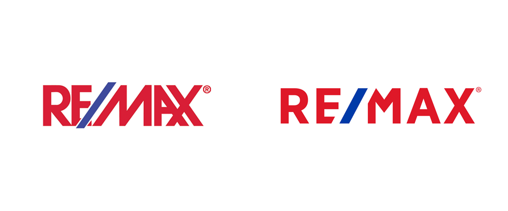
Bofore:

Aftor:

- https://twitter.com/…grafician
- no character, just a blob now.dbloc
- Girl Scouts 2022
*May not contain actual girls_niko - Cloverfield 2023utopian
- What is it supposed to be?MondoMorphic
- prinses Leiasrhadden
- https://it.wikipedia…Squiddy
- Human sacrifice, dogs and cats living together...mass hysteria!bezoar
- Extremely worse.CyBrainX
- Krassy1
French electro artist Étienne de Crécy

- Plug in herenb
- GayNBQ00
- https://www.cnn.com/…utopian
- brilliant logo for an e-car startup, wasted opgrafician
- ed's electric - well done; https://logopond.com…Krassy
- Solid. Not a fan of the gradient, though.maquito
- Always loved this.pedromendez
- fooler4
Amazon's new icon for its smartphone app has been mocked online by some customers who have joked that it looks like Adolf Hitler. Many have urged the brand to "rethink" the design
:format(webp)/cdn.vox-cdn.com/uploads/chorus_image/image/68893612/iconcs.0.png)
- Hayomook juts had an aneurysm.utopian
- Sorry what? In which way does it look like Adolf Hitler? It totally looks like Fleaoey_oey
- That time when Hitler died his moustache blue for a rave?Chimp
- Charlie Chaplin wants his royalties.StoicLevels
- grafician-1

- Yeah, it's badgrafician
- Pentagram?formed
- I'm on this team and proud of the work we did on the rebrand. A lot has gone into not only the mark, but the entire design system.bulletfactory
- Obviously you can love it or hate it all you want.bulletfactory
- https://youtu.be/qCU…bulletfactory
- Well, why the i t and l are not the same height? We just "judge" it visually man, who knows the strategy behind it. Also gives a lot of LinkedIn vibes, you knowgrafician
- but you might trashed a lot more on that Brand New bloggrafician
- also the "e" needs to be a 1% bigger than the other letters, there are rules for rounded letters to pass the baseline so they don't look smaller, oh well...grafician
- also the entire branding looks like it's made for a consumer market, when in fact Intel profits come from the enterprise market and b2b sales, so I dunnografician
- rant over, enlighten us @bulletfactory with your design choices, so I can take my awful criticism back?grafician
- The different heights of the i, t and l irritate me, too.grotesk_neue
- it looks really inconsistent and amateurish.hans_glib
- cyan is now called "energy blue". great.sandpipe
- I'd assume the tittle doesn't align with the top of the t because it's a different colour so needs compensating for visually.Nairn
- I'd be surprised if the design team for one of the world's best-known brands hasn't thought about details that some rando design board member's irritated byNairn
- I can only imagine all the approvals needed to get to this, is there a design system case study somewhere?zarkonite
- reminds me of internet explorer with that e jumping out like it does. bullet's video shows a bunch of color schemes i like better than this particular one.sarahfailin