Show some recent work
- Started
- Last post
- 8,593 Responses
- armsbottomer0
my first audio visualization. thanks to ukit for the song ;)
- flyingnowhere0
Some older things that just got back to me. Passing this book back and forth with some friends. These are some of mine:


- Miguex0
Just ordered these for my store

Embroidered Tag on left shoulder/
Screen printed inside care tag/- Nice! How is you store going? Wanna share some tips!
Centigrade - I'm all ears, share away! :)Miguex
- Ha ha. Touché. Well done sir.Centigrade
- well I just started, and I noticed most people are not interested in buying on line, they rather buy it at a store or eventMiguex
- when I do shows, people ask me for shirts, and I tell them about the site, and they don't go, so I'm wondering what am I doing wrongMiguex
- doing wrong..Miguex
- I think you need to hit a critical mass of people. I'm working on getting social numbers up.Centigrade
- Then hopefully with a bit of luck it'll snowball a little.
Centigrade - Pick a retailer.... and hunt them like a dog to take you on. I starting to realize retail is better than online.Centigrade
- thanks man! I have a local shop in mind that I like, not luck yet though. I'm too small for them I thinkMiguex
- check out mintees.com. there is a lot of resources for this..big community there..cbass99
- cbass!!!!
bad ass link right there thanks!Miguex
- Nice! How is you store going? Wanna share some tips!
- neue75_bold0
Part of a new identity & communications design package I've been working on for about 4 months [with no end visible in the near future] But at least this invitation to come and watch the Red Bull Air Race at the clients office was actually done and printed [granted the actual identity will end up different than this]
Printed 2/1 on newsprint...

- I'm feeling this neue, very nice!uncle_helv
- hmmm perfect!
I love big serif fonts.moamoa - thanks.. I'm actually not too keen on Farnham that large, we since switched to Plantin and have since dropped..neue75_bold
- using a serif completely.. the client is basically forcing me to use all helvetica...neue75_bold
- Farnham is much better then Plantin, in my opinion. The only thing I would change is...moamoa
- I would handle the backside like the front, headline(zondag) Helvetica, time = Italic, and then the copy in Regular...moamoa
- ahhhh you know what I mean, like on the front page, and pls not everything in Helvetica :(moamoa
- aye... agreed, on all comments...neue75_bold
- nice, like the colour scheme and use the translucent enveloppetank02
- I don't think using Helvetica exclusively is a total disaster?! especially with the current colour palette B&W and yellowuncle_helv
- Lovely neue. You still coming over this month?Concrete
- I hear you helv... I've just never been a big fan of using helvetica for copious amounts of body copy..neue75_bold
- thanks ben, unfortunately I don't think I can make it over... will def come in November or December..neue75_bold
- Cool. I spoke to Dancer about going for some beers to coincide with your visit...Concrete
- I love this!!!!!!!!phatlee
- nice.Jnr_Madison
- I hate it you cuntkelpie
- I hate it too..neue75_bold
- I always look forward to you posting in this thread neue.JerseyRaindog
- this is brilliant. nice job you've done there.skser
- *****skser
- mimeartist0
hey digdre... do you know who is sending me the black book?
- akrok0

- < a typical QBN user, maybe.akrok
- at least he's sitting comfortable.akrok
- Thought that was a portrait of our mate Brett.Amicus
- Why can I see through his head?detritus
- is that a portrait of me hans? cause it totally resembles me.capn_ron
- no, ron. you're not that handsome. hah.akrok
- cause he's mad. maybe.akrok
- i was thinking the fat face and mis-sized eyes looked like me this morning.capn_ron
- oh. well, i wasn't updated about that. haha. rock on, ron. hope to be in s.d soon.akrok
- Miguex0
^
I'm going to give some criticism, no one asked me but I want to say it. The spot is REALLY WELL produced, very cinematic, great soundtrack. Top Notch, it looks like you've been doing this for years!
Now the bad news, the concept car you show in the beginning is amazing, super futuristic, reminds me of Syd Mead's work, I got all excited thinking OMG is this the new toyota???!!
and then you break it and inside there's a a mundane looking car (next to the amazing futuristic machine you showed at the beginning) maybe the car is actually really cool, but you put THAT other one first, my expectations went through the roof..
Just sayin :)
Don't take this the wrong way please, I don't mean to be insulting!- Haha! Sad reality of how we never get those CONCEPT cars hey...
As stated I just designed the car cuts essentially. The spot was directed by Christopher Riggert - http://finchcompany.…filfury - I designed the car cut moments the spot was directed by Christopher Riggert:
filfury - http://www.finchcomp…filfury
- ok I'm glad you see it with humor, I didn't want to piss you off :)
great job though!Miguex - great logos too man!Miguex
- Haha! Sad reality of how we never get those CONCEPT cars hey...
- MSTRPLN0
.... and another

- moamoa0


- nice work... went through your website the other day by the way, hadn't realised it was updated. all lovely.skt
- not a big fan of the type going across the spine (unless it is the centre, can't see) top job though moa *clicks on siteDancer
- Love itdigdre
- Dancer I agree with you, I am not really happy with the big type site.. awwwwmoamoa
- is that silver ink? looks great.Midge
- its fairly nice but a bit bland, although of course I havn't seen the briefset
- ja silver..moamoa
- nice.akrokdesign
- Nice, i actually like that the type is going over the spine...tank02
- Very slick!slappy
- nice one...neue75_bold
- It looks 'nice' though I can't really see what it's saying or meant to be achieving. Not liking that hyphenation sorry.
Fussy eh?max_prophet - fussy fucker aren't Imax_prophet
- Looks lovely but not sure about the copy. Read sentences like that spine one all the time...JerseyRaindog
- colin_s0
- another beautiful book. i like them a lot - thanks for providing them!invisiblechamber
- thanks!colin_s
- Fouty20
Simple font I'm working on:

- theredmasque0
some more new work for a show this weekend

"Ouroboros II"

"Sleepy Gryphon"
Thinking of doing a giant rooster next....
- lovely!set
- what's the size?stewart
- first one is 19 x 25", second one is about 11 x 15".theredmasque
- Strike840
Some really rough screen shots of the site i'm working on at the moment.
http://www.flickr.com/photo_zoom…
http://www.flickr.com/photo_zoom…
http://www.flickr.com/photo_zoom…
- hektor9110

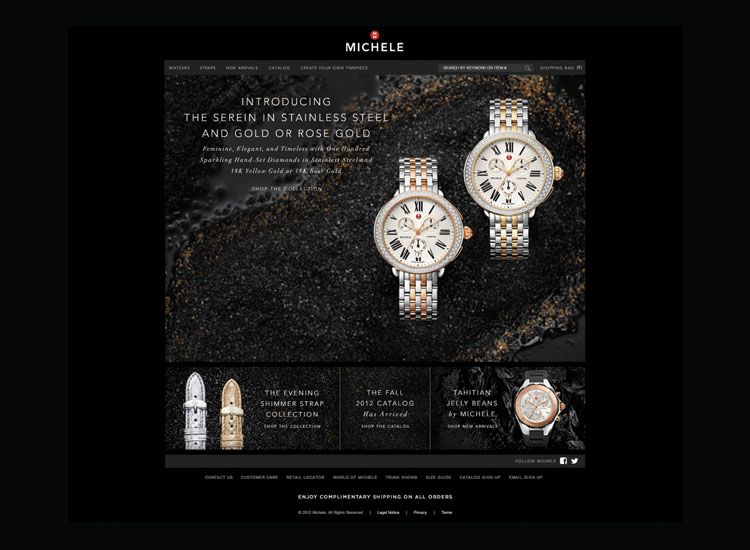
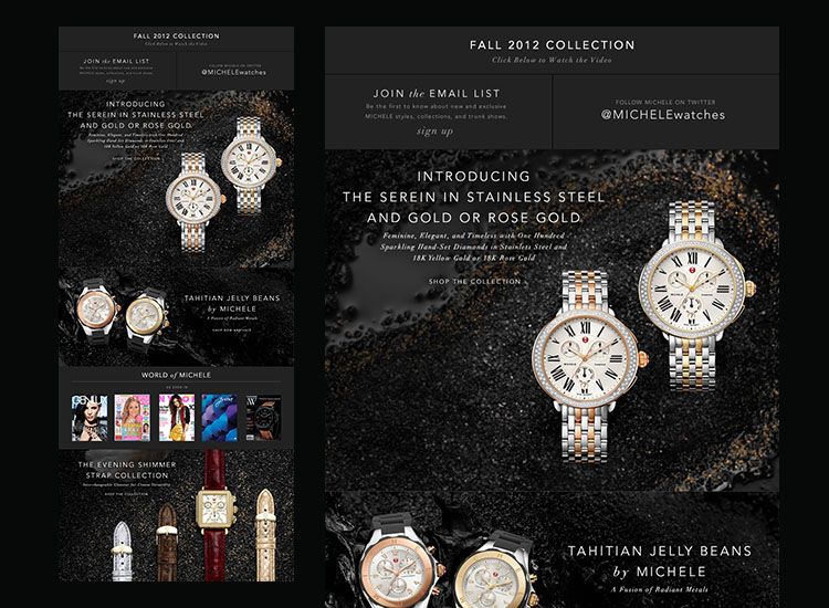
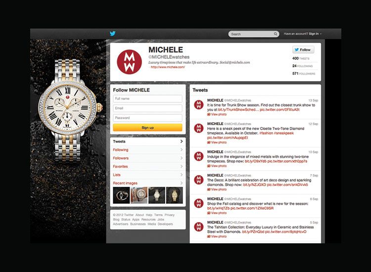
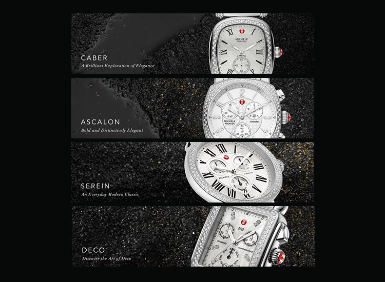
- Here you go!hektor911
- classy
Miguex - very nicebulletfactory
- are the watches on dirt?doesnotexist
- it was used coral, gold powder,sea shells, black sand, and painted rocks use for aquariumshektor911
- fancy dirt? nice!doesnotexist
- super clean. nice work.UKV
- arne0
- hektor9110
Quick little logo for a good friend of mine.