Show some recent work
Show some recent work
- Started
- Last post
- 8,592 Responses
- digdre0
- alter lego...neverblink
- no shit :Ddigdre
- I like it, but would'nt it be better if one of the lego heads had an evil face?non
- super lego and clark 'lego' kent?Amicus
- one of alter ego has glasses.digdre
- this is close to perfect :)SlashPeckham
- thank youdigdre
- arne0
quark on windows - old "work" - now sold as "art" ( :
- autoflavour0
I was invited to be a part of the Eastpak artist studio project..
here is the bag i did, which was in the opening show in Cologne on Friday night..
- the red took 13 coats of a Molotow red paint marker be solid.autoflavour
- niceakrok
- digdre0
www.tomhuveners.net !!!
1000
- nerrdboy0
- footer needs some love- looks as if it was vomited on the screen. everything else = gooddoesnotexist
- I like, was the issue of the navigation being at the bottom and out a standard viewable area brought up?rayborn3000
- no offense to you but that game looks like the antithesis of fun.MISTERKIJI
- linus1
Some recent shoots.
.jpg)
.jpg)

- Dude, you know Margaret?
Im a huge Margaret and david fan!slappy - And slick ficks too :)slappy
- good stuff.mrdobolina
- Yeah slappy, I met Margaret at a film festival I was shooting for. I was doing photos of all the speakers at seminars and all the general festivities. She's an awesome lady.linus
- Nice work.JerseyRaindog
- mmm nice work !_eh_
- love the second shot!! as an aspiring photographer, can you share the method you used to get that 'look'?joec
- AWESOMEbreadlegz
- what adjustments have you used for the 2nd one?kiusa
- an aussie - hoorsy!toshiedo
- adjustments? it's lightingeficks
- Dude, you know Margaret?
- thatboyneave0


- http://www.internati…thatboyneave
- nicely done, looks great. nice cufon use too.kelpie
- nice grid.gokernyourself
- nice jquery!Day
- well done, i'm feeling youceiling_cat
- digdre0

- wipdigdre
- http://www.moamoa.or…Mau
- nice diggy, would have gone for a heavier weight on all the types tholiveforever
- maus, more like this?
http://www.tomhuvene…digdre - fixed the type don there, the line, and the circle up theredigdre
- listen to the grid. ;) btw you don´t even have a grid? ;)Mau
- especially this part:
http://www.moamoa.or…Mau - now i do.digdre
- http://www.tomhuvene… like this?digdre
- i really need to start to read that grid book i have.. loldigdre
- hahaha indeedMau
- the line spacing between design and against is tooooo big..Mau
- and the serif font doesn´t fit to the other font.Mau
- 'listen to the grid'.
I like that moa.shitehawke - oh, ok I thought it was nice, the font. I'll work on it laterdigdre
- the Poster is nice Tom... needs just some refinementMau
- thats what I like to hear :D
Thanks :Ddigdre - Nice, must say...You have come a long way since those weird digital dreamer dolphins ;)Kiggen
- dolphins? I even can't remember dolphinsdigdre
- Audria0
designing websites are not really my thing... It still has a bunch of bugs and issues..
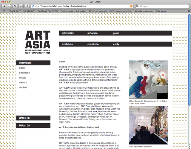
www.artasiafair.com
- digdre0
nice illustrations Skii
- digdre0
internship report.
gonna get it binded tomorrow + proper pictures!


- theplanet0
I made this last week.
<object width="400" height="300"><param name="allowfullscreen" value="true" /><param name="allowscriptaccess" value="always" /><param name="movie" value="
">Paul's Polaroids</a> from <a href="http://vimeo.com/user849811">Josh Stanley</a> on <a href="http://vimeo.com">Vimeo</a>.
- MSTRPLN0

- Nice!OSFA
- No, it's Adidas!invisiblechamber
- i love thatepete22
- yeah, slicksputnik2
- cool.akrokdesign
- akrokdesign0

- < now, i just need to come up with the web layout and the content for the site. :-)akrokdesign
- thanks for the 4th of july message akrok :)_salisae_
- :-Dakrokdesign
- http://icanhascheezb…invisiblechamber
- berry says hi too. lol. :-)akrokdesign
- molo0
- armsbottomer0
my first audio visualization. thanks to ukit for the song ;)