Show some recent work
- Started
- Last post
- 8,592 Responses
- Ampersanderson0
Over a month old, went on exhibit in Geneva, Switzerland.

- Ampersanderson0
- I'm new here.Ampersanderson
- make sure the url ends in .jpg or .gif. or .png or somethingJG_LB
- kidding man, i know. i'm not new here, it was a little late in the evening. thx tho.Ampersanderson
- sherm0
follow up to the look book.
- e-pill0
this is sorta recent, 2008. it is the king of all. i call it MONMON.

ENJOY!!!
:)
- DOPE!cosmoo
- whoa!invisiblechamber
- hot stuff manskii
- Posters or it didn't happenAnders
- what didnt happen?e-pill
- make something different!doesnotexist
- hey paul... go fuck yourself!!!edd-e
- Love it, e. Great work.blaw
- Enter response:
thanks brian!!
:)e-pill
- Sandder0


- WOW are these all paintings?uncle_helv
- wait, paintings? wait, am I drunk? am i ? i don't seem to believe thisdigdre
- very interesting idea to recreate paintings of lo-fi/poorly setup photos. i like it!_salisae_
- These are al photo's, but i had certain oaintings in mind. A bit pop art kind of stuff.Sandder
- paintings??
what? how?Meeklo
- moamoa0


- B-B-B-EAUTIFUL mate, loves it!!uncle_helv
- thanksssssssss, mate ;)moamoa
- you don´t see it but the etiquette is hot foil stamped ;(moamoa
- golden book?
typist - yes, but modified the A E & Kmoamoa
- Wow. Nice logotype.Ampersanderson
- full of the beauty! another winner..neue75_bold
- Solid!MSTRPLN
- neverblink0
Not really something to write home about (quick start card).. so much content so little space..
- ESKEMA0
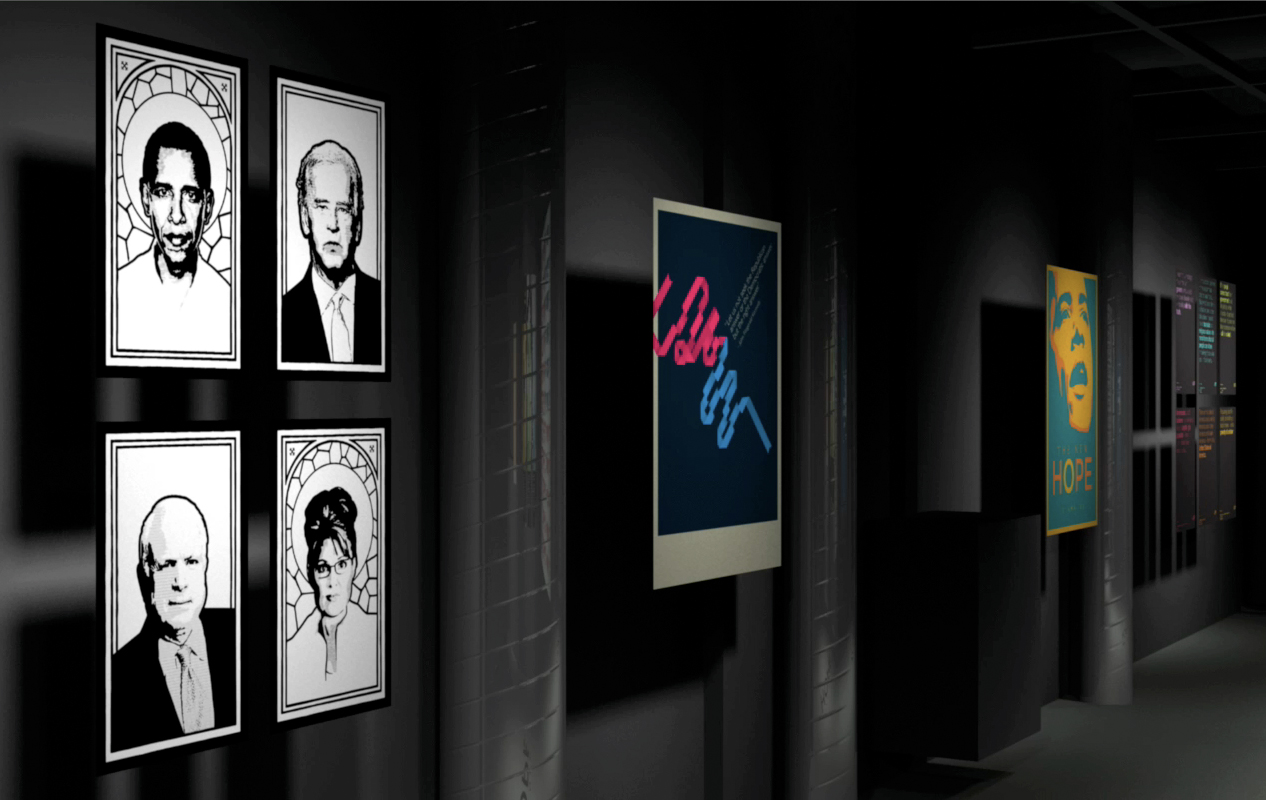
for a friend t-shirt

*Kant is my biological father.- kant=cunt?OSFA
- AH! don't think that it was that intention but that's a good one. :)ESKEMA
- Emanuel Kant?digdre
- nice copy of the obama poster style.doesnotexist
- @doesnotexist > I've been doing illustrations like these way long before obama. it has nothing to do with it...ESKEMA
- nor I thought of it while doing it. my style is not unique the same way the obama wasn't eitherESKEMA
- PunchDouble0
not all really new but i dont think ive ever posted any of my photos on here..
i really need to learn how to do proper post production on photos.. anybody have advice?


a lot more on my photoblog: http://blog.punchdouble.com
- looks good!
I use mostly the curves tool and the saturation tool in ps or apertureMeeklo - stay away from over sharpening your images! that looks pretty badMeeklo
- first pic looks like elton johndigdre
- nice pixs.akrokdesign
- FUCKING GREAT PHOTOS!!!!!janne76
- LAB Mode is your friend.
So is 'Smart Sharpen'.meemorize - thanks guysPunchDouble
- looks good!
- K4rl_D1x0
Check out my latest...
- Meeklo0
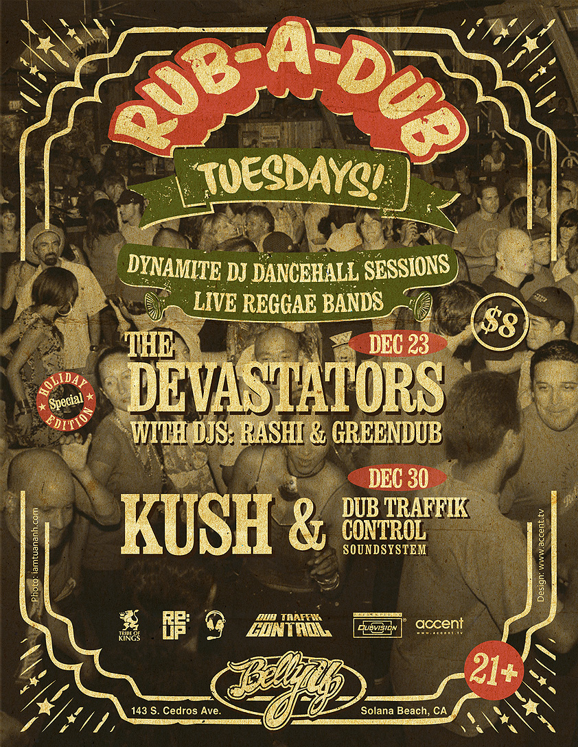
Poster for reggae/dancehall/dub event
- stewart0
it's that time of the year again!

- I like itMeeklo
- hotdigdre
- very nice, just the green button annoys me bit. especially the place.moamoa
- yeah, that button...major focal point.akrokdesign
- The green dot is part of a standard gift packaging called "Plume".stewart
- i like, but kern your 'r' and 'y' on merryskii
- kern or track? i don't see a problem between the r and y here.stewart
- ry » too close for something that's not a ligatureAmpersanderson
- JerseyRaindog0
Haven't got photos but just got the final thing delivered. Actual size 12pp A6 concertina fold. Christmas card mailer thingy for a jewellers.


- nice work as usual sir.OSFA
- yeah, looks good. :-) as always.akrokdesign
- Cheers you guys.JerseyRaindog
- flyingnowhere0
Still a work in progress, but its looking nice.
http://www.jerky.com/
Been using miva. It's a pain!


