Show some recent work
- Started
- Last post
- 8,593 Responses
- cls0


- nice. cute coloursJaline
- thanks jalinecls
- looks like a site 'mijn vriendin' would be interested in.. *sigh*neverblink
- solid work!jiaf
- brianbrooks0

- nice - shame about typeface - makes a tin look like the web.mistermik
- nice business cards toostewart
- awesome work and site.Jaline
- yeah, great work!akrokdesign
- s'nice.gramme
- I like your square gallery work a lot!Meeklo
- thanks!brianbrooks
- brianbrooks0
<img src="images/folio/ptc_teacans.jpg" alt="Portsmouth Tea" width="640" height="399" /></div>
- neverblink0

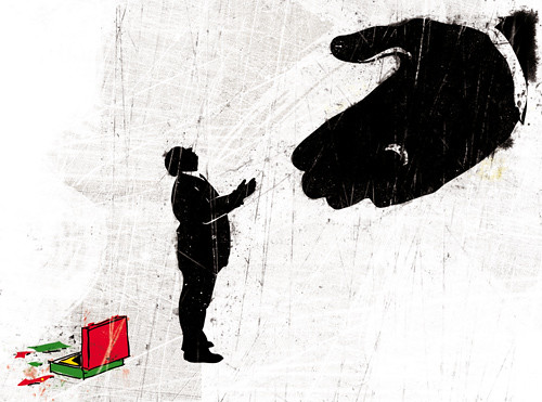
- I hear femurs are the new skulls...neue75_bold
- skulls are back, because of an overkill of humans with animal headsneverblink
- Nice Neverblink. You have of course walked into a whole shitstorm about skulls, but all the same... nice work!Horp
- thnx TIm.. I'm thinking about a skull a week, just to mess with people who are fed up with skulls..neverblink
- skulls will never be out of style..
this looks pretty original though.. it reminds me of someone in real lifeMeeklo - don't know who yet.. hahaMeeklo
- akrokdesign0
work in progress...

- Sushi...I'm getting hungry;)ukit
- alaskan rolls. hmm. salmon on top, baked. delicious.akrokdesign
- this looks delicious man. is this for a bar in LA? I'm so hungry nowMeeklo
- the creative recruiter wanted menu design. so, i made one, yesterday. :-)akrokdesign
- kodap0
- Sweet. This a commission piece or a personal?Horp
- illustration assignment, out next weekkodap
- tax time? lol.akrokdesign
- Corruptionkodap
- :-)akrokdesign
- Horp0
Started this picture about 18 months ago, thought I'd fucked it up so I put it away. For some reason I dug it out today and painted over it and I'm quite liking where its going now..

- Sorry for shit angle but the light reflects off some of the paint straight on.Horp
- good work. where's the little lady in the drawer?magnificent_ruin
- I made love to her to death and buried her body in the sea.Horp
- nice work.akrokdesign
- droolsdigdre
- nice.Jaline
- Dali?OSFA
- akrokdesign0
vw park assist™ - commercial
- cute.. except for the rounded font at the end. totally off-brand.anxiousarms
- thanks.akrokdesign
- akrokdesign0
<object width="400" height="300"><param name="allowfullscreen" value="true" /><param name="allowscriptaccess" value="always" /><param name="movie" value="
">vw park assist™</a> from <a href="http://vimeo.com/akrokdesign">akrokdesign</a> on <a href="http://vimeo.com">Vimeo</a>.
- kult0

- very nice. where'd you get the gorillas?anxiousarms
- The wildkult
- u should work for National Geographic.anxiousarms
- hahahahaMeeklo
- duggdigdre
- dopeliveslow
- hah. great work!akrokdesign
- Nice, I like the aesthetic you're using -- especially the colors.dMullins
- I really like this! nice!MSTRPLN
- strong.gramme
- ill
Cabein
- kodap0
- lovely work as always kodapComplexfruit
- Thnk YOU!kodap
- niceedigdre
- Yeah, lovely jubbly.Horp
- dig itmagnificent_ruin
- do you have printsdigdre
- nopekodap
- great work.akrokdesign
- ohh, I really like the illustration of the girl...neue75_bold
- really like this! :)PonyBoy
- erikjonsson0


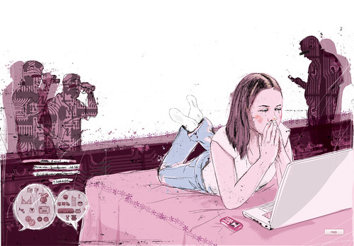
I know spacescapes and smoke does not appeal to the general public here and is dismissed as kdu shit but to my defense the project was started last summer and has just recently begun to see the light at the end of the pipe
- I don't think you need to defend it as long as it's done well. I especially dig the Music one.Point5
- yes, screw them. personally I dig this style. looking good, well done.gung_hoek
- needs boobsPupsipu
- I like this.Jaline
- I dig it.Complexfruit
- I like the TV texture of the bottom one. They are much nicer than the fodder you refer to.Horp
- Do you have a wallpaper or something of the second one?Jaline
- Nevermind, it's big enough, I think. It's now my wallpaper.Jaline
- niceakrokdesign
- Wow! These look really good. How do you go about creating a spacescape like this anyway?TraceTheLines
- pick out 5 clean space pictures of the day from nasa, do some masking with circular gradient tool, blend it together and smack a fitting gradiant map ontop in color dodge.erikjonsson
- i like it.tank02
- skt0
I can honestly say, all the bad things that ever happened to me were directly, directly attributed to drugs and alcohol. I mean, I would never urinate at the Alamo at nine o'clock in the morning dressed in a woman's evening dress sober.
- LOKi0
poster for my buddy's exhibition

- I like the feel of it.Jaline
- The only thing that bothers me is the large, white circle on the top left.Jaline
- Jaline, that's the O of Omenstewart
- Yes, that. I thought it was also a moon or something by its positioning. My eye is drawn to it.Jaline
- I agree Jaline... it makes it unbalancedAmicus
- so do I, now that you mention it. oh well... printed and done.LOKi
- tank020
Working on 10 illustrations for a book.
I have to give advice about being a graphic designer.
Divided in 10 topics.
- And the name of the image is "Be sub...".
Who's the target audience?stewart - target audience, tsjees u dunno, whoever buys the book.
I just have to give my advice...tank02 - btw, i don't really belive in target audiences...ah look another tip...tank02
- hm.stewart
- Jup.tank02
- If you don't like, just say it.
Typical dutch, beating around the bush, tsssk ;)tank02 - if you posted the other 9 topics too you'd have the 1400. but that's as irrelevant as "target audience"stewart
- No, that's Minnesota Nice.
We're mostly up-front.stewart - I really like it. And I need to learn some more 3D text one day. I finally got Cinema 3D.Jaline
- well there are going to be 10 totally different styles, because
thats also a topic, diversify...tank02 - I do like the image. But the text "Objective" bothers me a little.stewart
- explenation is to be objective about your own work, in the way that you sometimes must learn to take distance...tank02
- i meant in my sec reaction..
'I dunno'tank02 - i like it.akrokdesign
- I can dig it..neue75_bold
- And the name of the image is "Be sub...".
- stewart0
I made this poster tonight for a friend.
Lecture about a crucial moment in the year 1946 (religious conflict and seperation) for the The Apostolic Society in the Netherlands.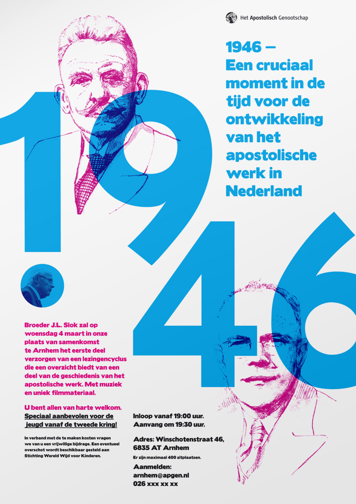
- liveslow0
updated with your suggestions (thanks)

- non0
Quick little band poster I made (for my band).
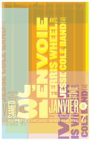
- really nice work!jiaf
- V Niceset
- Well, visually its very nice but in terms of presenting info its pretty bad actuallyset
- That's because you can't read french silly!non
- irrelevant! Just very hard to get any info from this poster, sideways text, same tones, pretty though.set
- i'd spend the extra time to figure it out. really nice.Chief
- Hehe, I know set. Thanks for the comments. I have to say that when creating this...non
- I was thinking more form than function. I still think its readable though.non
- great stylingskii


