Beer Label Crit
- Started
- Last post
- 21 Responses
- MarleyMarl1
What does the brand stand for? What is its personality? What is Stod Fold? What is the significance of your solution and how does it connect to and further enhance build the Stod Fold brand?
For me, it's a nice typographic solution for a product that feels so disconnected from the brand that it lives under.
- Chimp0
Love the “lined” typography. Could you tell us a bit more about what kinds vibe you wanted to transmit and the customer?
- faxion2
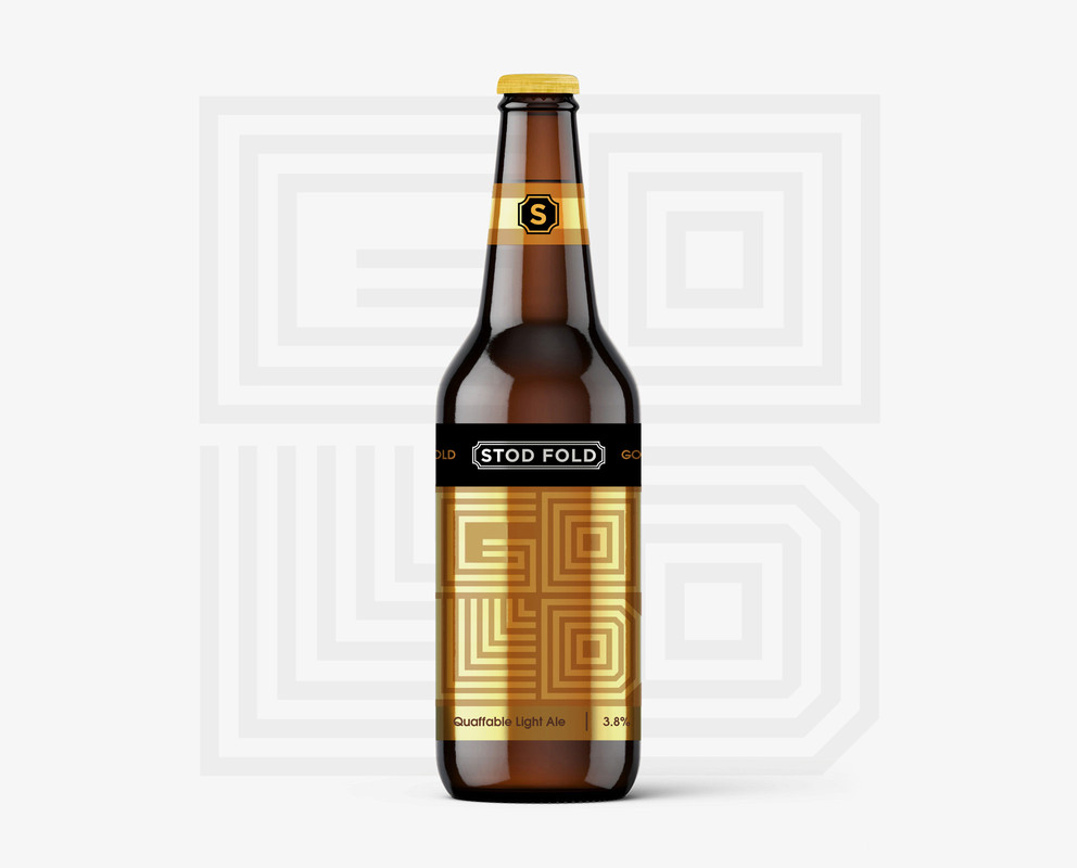
Cheers fellas, this is an existing brand so the logo remains untouched (main marque and 'S').
The name is directly taken from the country lane where they reside.
Mono & Nairn hit the target.
- AQUTE1
coffee / energy drink cool
- monospaced3
G was better when it was all filled in. The big gap is not as successful to me.
- I think the sameoey_oey
- Agreed.MondoMorphic
- Personally I like that it’s a graphic as more than type. That it doesn’t “read” instantly is good. If it’s too easy it’s less interesting.monospaced
- https://imgz.org/i8j…Nairn
- bingo Nairnmonospaced
- +1 to mono's comment. I liked it more when it was more textural and less literal.noRGB
- faxion4
Yeah the G is not working for me
Tweaked the R too
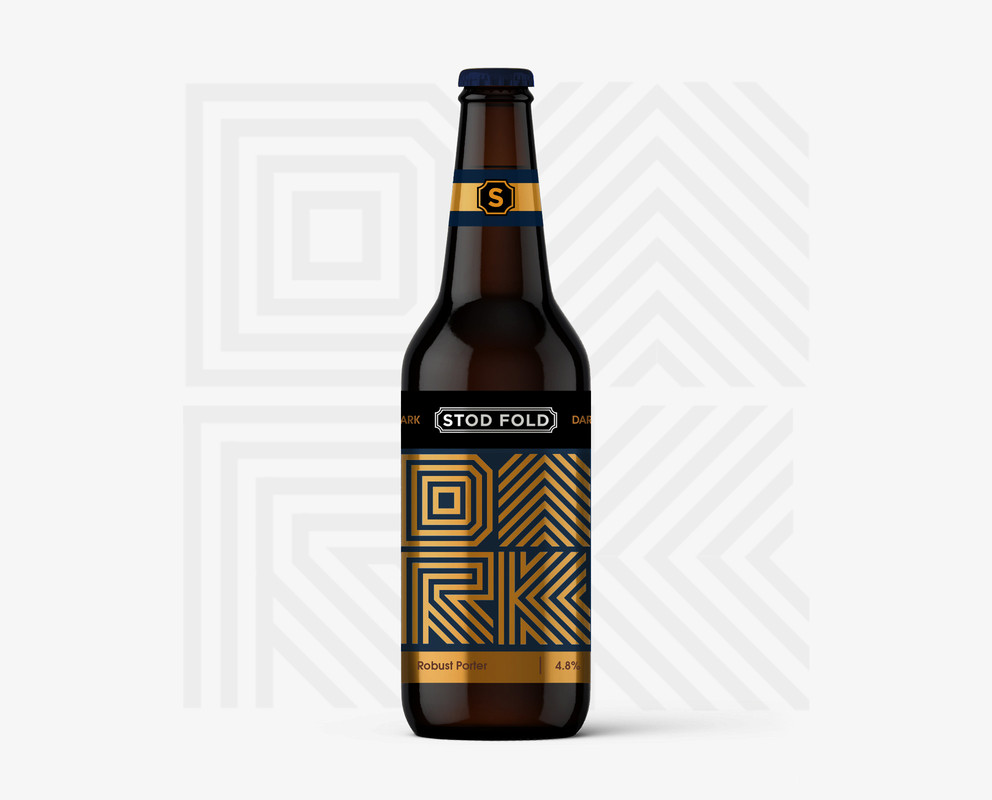
- this R is betterfooler
- I like the R too, but the G I think can fill in and still be successfulmonospaced
- "dork"StoicLevels
- Definitely, much better on the R. That was really the only issue I sawMondoMorphic
- add another lined to the G from the top to the left wall on the inners fill that wack space like you did with the L maybe even add a dot to the LAQUTE
- I like these!utopian
- I don't liuke gold at all but I do like "dork". Still... Stod Fold pops way too much. Make it more subtle somehow. I think Gold should look like Dork.StoicLevels
- Also, instead of navy blue go with black or the darkest navy blue you can find that looks like black, basically.StoicLevels
- And that S seal looks amateurish and basic. Add some detail!StoicLevels
- Im taking you off the project for the weeken. come back on monday with a fresh set of eyes. imm not paying you to crowdsourse. fn amateur manStoicLevels
- https://memegenerato…StoicLevels
- o_0monospaced
- dbloc2
Looks great. What's the story behind the name?
- monospaced0
btw that is a convincing metallic label effect from very little going on. I always struggled with that in presenting. But this is communicating well.
- cassiellux1
Really nice man!
- doesnotexist1
reads as coffee, not beer
- Hayzilla2
Lovely. Any crits would just be nitpicking for the sake of it.
- renderedred0
i like this. for me the only letter that wasn't clear is G.
- but you can figure it out based on context so really it’s a non issuemonospaced
- misterhow0
I don’t like the black rectangles. I think that part of the label should match the color bars of the neck banner.
- fooler2
Honestly they are very pretty and look very high end. Almost too fancy for a local brew pub.
What's going on with the leg of the R in DARK? Did you mean for the bottom 45° line to extend over the stem line? I think that should be clipped off.
And my BIGGEST critique ls an American Pale Ale should be more than 4.0%!!!!!!!!!!!!!!!
- Yeah, 4.0% is bud-lite territory. This beer will be decidedly weak. Sierra Nevada's Pale Ale is 5.5% I believe.section_014
- Nairn1
I prefer this direction to the contours, but the train-station sign-esque branding itself doesn't seem to gel well with the modern forms.
One irksome point - the singular crossing-over line in the R. Seems inconsistent. Also, like Simon, I read 'Cold' not 'Gold'
Nice work!
- This is a terrible idea, but: Is there anyway to make the line forms rail-track like, somehow?Nairn
- Signed, that irritating fuck in marketing who throws shit ideas into the fray and you're expected to see them done no matter how useless the effort.Nairn
- lol walk awaymonospaced
- oey_oey0
this is really good.
the writing is totally okay.
specially if it's going to be sold in shelves where's a label with price, brand and sort.
so, it's just eye educating the consumer.can't stop looking at it.
- monospaced4
I love the direction. Kudos on designing a modern label and still making it feel like beer and not an energy drink. It’s not easy to do! I also expect the type of beer spelled out to be a little bigger but this is really nice.
Did you consider “PALE” as well as “WEST” in there?
- cheers mono
these are existing ales, but others can be added - PALE is an optionfaxion - For sure man. I thought pale would work for the American Pale Ale just as well as West.monospaced
- Seriously love these though. There’s also room to throw in a little Easter egg ;)monospaced
- ++Krassy
- cheers mono
- palimpsest0
Nice alternative. You've managed to keep the same feeling from the other version while switching it up. I think the light ale needs more contrast like the porter. The APA and the hop ale have appetizing colors that make up for the lack of contrast.
As a beer drinker, I would pick this one over the version since it has more of an identity.
- Projectile2
Awesome. However you'll need to clarify in normal writing as well, this I can guarantee
- it is on the black logo band, but is it too subtle?faxion
- I could see it on the bottom right away without zooming in. It's usually where the info is placed.palimpsest