Beer Label Crit
Beer Label Crit
Out of context: Reply #16
- Started
- Last post
- 21 Responses
- faxion4
Yeah the G is not working for me
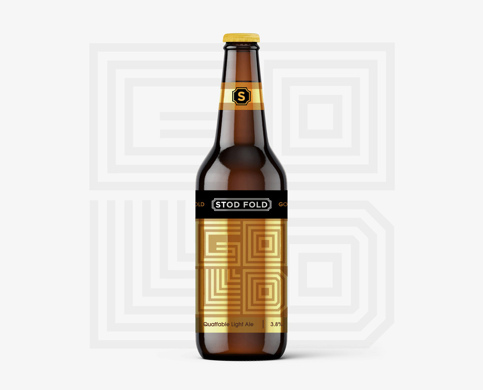
Tweaked the R too
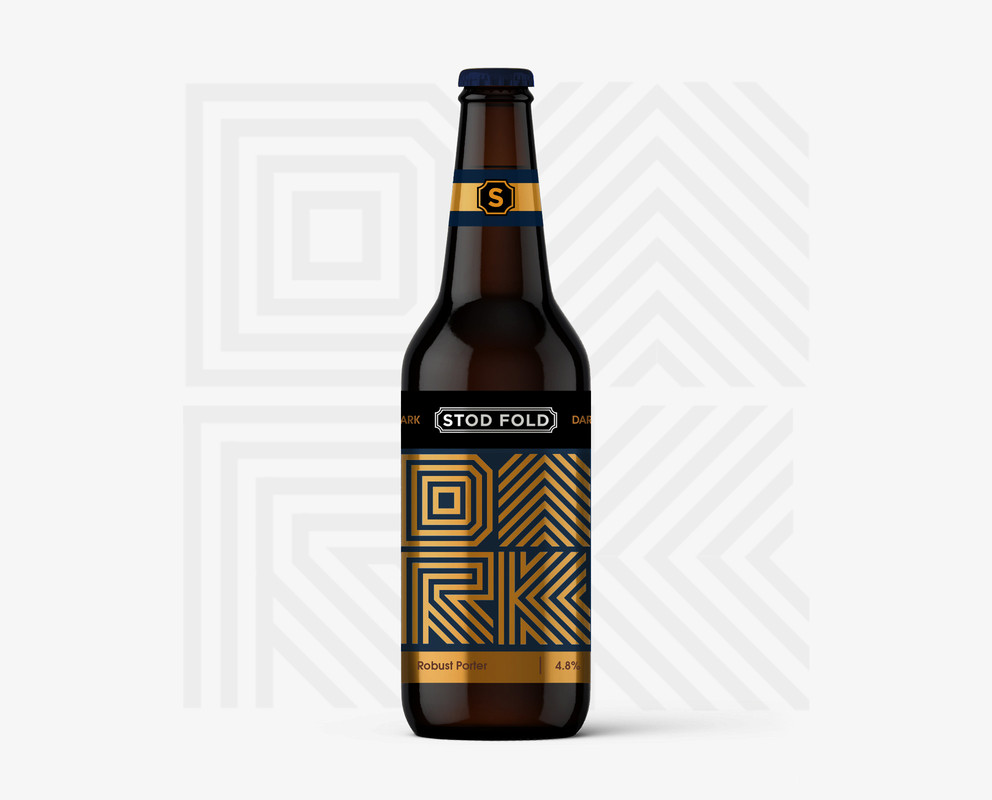
- this R is betterfooler
- I like the R too, but the G I think can fill in and still be successfulmonospaced
- "dork"********
- Definitely, much better on the R. That was really the only issue I sawMondoMorphic
- add another lined to the G from the top to the left wall on the inners fill that wack space like you did with the L maybe even add a dot to the LAQUTE
- I like these!utopian
- I don't liuke gold at all but I do like "dork". Still... Stod Fold pops way too much. Make it more subtle somehow. I think Gold should look like Dork.********
- Also, instead of navy blue go with black or the darkest navy blue you can find that looks like black, basically.********
- And that S seal looks amateurish and basic. Add some detail!********
- Im taking you off the project for the weeken. come back on monday with a fresh set of eyes. imm not paying you to crowdsourse. fn amateur man********
- https://memegenerato…********
- o_0monospaced