kerning on logo
- Started
- Last post
- 11 Responses
- somebody78
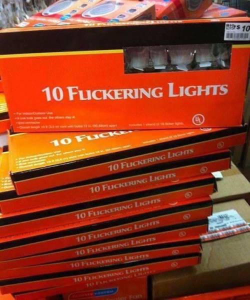
hi all,
wondered if I could get some fresh eyes on a a logo type I'm kerning, here it is:

- Nairn2
I'd possibly just nudge the F.U a smidge right to make the space between the U&S a tad smaller. But then if you do that the space between F&U might need tweaking down too, and then if you do that you may as well...
- http://concep3.com/d…Nairn
- ^ thisrenderedred
- I should have not clicked it, my eyes hurt now...********
- Joking aside, it is actually 'fused'.
:|Nairn - LOL!********
- ********0
hm...for me the S is too close to the E cause of the curves, so I would position the S slightly, like a pubes hair tiny bit closer to the U
- somebody780
cheers all, I'll have a play.
- Nairn0
CALLING HANS
HANS TO THE FOYER
- MrAbominable0
the spacing is so tight as to almost make kerning a non issue. Some of this is going to depend on scale. the f-u; u-s; and s-e all have different beats so pick one and correct to it.
at the risk of asking the obvious, why aren't the letters "fused" together thus eliminating your kerning issue and solving further with the logo?
- because there's already a logo that does just that.Gnash
- https://www.undercon…Gnash
- Gnash and monospaced gave him feeback only three days ago.********
- https://www.qbn.com/…********
- sorry chaps, yes, I decided to space them out because when tight together I didn't like how the f sat. My bad, should have responded to the original post.somebody78
- I'm lost here now, is it the same logo/company?********
- tnx soundofreason...was having a confusing déjà vu moment for a second.uan
- Gnash11
you should at least "fuse" something on the logo.
- uan9
kerning upside down is a good trick:

- asnj
I prefer this version!******** - +1 for the tip!renderedred
- That IS a good tip.CyBrainX
- flipping a logo back to front is a good trick for checking weighting, especially when it's necessarily imbalanced.Nairn
- artists have been doing this for centuriespinkfloyd
- Does anyone have a badge for pinklefyod?Nairn
- good ideaSimonFFM
- i could rotate my entire screen, but i am not on mobile, so my brain had to render.api
- ^^^ https://cdn.roostert…pinkfloyd
- I've been doing typography standing on my head for years now********
- asnj
- misterhow-3
Too soon?

- Michaelwillis-1
Each typeface requires its own kerning, modifications and attention to detail. So it's important that you make a decisive choice on the typeface you will work with at an early stage inside the plan procedure. Rolling out a minute ago improvements can fundamentally alter the course of your plan and additionally the kerning that particular typeface needs. Rushed, last-minute kerning is rarely successful kerning, so don't put yourself in that position. https://www.courseworkempire.co.…
- famitofu-1
Broken smile, tired eyes. I can feel your longing heart
Call my name, http://basketballgames.io from afar. I will bring a smile back !