WPBakery Plugin for WP - Help
- Started
- Last post
- 8 Responses
- mg33
Anyone here build Wordpress sites with the WPBakery Plugin?
I'm trying to do a column layout that is as follows on desktop:
[image 1] [heading and text 1]
[heading and text 2] [image 2]
[image 3] [heading and text 3]
[heading and text 4] [image 4]On mobile, this ends up being the following:
[image 1]
[heading and text 1]
[heading and text 2]
[image 2]
[image 3]
[heading and text 3]
[heading and text 4]
[image 4]And I need it to be this on mobile:
On mobile, this ends up being the following:
[image 1]
[heading and text 1]
[image 2]
[heading and text 2]
[image 3]
[heading and text 3]
[image 4]
[heading and text 4]Anyone know how to do this without major customization of code?
- nocomply2
Sorry, don't know exactly how to do it mg, but issues like the one you brought up are exactly why I don't use and don't recommend that plugin. I feel your pain!
I've had much for luck with Beaver Builder. It allows for a lot more flexibility and customization, including the "reverse stacking" you're looking for. The team is really good with their support, too.
And no, no one is paying me to say this. I just like to share good, battle-tested tools.
- ********1
add custom css to the page, add classes to the sectons, this should be hard to do id think
- rootlock1
I'm sure it has built in responsive utilities to hide divs based on media queries. ie have two images one that his hidden on mobile and one visible on desktop. Bit of a hack. I would use flexbox to reorder based on a media query.
- fate1
Pockets and rootlock have the right answers for you.
I've done exactly the same thing - for shit I want hidden, give the element a class name of "show-on-mobile" or something like that.
Very easy to accomplish with just adding a class and a little CSS media query.
- And yes, specifically using VisualComposer from WPBakery.fate
- +********
- mg330
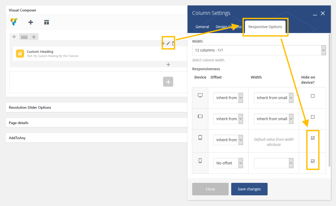
Found an easy way actually even if it's kind of a shitty hack. In the Responsive Options settings for columns, you can hide columns from a device. So, can layout my desktop ones with the pattern above, then hide them on mobile and just do a single column stacked the way I need it for mobile.
Only doing this for three homepage items, so not a huge deal. I'm actually just building a prototype in Wordpress using an all-purpose them I know really well, so our tech team can use it for reference when they custom build in Drupal.
- ********3
dont forget we have a wordpress discussion thread to keep qbn clean...
- now someone consolidate ganja threads for fuck sakes********
- +++GuyFawkes
- ++********
- now someone consolidate ganja threads for fuck sakes
- Cosmodrome0
If it uses Bootstrap columns, can you use the push / pull classes for the medium - large views?