WWDC 2013
- Started
- Last post
- 220 Responses
- monospaced0

Decent icon, but doesn't relate to the rest. Whomever made this one should have done ALL of them. One artist = consistency. Ugh.
- monospaced0
Dear Johnny Ive,
What were you doing the whole time?
- Continuity0
Apple should have hired this guy:
- prophetone0
iOS7 = iPhone 4 and later, iPad 2 and later, iPad mini and the 5th gen iPod touch
- prophetone0
Cpt. Cook Closer: "I'd like to close this morning with a reminder. That our goal at Apple is to make amazing products that our customers love. Really great products that enrich peoples' lives. The words you saw at the beginning of the show are more than just words to us. They are the values we live by. They drive us. You've seen them reflected in our products over the years ... And you'll continue to see them reflected in the products we do over the future."
- utopian0
It looks like someone smeared shit all over the screen.

- Your shit looks like that? What are you eating?Wolfboy
- looks like the leftover milk after eating a bowl of fruit loopsmonospaced
- < hahaukit2
- monospaced0
iOS 7 design inspiration:

- monospaced0
Anyway, the Store is now back up with new stuff.
- Pupsipu0

The old one doesn't look dated. I haven't looked at it much, so may be more objective.
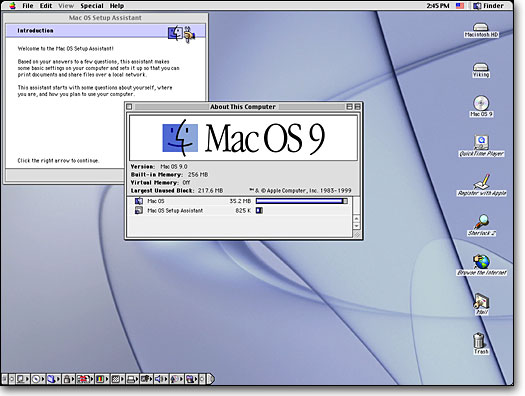
Unfortunately I'm old enough to remember the switch from Mac OS 9 to OSX. OSX looked great in screenshots, promised the moon, etc. But in practice the UI was worse, the Aqua look wasn't better and eventually OSX went back to platinum/patina simple shapes and got rid of the Aqua overload.

It's probably some art director switch or designers got bored of the old look. Or they're trying to advertise iOS7 as something new. They won't let it stand for long, they have to look at the thing all day and will notice it's not all that.
- err0
Helvetica Neue. I always liked it for print and static design. But I have problems using it for anything dynamic.
- utopian0
iOS8

- Crack_Junkie0
Isn't this all that really matters? > http://wwdcparties.com/
- inv0
Apart from the stiched leather and green felt (+ some other skeumorphism) I do not understand how the old gradients and shadows cannot be considered "true to form" and why they had to change everything.
They should have done a thurrow cleanup, but not gone this far. In my opinion there is not better way than to utilize gradients and shadows/depth to layout graphical elements on a computer screen.
Seems like the apple designers got cocky and though they could pull of some kind of minimalizm-bauhausish-überdesign and ended up with an emperor without clothes. In my experience, this is not how real design works.
If people think the old style got boring, then I think that will happen exponentially faster with the flat style, which in my opinion is far less expressive.
- utopian0
Apple is now playing catch-up with Google for the first time...
- Really?inv
- yeha, Google's global developer's conference and computers are much bettermonospaced
- no.rosem
- it's the first time someone is in the same ballpark — maybe.rosem
- utopian0
Apple should have hired this guy:
- inv0
Best illustraded in the form of chairs =)

vs

The first is "true to form" and stripped of everything unnecessary. I would still own the latter which just looks better. Maybe a far of comparison but you get my point =)
- TheGreatGlorpo0
You are all acting like a bunch of magnificent dildos. Seriously, if this is such an affront to your design sensibilities, go buy a landline phone, and start mailing letters more to communicate with people.
Like you're gonna fucking die to have to use this update. Christ.
- we're designers critiquing design, this isn't about adoptionmonospaced
- GeorgesIV0

- < thischrisRG
- Right. That's what I've been saying. It's not even consistentmonospaced
- This mutha fucking fanboys!utopian