WWDC 2013
WWDC 2013
Out of context: Reply #208
- Started
- Last post
- 220 Responses
- Pupsipu0

The old one doesn't look dated. I haven't looked at it much, so may be more objective.
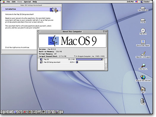
Unfortunately I'm old enough to remember the switch from Mac OS 9 to OSX. OSX looked great in screenshots, promised the moon, etc. But in practice the UI was worse, the Aqua look wasn't better and eventually OSX went back to platinum/patina simple shapes and got rid of the Aqua overload.

It's probably some art director switch or designers got bored of the old look. Or they're trying to advertise iOS7 as something new. They won't let it stand for long, they have to look at the thing all day and will notice it's not all that.