Logo Criteria
- Started
- Last post
- 84 Responses
- fiver0
yeah, this could be a nightmare to print at small sizes. you'll likely have to do several iterations for a style guide based on scale...
- SoulFly0
We can't wait until tomorrow to see this.
Post the new files!
- syst_m0
- love the 60's design feeling...vaxorcist
- so good!oey
- why not use this as direct reference? so gooddoesnotexist
- oey0
Right now I'm doing some variations over albums letters, the ones uploaded in colors, to apply the spirals like above but taking in consideration the stroke size.
Awaiting feedback from client.
Gonna keep you updated and will upload the experiments later.
Thanks!
- it seems like you need to slow down, and work on refining a legitimate idea...sine
- that's true sine. too many spirals and too many ideas.oey
- but I've got this specific idea I want to develop to combine things in a homogeneous wayoey
- for the vinyl label. both labels together and separately. stamp. stencil. stationery.oey
- refinement, work, test prints...oey
- pig0
KEEP THE SWIRL, KEEP THE SWIRL, KEEP THE SWIRL.
When I first opened the post I thought this was your submission:

Which looks very 1998, but has bags of character.
This, whilst well aligned, bold and geometric, has no character whatsoever. It could be for a kids TV show, stationery shop, or expensive homeware company selling overpriced chopping boards:

- pig0
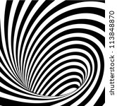
Cleaner version of i_monk's vortex thing:
- pango0
:( I like the old logo... like pig said, lot of characters. But the old swirl's killing it for me (bad way).
I would try to keep the slanted directional elements too.
It's always tough to decide how much of the old characteristic should you keep.
- pig0
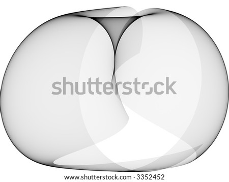
These are a little OSX-chic, but how about cleaner swirls:

- pig0


- Fatal0
I wouldn't use a swirl for records brand, first thing that came to my mind was Interscope records, they have always used the swirl everywhere
- newuser0
His original was more organic and fun and your simplifications lost that sort of. You can't get that same feeling by simplifying.
- stoplying0
Looking at 3 pages of swirls makes me have to go TINKle.
- oey0
UPDATE!
I talked with the client, I used the advice I received here to do so, and we agreed on extra time.
First for him to decide what he really wants and second for me to experiment and develop a better concept.Yesterday and today I had really busy days at my regular job but I used my free time to play a bit with what Ive learned here.
I still have things under development.
It's too many things at the same time, specially drawing swirls.First examples follow both Amicus and Fresnobob's advice.
Changing the K and !.
Removing the swirl or warp or whatever.
A different swirl (just as an example)
Thanks guys!


