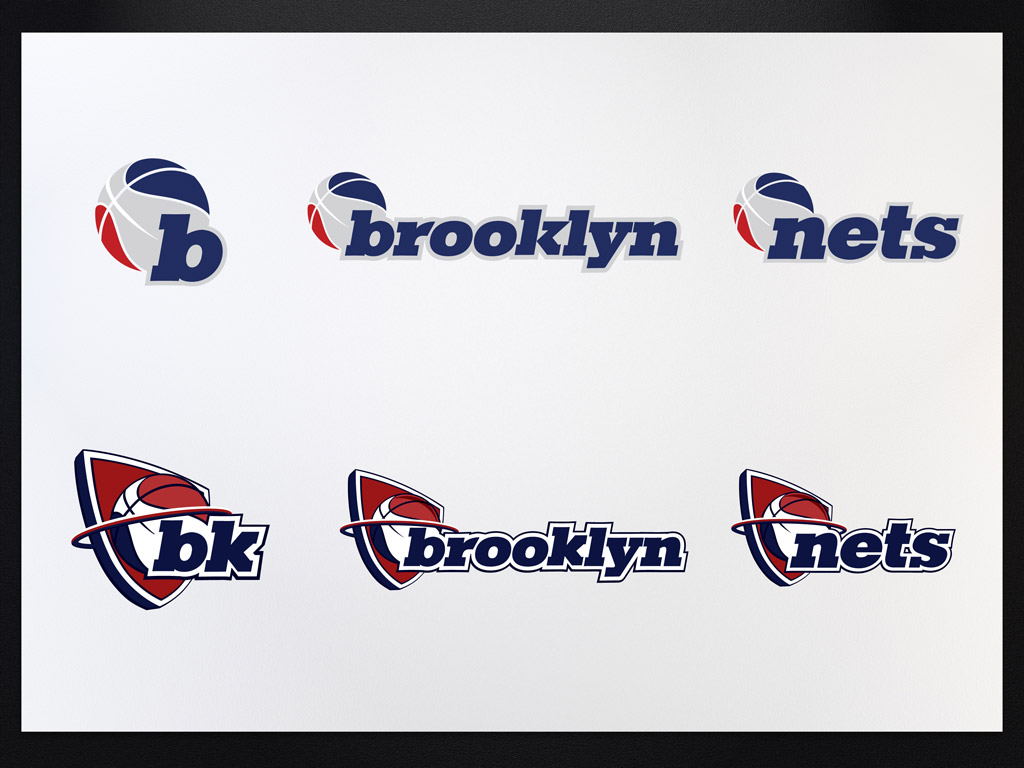
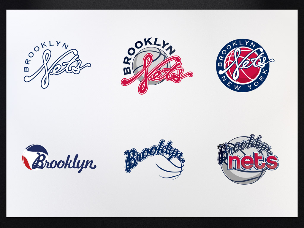
Brooklyn Nets Logo
- Started
- Last post
- 68 Responses
- gramme0
Everything but net.
- It's crap.gramme
- haters gonna hateyeeblazer
- baiters gonna bait.CanHasQBN
- maters gonna mate.CanHasQBN
- skaters gonna ollie thisprophetone
- vegetarian gonna eat a salad.grymes
- hovas gonna pull ovasprophetone
- It's not crap in my opinion.waterhouse
- prophetone0
bee are double oh kay elle why en
- identity0
The guy can rap. Why would branding or architecture be any harder?
- set0
I like he one on the right. It does the job.
- dbloc0
I was waiting for this thread.
- desmo0
The Nets logo seems like its still in the BW concept stage. Where are 29 other options?
- Maaku0
What do they mean, HE designed the logo?
- http://www.observer.…albums
- Did he really sat down to sketch? That's what I'm asking....Maaku
- akrok0
crowd-sourced?
- prophetone0
if you're having color problems i feel bad for you son i got 99 palettes and pantone ain't one?
- zoozoo0
good start should be tweaked a little
- SHAMAN0
I think this is a great dissection of the new logo by Jon Contino.
- utopian0
Brooklyn Timeline in da' Haus
- flashbender0

- highschool?attentionspan
- Boston Bruins. Hockey.flashbender
- akrok0
do you want to work for a hip and cool company. (pays zero) but you will get the ball in your court and an opportunity of a life time.
b.
- identity0
this is from that hipster designed logos thing, yes?
- letterhead0
Is it an optical thing or is that "B" not centered correctly? Center that fucking B!!!
- i think it's an illusion because the lines in the bball are heavier on the rightjayliquori
- futuremongolian0
the circle is nice, the shield is terrible, and a really bizarre choice as it's based on the Jersey logo.