Brooklyn Nets Logo
Brooklyn Nets Logo
Out of context: Reply #26
Started
Last post
68 Responses
CanHasQBN
0
http://www.timothypmorris.com
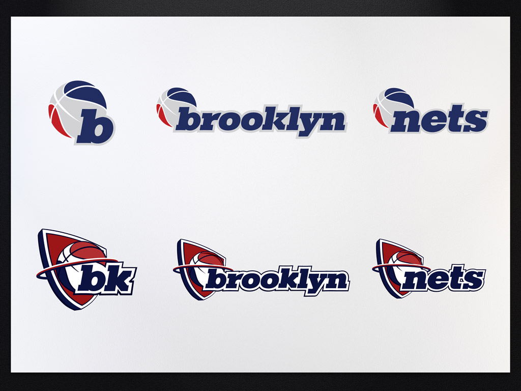
Rejected concepts
CanHasQBN
0
Permalink
Upvote
Downvote
Flag
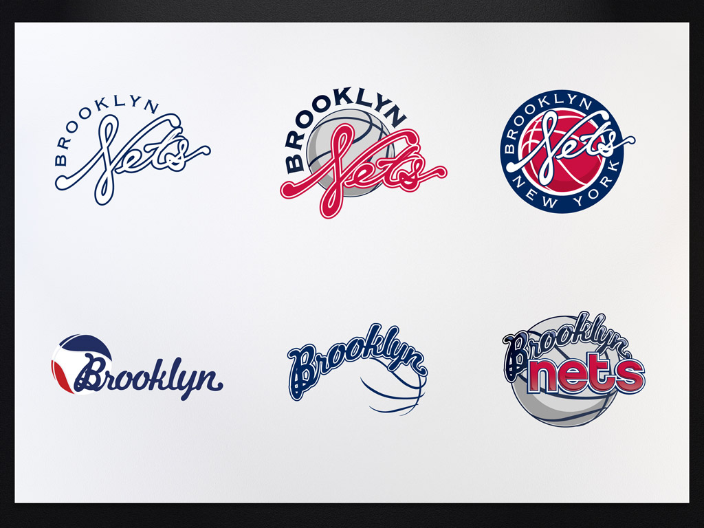
I like the top right execution on the second image.
CanHasQBN
Bottom left on 2nd image
DaveO
bottom top looks too much like Jets.
dbloc
the second looks like baseball with the scripted type. Perhaps im too used to yankees etc
k_temp
Glad they got rejected. Ugly.
non
I keep reading Fets or Jets
fresnobob
Show [[ numHiddenNotes ]] more notes
Add Note
Save
Cancel
View thread
Prev
Next
Prev
Next
Log in
Register
Broadcast
Filter
Jingle
Made with
❤
by Krop
Build a Portfolio Website