Windows 8 logo
- Started
- Last post
- 69 Responses
- feel0
hmmm are they heading to that single color identity scheme like apple has in its products? i like it, even looking awkward as fuck, keeping it simple is a good idea.
- dbloc0
it was kerned by an 8 year old.
- A windows 8 year old********
- Just for clarification.********
- windows 8 pro kid to be extra clearmonospaced
- A windows 8 year old
- fresnobob0
No way this is real
- ETM0
There has got to be 20-30 different Windows 8 logos out there between different builds and demos, along with public speculation. I wouldn't believe any of them until it goes RC or gold.
- Amicus0
"The problem with Microsoft is they just have no taste. They have no taste and I don't mean that in a small way, I mean that in a big way"
– Steve Jobs
- utopian0
Is it April 1st already?
- SteveZissou0
This can't be the real thing...another Gap style marketing trick, surely.
- monospaced0
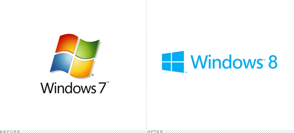
I count 4 windows, not 8
- 1 window, 4 panes?Amicus
- fine, 4 panes, not 8monospaced
- Double paned windows.ETM
- lolmonospaced
- ukit20
It's fake
Not real. Another fake news story.
- ********0

- popovich0
Behind the scenes:
http://windowsteamblog.com/windo…
- i_monk0
Update:
http://www.underconsideration.co…Gee, the lighter blue totally saves it, don't you fellows agree?