miami marlins
- Started
- Last post
- 35 Responses
- utopian0
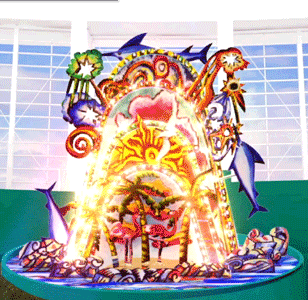
Fouty?
- albums0
of all the things I've seen on this site, I feel like that needs to be killed the hardest with the most fire.
- OSFA0
What a fucking shame... and to think there are people her ein Miami that are 'getting used to it' and 'starting to like it'. Fuck!
- zoozoo0
i like the logo now, the uniform and usage need tweeking but yeah im starting to like it. And Im not in Miami
- albums0
it, like the logo comes across very, how should I say...

- teh0

- teh0

- CygnusZero40


- That worked out well. Just click them for better versions of the logo.CygnusZero4
- dbloc0
horrible.
- jon_d0
I am trying to just accept it. The designer (Loria) said that he chose yellow to represent the sun, orange the sunset and blue for the ocean. I see what he did there but the 'M' on the helmet as it was displayed at the unveling is WAY too big. And honestly going to this futurist style instead of the english mark style lettering is a bold departure, if the uniform proportions can be modified to include a more minimal, streamlined futurist approach using the colors... the style can be somewhat manageable.
- teh0
It makes sense that it does have alliteration but when sport teams do this its because there are more than 1 team in the state. Is there going to be another team in Florida? In the current economy and the housing crash in Florida I'd say NO!
With how bad Florida is financially anything is better. Wish them the best! Its so super gay and festival-like I can't see it making thing worse unless you gotta wear those uniforms.
I'll have to keep an eye on the seats this season. I wonder how much tickets are?
Did the Florida Marlins play in Miami? Miami is the wealthiest probably of all Florida.
- BattleAxe0
barf

- OMG, this is fucking awful.Continuity
- some of the player arent smiling..and the ones that are..arent really smilinguncannylikeness
- look at the bellies on these 'athletes' hahaOSFA
- jon_d0
so in other words, they are bad and need more work.
- nocomply0
wow.... just... wow.
And that's not a good wow.