Logo Critique
- Started
- Last post
- 29 Responses
- domacle
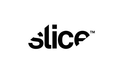
For a DJ duo called Bandit Brothers.
Thoughts?
Constructive feedback welcome - thanks:

- ********0
- fooler0
i read it as "Band of Brothers" needs work on the "IT"
- same herebjladams
- x2sofakingbanned
- +1********
- this might be caused by the 'TM' - move this to the bottom right of the logo..? i like it :)SlashPeckham
- domacle0
Yep. Sliced and diced that badboy.
- monospaced0
Hmmm, reminds me of this:
http://www.qbn.com/topics/655650…I think it's alright, but as you already know, conceptually I need an explanation before I just accept the slices. Does that read Bandit?
- fooler0
™ needs to go at the end
- <<<<<<<<<<<<<<<<k_temp
- yahakrok
- tm NEEDS to be registered. it can go wherever you want********
- no, it doesn't have to go anywhere specific whatsoevermonospaced
- ™whatever...
I know there is no rules to design but it looks weird at the frontfooler - i read it as "the band brothers" at first glance.sea_sea
- k_temp0
The ligature in "IT" amkes the word illegible, remove it so it can be read as two separate letters.
- ********0
Chosen font seems wonky, not liking the R or S. Seems as if Gotham would have been a better choice. It reads TM BAND BROTHERS
- boobs0
Purple and black?
- kona0
it reads "time bandit brothers" which is awesome. time bandits are just fucking cool.
i don't care much for the font either. it's clunky and i'm not digging the r's.
- epill0

reminds me of this.. was that what you wanted with the edges sliced?
- detritus0
The logic behind the cuts isn't really clear, and the form of the cuts feels contrived and .. well, like a first sketch..
The ™ placement isn't good.
Overall, feels like it's trying to be clever, but not quite doing it.
- ********0
not so constructive: looks just like every other silly "logo" made with avant garde alternates, so it will disappear just nicely on whatever flyer they are being billed on.
and is the trademark actually listed with the uspto? i'm not seeing it in my search. so if it's not trademarked, why the TM. it's like a poser or something
- Too bad its not Avant Garde or and of its alternates...fresnobob
- dbloc0
The ' IT ' is too covered as stated above.
- CygnusZero40
Why dont you try it so the letters are italicized at the same angle as the slice? If it's too extreme like that, lessen the degree of the slice.
- dbloc0
needs more bandana..

- ********0
still boring

- IT
ONLY
DOES
EVERYTHING™i_monk - even
gets
hackedfooler - haha!********
- hate the Gotham here -SlashPeckham
- IT
- antagonista0
start over.
- ********0

- I like this, remember when every band was ripping of well know logos, like 311 stole the 7/11 logo.
fooler - http://1.bp.blogspot…fooler
- early 90s freshjivefresnobob
- Yeah FreshJive and Ride both had Tide detergent rips.fooler
- I like this, remember when every band was ripping of well know logos, like 311 stole the 7/11 logo.
- i_monk0
Doesn't work for all the reasons listed above.
The line spacing is also bad. Either make them touch, or give the words some space.
