site critic...
- Started
- Last post
- 17 Responses
- Elfangio
Hi guys,
its been a while since i came here last time...
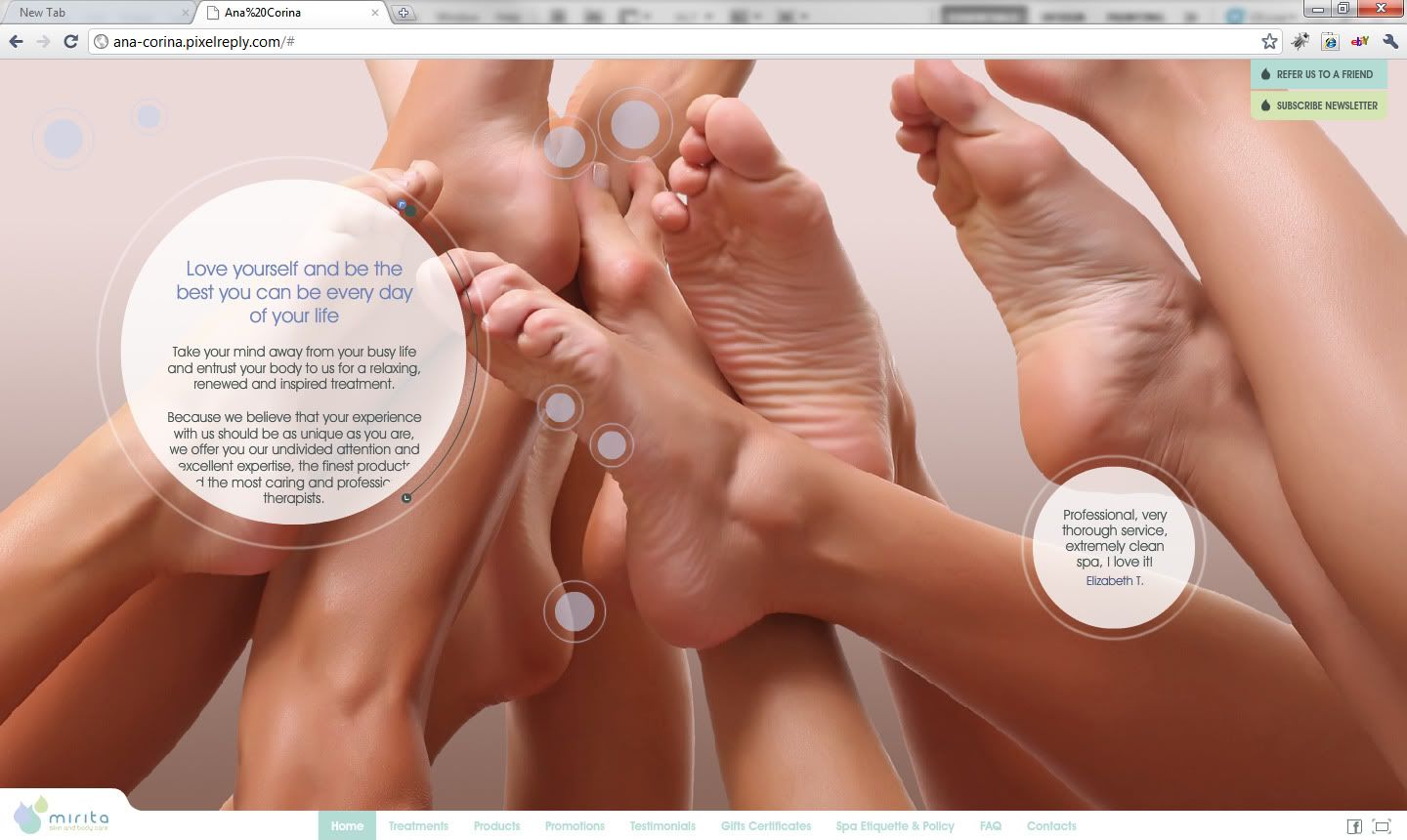
We are finishing a new website for a client in Toronto, a Spa.http://ana-corina.pixelreply.com…
Please, inputs are welcome
thanks
- set0
My first thought was that the navigation gets lost all the way down there. As I was looking at it the developer next to me said 'whats that?' I said a site... the navigation gets lost down there though doesn't it. He replied 'oh I didn't even notice that'.
- flash sucks.antagonista
- Thanks...Elfangio
- "flash sucks" is for hipstersmoldero
- BozMan0
^Yea took me a second to find the nav too.
- detritus0
I'm not a fan, at all, of the rounded text boxes.
If you'd fully explored the possibilities herein, you might've pulled something quite novel and engaging off. As it is, you have slightly-unreadable text delivered awkwardly, as a gimmick.
Code controlling bauble position spacks out intermittently, flicking in between two 'seed states' (I guess?). Also, the motion's not exactly smooth — I'm on a fairly fast machine here, and these delectable baubles are glitching a bit. And I'm a geek, with a high toelrance for that kind of thing. Not sure your average spa-goer would be so forgiving. Image masking on nav baubles seems broken too? (I can see rectangular edges underneath?)
Overall navigation is confusing too.
I'm guessing you've tried to drive a lot of impact from very little content, which is commendable... but tbh, I think a much, much simpler site would better serve their needs.
Perhaps not their ego, but certainly their needs.
- Projectile0
ok I agree with detritus... but assuming that the client has been banging on and on about "wow factor" and wants something people will get immersed in and loves this to bits...
put the backup nav at the top and make more prominent, make the text boxes much, much bigger (the actual paragraphs can remain thin... but the fact that you can only rad one or two full lines at a time makes it completely unreadable) and maybe make it more obvious that the dot is a scroll point
- Elfangio0
Thanks for the feedback.
Finished and approved!!
I dont think navigation have always to be the focus of a website, sometimes is also nice to discover on the way . just my opinion. The amazing is that the target, middle age women not geek people, loved the navigation...iPad and iPhone, or mobile devices in general, we have to design alternative content just for that. No matter what is the technology we use on the main site, my opinion is you have always to adapt to those small devices...We are working on the alternative mobile device design!
Everything is working a lot smooth now. I am happy overall with the final result, and if my granny can use it, everybody can! :)
Cheers
- acrossthesea0
Doesn't feel like it was built well. Slow and janky. Maybe the code/motion needs optimizing.
- omg0
Doesn't really look like any of our feedbacks and critiques were used in the final. You should have asked us earlier before you finish and approved it. :) I can't believe you actually used your grandma as a test subject. Would love to know more about that story!
- akrok0
meh!
- dbloc0
took me a while to find the nav...it's a little to hidden.
- stoplying0
SPAZ. haha spas
- mattiaBK0
I think it's well done, classy and clean. I didn't see the bottom navigation either, but I like to discover things, and the floating buttons are a cool way to "entertain" the visitor. There are few issues here and there, but overall I think it's well done.
- Amicus0
I found the backup nav easily, as it loaded before the rest of the site.
I agree the typography needs some cleaning up, but overall I liked it.