simple packaging
- Started
- Last post
- 18 Responses
- bigtrick0

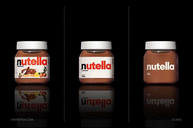
how's that for simple packaging.
- pretty crappy. fire the designer.cannonball1978
- haha.akrok
- OSFA0
Some of them are complete fails if you ask me...
- cannonball19780
For people who don't know what Nutella is, the packaging on the left helps people understand how it is consumed and tom some extent what it tastes like. The packaging on the right looks like it's for spackling cracks.
- uan0
reminds me of noname floppy disks:

- liveforever0
cnt be this timeless piece of simple packaging

- randommail0
I don't get why they decided to use Nutella as an example.
I mean how often do you see packaging where they simply use a clean straightforward illustration of the product on a white background with a fairly good logo.There are no random dropshadows, gradients, starbursts, or bevels to be seen.
- kona0
what are you drinking there?
redbull, you know... the drink in the all blue can.
- kona0
so, basically remove everything but the logo and/or name. gotcha.
- randommail0
honestly, I prefer the original on the left
- fooler0
the one on the right looks fine when completely full but is going to look like a jar of shit after digging a knife or spoon into it after a couple of meals.
- pressplay0
I found cornflakes and toffifee to be the least appealing...
- akrok0
yeah, isn't working for all of those products. but some it does. ex. the nutella.
- pressplay0
yeah, well, seems like I missed that thread...
- bigtrick0
i think the consensus was that this only works if the brand is already strong and enjoys enough recognition that it can stand without any supporting text/images
- bigtrick0
sorry, it's a bit timeline
- pressplay
Alternate simple versions for some package samples of international brands.
I found this on "It‘s nice that", thought it would be nice to share it here... I always wondered how packaging would look without the cheesy imagery... interesting to see it executed here...http://www.a2591.com/2010/12/min…