new virgin identity
- Started
- Last post
- 50 Responses
- BoyWhoLived0
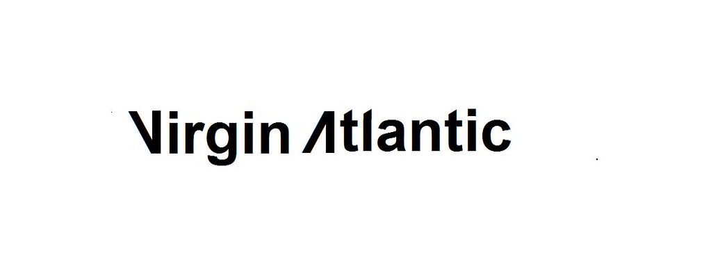
even the lower case arial t would have given that cut feel the logo has
- Chimp0
The most important part of this logo should be the 'Virgin' script, this feels like a bit of an after thought. Although I know its pretty hard to combine the Virgin script with any other type or mark
- 74LEO0
They should have a vertical underneath the plane like this
Virgin:
You know I love you right? -him
really -her
Yes - him
Ok- her -WINWINWINWINWINWINWINWINWINWIN
- BoyWhoLived0
VΛ slanted would have had that feel also
you can apply that to both v and a and lower case t and l
- Point50
no matter what, that candy red on the plane looks damn nice.
- indian_pole0
man that's tight kerning.
- quite like the curve of the icon over the C tho.indian_pole
- that is amazing74LEO
- you mean keming74LEO
- tight...like a virgin?TheMagicSheep
- set0
i liked the old one. The new one is a metaphor for being strangled
- Amicus0
it just doesn't have that fresh "fuck off, I'm grabbing a beer and going for a slide" look.
That and it's pretty boring. I hope they loosen up the kerning for signage and livery applications.
- Lillebo0
OK, I guess. As long as they leave the logo alone. Liked the Vimeo-clip...
- AVAVA0
They both seem so dated.
The new one doesn't sit right with me.
The purple and red is a bit yucky.
- 74LEO0
maybe the r could be stabbing the hole in the g or just have a girl trying to open a can of spaghettiOs.
- georgesIII0
best logo ever,
I like the curves, colors, style,
it is also well balanced and the kerning.... is just fantastic,
It makes me feels whole, like when I eat pancakes while drinking beer.
- OSFA0
What the fuck?
- i_monk0
Virqin
Am I the only one who sees it? That isn't a g.
- whereRI0
it feels wrong to have the tail of the plane on the right. when i think of an airplane i always think of it nose on the right, tail on the left.
- utopian0
The kerning is so tight, that I can not breathe.
- pillhead0
That is just tacky placement, FFS.

- I think, that's good idea303
- I mean the way the Virgin over hangspillhead
- Tacky placement? Great marketing over cities, I'd say.detritus
- I dig it. Plus, it's somewhat phallic.Gucci
- actually the bottom of a plane is great placementiCanHasQBN
- should just be a nice tight looking hole that your lookin g up at74LEO
- BoyWhoLived0
i would have done this
- Ke rn i n gutopian
- horrificmonospaced
- no way i like the wing feel has that tail wing edge feelBoyWhoLived
- easy man you getting paid for this?74LEO
- but...Arial!?!?!?monospaced
- cause of the t it has that tail wing edge feel what can you do with the i r g n c not much so it has helvetica feel standard but modified and edgyBoyWhoLived
- but modified and edgyBoyWhoLived
- 74LEO no but im just sayingBoyWhoLived
- doesnt have to be arial id do all from scratch but the idea off the wings tails and edges is what id keepBoyWhoLived
- short form VA would look nice beside the Tail logo without gradient its like two wings and tailBoyWhoLived
- Continuity0
Overall I like it, except for the gradients on the tail; they make it look a bit too lozenge-ish. Flat would have been better.