New Attitude Design Website
- Started
- Last post
- 24 Responses
- Continuity0
There's a pretty glaring typo here ...

- Frosty_spl0
It's very web 2.0
- Mr_Right0
meh
- orrinward0
I think you forgot to close off a div or 2 as well.

- orrinward0

That thing is fucking irritating.
A lot of the style of the site just doesn't match up I feel.
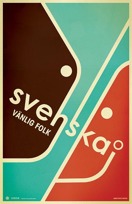
The image quality is really low as well.
- BonSeff0
The gold frame looks fucking fancy!
Sincerely,
Grandma
- Continuity0
Like hellojeehae said, I'm not getting any sense of what your brand purports to stand for from this site. By comparison to the brand premise, the website is bland. In other words, I'm not getting any sort of attitude at all, looking at this.
Also, the header bar with the mark and navigation site look completely seperate from the rest of the site in style.
- dMullins0
The colors are killing it for me. Seems like a contrived concept, and the romance-y colors are not helping. That's just how it comes off to me, and I mean no offense.
Also, you need to add some hover states to your buttons, especially the slideshow dots.
- PIZZA0
Up your image quality for god sake, JPEG artefacts everywhere.
Also your text jumps up on that huge gold button at the bottom when you roll over it.
- WhiteFace0
Some nice work there but as d_rek said it needs some refining. Spend a day or so going over it with one of these,

- MrMackem0
The third page of logos isn't left alligned either.
Goes a bit sqew wiffy near the bottom.
I agree - not really fresh or tasty i was expecting.
Some canny stuff.
- utopian0
NICE TEMPLATE
- sfmkg0
same old responses.
- bumdrizzle0
you were a baw hair away from adding bevels to your buttons weren't you?
- d_rek0
I see a lot of fluff on your site... some very good work there but there a lot of things taking away from the overall experience. The background texture is probably the worst offender - being what is obviously a low-res image scaled up. I would lose it. Also, you have some copy issues going on in your splash images and also in other parts of the site. Proofread carefully. And lastly the image carousel indicator (the small circles) are pixellated.
I would reconsider some of the decorating you've done to the site. Pare it down and refine it to something a little more functional and use the decoration with a little more finesse.